
@angular-material-expensions/password-strength - 材料密码强度计,以显示所提供的密码是否安全


由开发者建并供开发者使用 : 心脏 :
你有什么问题或建议吗? 请不要犹豫联系我们! 或者,提供PR QQ打开一个适当的问题 这里
如果你喜欢这个项目,请支持 角-材料-扩展 由主演: 明星: 分享它 : 高音:
目录
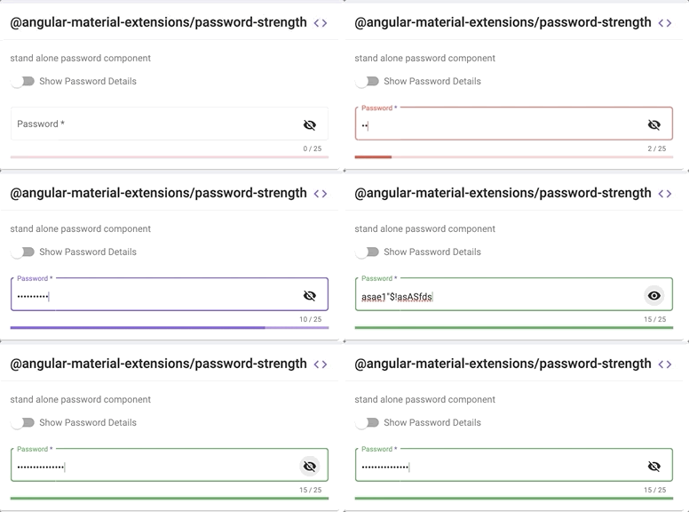
演示
在 https://angular-material-extension.github.io/password-strength 页面存档备份,存于互联网档案馆
图书馆的组成部分
<mat-password-strength>用于计算和显示提供密码的强度
- 强度得分 20%
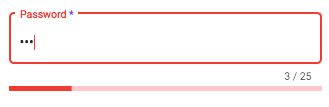
- 强度得分 80%
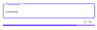
- 强度分数 > 80%
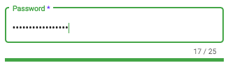
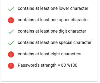
<mat-password-strength-info>用于显示更多关于提供密码强度的信息
<mat-pass-toggle-visibility>用于显示/隐藏输入元素中提供的密码
依赖关系
- 角质 开发并测试
15.x
安装
1. 通过 纳克后加. (建议)
如果未设置角材料设计, 请运行 ng add @angular/material 学习更多
现在通过 angular schematics
ng add @angular-material-extensions/password-strength
2. 通过 无. (备选案文)
现在安装 @angular-material-extensions/password-strength 通过:
npm install --save @angular-material-extensions/password-strength
系统JS
说明: 如果您正在使用
SystemJS,您应该调整您的配置,以指向 UMD 捆绑. 在您的系统配置文件中,map需要告诉系统加载器在哪里寻找@angular-material-extensions/password-strength数字 :
{
  '@angular-material-extensions/password-strength';: 'node_modules/@angular-material-extensions/password-strength/bundles/password-strength.umd.js',
}
-> follow the instructions 这里
导入库
安装后需要导入主模块 :
import { MatPasswordStrengthModule } from "@angular-material-extensions/password-strength";
剩下的唯一部分是在您的应用程序模块中列出导入的模块. 准确的方法是略微的
不同的根( 顶级) 模块, 您最后应该使用类似于( 通知) 的代码 MatPasswordStrengthModule .forRoot():
import { MatPasswordStrengthModule } from '@angular-material-extensions/password-strength';

@NgModule({
  declarations: [AppComponent, ...],
  imports: [MatPasswordStrengthModule.forRoot(), ...],
  bootstrap: [AppComponent]
})
export class AppModule {
}
应用程序中的其他模块可以简单地导入 MatPasswordStrengthModule数字 :
import { MatPasswordStrengthModule } from '@angular-material-extensions/password-strength';

@NgModule({
  declarations: [OtherComponent, ...],
  imports: [MatPasswordStrengthModule, ...],
})
export class OtherModule {
}
API 密码
<mat-password-strength> 用于计算和显示提供密码的强度 - 参见演示示例
| 选项 | 绑定 | 类型 | 默认 | 说明 |
|---|---|---|---|---|
| 密码 | Input() | 字符串 | - 说吧 | 用于计算其强度的密码 |
| 自定义变量 | Input() | 正则Exp | - 说吧 | 自定义 regex 验证符 |
| 外部错误 | Input() | boolean | false | 用于更改密码的颜色以警告外部出错 |
| 启用 Length 规则 | Input() | boolean | true | 是否验证密码长度 |
| 启用下目录规则 | Input() | boolean | true | 小写字母是否可选 |
| 启用 UpperCaseletter 规则 | Input() | boolean | true | 大写字母是否可选 |
| 启用数字规则 | Input() | boolean | true | 数字字符是否可选 |
| 启用特别查尔规则 | Input() | boolean | 真实 | 特殊字符是否可选 |
| 分钟 | Input() | number | 第8条 | 密码的最小长度 |
| 最大数 | Input() | number | 30个 | 密码的最大长度 |
| 警告危险 | Input() | number | 21国 | 密码强度小于此数字显示警告颜色 |
| 重音威胁 | Input() | number | 81国道 | 密码强度小于此数字显示口音颜色 |
| 已改变 | 产出( ) | number | - 说吧 | 提供密码的强度以%表示,例如:20%、40%、60%、80%或100% |
<mat-password-strength-info> 用于显示更多关于提供密码强度的信息 - 参见演示示例
| 选项 | 绑定 | 类型 | 默认 | 说明 |
|---|---|---|---|---|
| 密码组件 | Input() | 密码Strength 组件 | - 说吧 | 模板中用于显示更多与所提供的密码有关的信息的密码组件 |
| 启用分数信息 | Input() | boolean | false | 是否以 % 显示密码的分数 |
| 下目录 | Input() | string | 包含至少一个下字符 | 小案件的适当毫升 % |
| 上目录 | Input() | string | 至少包含一个上字符 | 较大病例的适当毫升 % |
| 数字 | Input() | string | 包含至少一个数字字符 | 数字大小写的适当 msg % |
| 特殊目录 | Input() | string | 包含至少一个特殊字符 | 特殊情况的适当 msg % |
| 自定义 Chars 标准磁斯 | Input() | string | 至少包含一个自定义字符 | 用于自定义验证器大小写的适当 msg % |
| 微分目录 | Input() | string | 包含至少 ${ this. password Conferent.min} 字符 | 最低限度的适当 msg number 字符数% |
<mat-pass-toggle-visibility> 用于显示/隐藏输入元素中提供的密码
| 选项 | 绑定 | 类型 | 默认 | 说明 |
|---|---|---|---|---|
| 可视 | Input() | boolean | false | 密码是否可见或隐藏 |
| 选项卡 | Input() | string | null | 设置切换可见度按钮的所期望的标签索引值. |
使用量
添加 @angular-material-extensions/password-strength 模板中的元素 :
<mat-password-strength [password]="password.value"> </mat-password-strength>
这将仅以没有任何输入字段的进度形式显示 或类似.
在以下例子中,我们将一个材料输入容器与 @angular-material-extensions/password-strength 组件.
注:为了在改变密码强度值后正确重新油漆垫面-窗体-场,请考虑 更改母组件的检测策略 -- >
import {
  ChangeDetectionStrategy,
  Component,
  OnInit,
  ViewEncapsulation,
} from "@angular/core";
import { Title } from "@angular/platform-browser";
import { MatSlideToggleChange } from "@angular/material";
import { MatPasswordStrengthComponent } from "@angular-material-extensions/password-strength";

@Component({
  selector: "app-home",
  templateUrl: "./home.component.html",
  styleUrls: ["./home.component.scss"],
  encapsulation: ViewEncapsulation.None,
  changeDetection: ChangeDetectionStrategy.OnPush,
})
export class HomeComponent implements OnInit {}
<div>
  <mat-form-field
    appearance="outline"
    style="width: 100%"
    [color]="passwordComponent.color"
  >
    <mat-label>Password</mat-label>
    <input
      matInput
      #password
      [type]="inputType"
      required
      placeholder="Password"
    />
    <mat-hint align="end" aria-live="polite">
      {{password.value.length}} / 25
    </mat-hint>
  </mat-form-field>

  <mat-password-strength
    #passwordComponent
    (onStrengthChanged)="onStrengthChanged($event)"
    [password]="password.value"
  >
  </mat-password-strength>
</div>
如何在模板中使用密码所释放的强度的实例
<div fxLayout="row" fxLayoutGap="10px">
  <div *ngIf="passwordComponent.strength === 100; then done else error"></div>
  <ng-template #done>
    <mat-icon color="primary">done</mat-icon>
  </ng-template>
  <ng-template #error>
    <mat-icon color="warn">error</mat-icon>
  </ng-template>
  <div>
    <p>Password's strength = {{passwordComponent.strength}} %100</p>
  </div>
</div>
使用切换能见度组件
- 添加
mat-pass-toggle-visibility给您的mat-form-field - 给它一个名字,在 html 文件中使用它像
toggle - 设置从
mat-pass-toggle-visibility组件<input matInput [type]="toggle.type"/>
<mat-form-field
  appearance="outline"
  style="width: 100%"
  [color]="passwordComponent.color"
>
  <mat-label>Password</mat-label>
  <!-- HERE DOWN :D-->
  <mat-pass-toggle-visibility #toggle matSuffix></mat-pass-toggle-visibility>
  <!-- THERE ABOVE ;)-->
  <input
    matInput
    #password
    [type]="toggle.type"
    required
    placeholder="Password"
  />
  <mat-hint align="end" aria-live="polite">
    {{password.value.length}} / 25
  </mat-hint>
</mat-form-field>
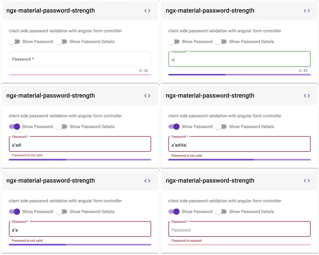
客户端密码使用 angular 格式控制器验证
- 在您的模板中添加一个输入元素, 并配有适当的 @ angular- material- extensions/ password-strength 组件
- 通过添加来保留@angular-material-extension/password-strength 组件的引用
passwordComponentWithValidation(或任何你想要的)元素内部
例如:
<mat-password-strength
  #passwordComponentWithValidation
  [password]="passwordWithValidation.value"
>
</mat-password-strength>
- 将 sat-password-strength 的窗体控制器绑入输入元素
- 您可以使用 khile 视图访问 @angular- material- extension/ password- strength 的窗体控制器 -- >
passwordComponentWithValidation.passwordFormControl - 将窗体控制器绑定为输入元素 -- >
[formControl]="passwordComponentWithValidation.passwordFormControl"
- 完整的例子----见下文
<div>
  <mat-form-field appearance="outline" style="width: 100%">
    <mat-label>Password</mat-label>
    <input
      matInput
      #passwordWithValidation
      [type]="inputType"
      required
      [formControl]="passwordComponentWithValidation.passwordFormControl"
      placeholder="Password"
    />
    <mat-hint align="end" aria-live="polite">
      {{passwordWithValidation.value.length}} / 25
    </mat-hint>
    <mat-error
      *ngIf="passwordComponentWithValidation.passwordFormControl.hasError('required')"
    >
      Password is required
    </mat-error>
    <mat-error
      *ngIf="passwordComponentWithValidation.passwordFormControl.hasError('pattern')"
    >
      Password is not valid
    </mat-error>
  </mat-form-field>
  <mat-password-strength
    #passwordComponentWithValidation
    (onStrengthChanged)="onStrengthChanged($event)"
    [password]="passwordWithValidation.value"
  >
  </mat-password-strength>
  <!--Password's strength info-->
  <mat-password-strength-info
    [passwordComponent]="passwordComponentWithValidation"
  >
  </mat-password-strength-info>
</div>
这将看起来像 -- >
自定义正则x 验证
请考虑使用 customValidator 投入(见下文)
<mat-slide-toggle #toggle>Show Password Details</mat-slide-toggle>

<mat-form-field
  appearance="outline"
  style="width: 100%"
  [color]="passwordComponent.color"
>
  <mat-label>Password</mat-label>
  <mat-pass-toggle-visibility
    #toggleVisbility
    matSuffix
  ></mat-pass-toggle-visibility>
  <input
    matInput
    #password
    [type]="toggleVisbility.type"
    placeholder="Password"
  />
  <mat-hint align="end" aria-live="polite">
    {{password.value.length}} / {{passwordComponent.max}}
  </mat-hint>
</mat-form-field>

<mat-password-strength
  #passwordComponent
  (onStrengthChanged)="onStrengthChanged($event)"
  [password]="password.value"
  [customValidator]="pattern"
>
</mat-password-strength>

<mat-password-strength-info
  *ngIf="toggle.checked"
  [passwordComponent]="passwordComponent6"
  customCharsCriteriaMsg="1 german special chars is required"
  [enableScoreInfo]="true"
>
</mat-password-strength-info>
pattern = new RegExp(/^(?=.*?[äöüÄÖÜß])/);
确认密码以角窗体控制器构建 - 参见现场实例
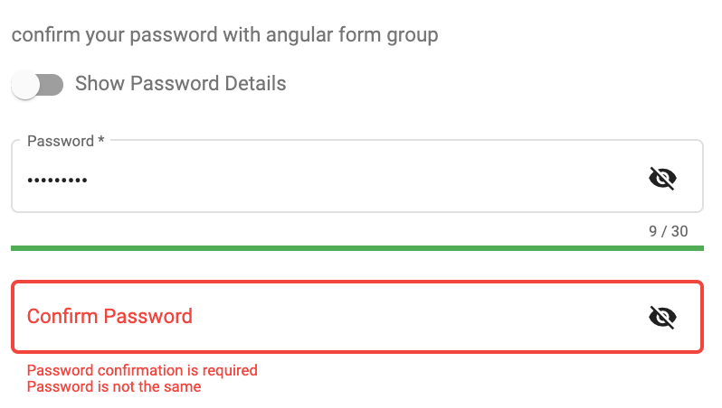
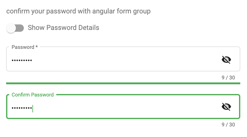
总是使用绿色来获取一个强大的密码,只需添加 green cs 类到 mat-password-strength
<mat-password-strength
  #passwordComponent
  class="green"
  [password]="password.value"
>
</mat-password-strength>
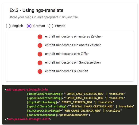
支持信息组件的自定义信件和ngx- translate 请检查示例演示 这里
更多实例请访问此 URL : [(]https://angular-material-extension.github.io/password-strength/examples 页面存档备份,存于互联网档案馆(] ([https://angular-material-extension.github.io/password-strength/examples 页面存档备份,存于互联网档案馆(中文(简体) )
本地运行 Demo 应用程序
发展
其他角图书馆
- ngx-auth-fire-baseui (英语)
- ngx-mailto (英语)
- ngx-链接js
- @angular-material-extension/google-maps-自动完成
- @angular-material-extensions/select-country (英语)
- @angular-material-extension/select-icon (原始内容存档于2018-09-28)
- @angular-material-extensions/fab-menu (法语)
- @angular-material-extensions/link-preview (英语)
- @angular-material-extensions/页面
- @angular-material-extensions/ contacts (英语)
- @angular-材料扩展/faq
- @angular-material-extensions/合并-生成器
支助
由开发商建造
谁用这个图书馆? 伟大的应用程序?
你错过了你的项目还是你的应用? 公关我发表在读本上

这个项目得到下列机构的支持: 喷射板 1个产品包 OS License 包括. 网络风暴
许可证
版权(c) 2019-2023 安东尼·纳哈斯获得麻省理工学院许可证