蚂蚁设计方案布局


💻 预览布局数字 :
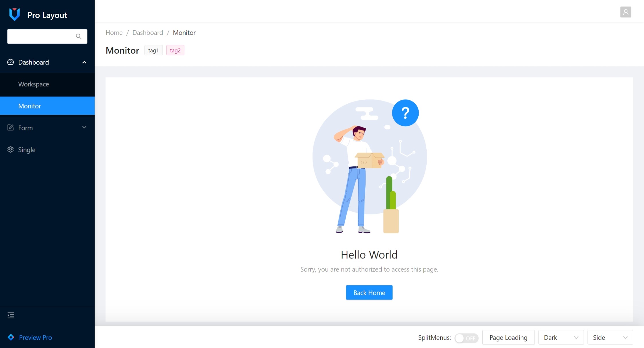


基本用途
处
- 下一个: Vue3 + 蚂蚁设计图@ 3.x (最新数据)
- v3.1: Vue3 + 单曲 蚂蚁设计图@ 2.2.x (释放LTS)
- v2: Vue2 + (中文(简体) ) 蚂蚁设计图@ 1.7.x
安装
# yarn
yarn add @ant-design-vue/pro-layout
# npm
npm i @ant-design-vue/pro-layout -S
简单使用
首先,你应该添加 @ant-design-vue/pro-layout 你需要进入图书馆.
// main.[js|ts]
import "@ant-design-vue/pro-layout/dist/style.css"; // pro-layout css or style.less

import { createApp } from "vue";
import App from "./App.vue";
import Antd from "ant-design-vue";
import ProLayout, { PageContainer } from "@ant-design-vue/pro-layout";

const app = createApp(App);

app.use(Antd).use(ProLayout).use(PageContainer).mount("#app");
之后,您可以在您的 Vue 组件中使用 pro-layout, 简单如下:
<template>
  <pro-layout
    :locale="locale"
    v-bind="layoutConf"
    v-model:openKeys="state.openKeys"
    v-model:collapsed="state.collapsed"
    v-model:selectedKeys="state.selectedKeys"
  >
    <router-view />
  </pro-layout>
</template>

<script setup lang="ts">
import { reactive, useRouter } from "vue";
import { getMenuData, clearMenuItem } from "@ant-design-vue/pro-layout";

const locale = (i18n: string) => i18n;
const router = useRouter();

const { menuData } = getMenuData(clearMenuItem(router.getRoutes()));

const state = reactive({
  collapsed: false, // default value
  openKeys: ["/dashboard"],
  selectedKeys: ["/welcome"],
});
const layoutConf = reactive({
  navTheme: "dark",
  layout: "mix",
  splitMenus: false,
  menuData,
});
</script>
API 密码
普罗拉尤特
| 财产 | 说明 | 类型 | 默认值 |
|---|---|---|---|
| 标题 | 左上角标题中的布局 | VNode QQ 字符串 | 'Ant Design Pro' |
| 标志 | 左上方的标志 url | VNode QQ 渲染 | - 说吧 |
| 装入 | 布局加载状态 | 布尔 | - 说吧 |
| 版式 | 布局菜单模式,侧菜单:右向导航,上菜单:上向导航 | “ 边 ” “ 顶 ” “ mix ” | 'side' |
| 内容窗口 | 内容布局模式, 流体:适应性, 固定: 固定宽度 1200px | "Fixed" "Fluid" (英语) | Fluid |
| 导航主题 | 导航主题 | "光" "黑暗" | 'light' |
| 标题主题 | 标题栏主题 | "光" "黑暗" | 'light' |
| 菜单数据 | 单路车 routes 道具 | 对象 | [{}] |
| 崩溃 | 控制菜单的崩溃和扩展 | 布尔 | 真实 |
| 选中关键字 | 菜单所选密钥 | 字符串 [] | [] |
| 打开密钥 | 菜单打开密钥 | 字符串 [] | [] |
| 移动 | 移动 | 布尔 | 虚假 |
| @ collapse 上的缩写 | 菜单折叠倒塌事件 | (拼接:布尔) | - 说吧 |
| 菜单头 | 渲染页眉标识和标题 | v-slot QQ VNode QQ (logo, title) (中文(简体) ). VNode QQ 错误 | - 说吧 |
| 菜单外延渲染器 | 转换额外菜单项 | v-slot QQ VNode QQ (道具) QQ VNode QQ 错误 | - 说吧 |
| 菜单 | 转换页脚菜单项 | v-slot QQ VNode QQ (道具) QQ VNode QQ 错误 | - 说吧 |
| 菜单 | 自定义变成菜单。 项目 | v- slot# menu ProjectRender="{项目,图标}" QQ ({项目,图标}) QQ V 节点 | 无效 |
| 子菜单项目渲染器 | 自定义变成菜单。 子项目 | v- slot#subMenu ProjectRender="{项目,图标}"({项目,图标}) QQ V 节点 | 无效 |
| 崩溃的按钮渲染器 | 自定义已崩溃的按钮方法 | slot | (拼接:布尔) => (=>) V 节点 | - 说吧 |
| 页眉 | 自定义页眉渲染方法 | slot (道具: BasicLayoutProps) =>. V 节点 | - 说吧 |
| 信头连线 | 标题内容只渲染布局侧面的方法 | slot (道具: BasicLayoutProps) =>. V 节点 | - 说吧 |
| 右连线 | 右侧内容渲染方法 | slot (道具: BasicLayoutProps) =>. V 节点 | - 说吧 |
| 页脚 | 自定义页脚渲染方法 | slot ({宽度,. BasicLayoutProps}}}} { 宽度, { 基本 Layout Props}}}} V 节点 | false |
| 选项卡 | 自定义标签渲染方法 | slot ({宽度,. BasicLayoutProps}}}} { 宽度, { 基本 Layout Props}}}} V 节点 | false |
| 面包屑铸造器 | 自定义面包屑渲染方法 | slot * * * * * * * * * * * * * * * * * * * * * * * * * * * * * * * * * * * * * * * * * * * * * * * * * * * * * * * * * * * * * * * * * * * * * * * * * * * * * * * * * * * * * * * * * * * * * * * * * * * * * * * * * * * * * * * * * * * * * * * * * * * * * * * * * * * * * * * ** * * * * * * * * * * * * * * * * * * * * * * * * * * * * * * * ** * * * * * * * * * * * * * * * *** ******************************************************************** | - 说吧 |
| 语言 | i18n (英语) | 函数( 键: 字符串) QQ 字符串 QQ false | false |
菜单生成需要
getMenuData财务报告和审定财务报表clearMenuItem函数 譬如说.const { menuData } = getMenuData(clearMenuItem(routes))
页面连接器
| 财产 | 说明 | 类型 | 默认值 |
|---|---|---|---|
| 内容 | 内容领域 | VNode QQ v- slot 图像 | - 说吧 |
| 额外 | 其他内容区域, 在内容的右侧 | VNode QQ v- slot 图像 | - 说吧 |
| 额外关联 | 其他内容区域, 在内容的右侧 | VNode QQ v- slot 图像 | - 说吧 |
| 选项卡列表 | 标签标题列表 | Array<{key: string, tab: sting}> | - 说吧 |
| 选项卡更改 | 切换面板回调 | (键) 虚空 | - 说吧 |
| 选项卡活性键 | 当前突出显示的标签项 | 字符串 | - 说吧 |
| 面包屑 | 显示面包屑栏 | 布尔 | - 说吧 |
水马克
| 财产 | 说明 | 类型 | 默认值 |
|---|---|---|---|
| 标记样式 | 标记样式 | CSS 财产 | - 说吧 |
| 标记分类Name | 标记类 | 字符串 | - 说吧 |
| 差额X | 水标记之间的水平间隔 | 编号 | 212号 |
| 差额Y | 水印之间的垂直间隔 | 编号 | 第222条 |
| 页:1 | 页:1 | 编号 | offsetTop = gapX / 2 |
| 页:1 | 页:1 | 编号 | offsetTop = gapY / 2 |
| 宽度 | 编号 | 120国 | |
| 高度 | 编号 | 64国道 | |
| 旋转 | 旋转角度, 单位 ° | 编号 | -22号 |
| 图像 | 图像弧 | 字符串 | - 说吧 |
| zindex 数据 | 水标记 z 索引 | 编号 | 第9条 |
| 内容 | 水标记内容 | 字符串 | - 说吧 |
| 字体颜色 | 字体颜色 | 字符串 | rgba(0,0,0,.15) |
| 字体大小 | 字体大小 | 字符串|编号 | 16个 |
自定义渲染器
自定义右侧串联
<template #rightContentRender>
  <div style="margin-right: 12px">
    <a-avatar shape="square" size="small">
      <template #icon>
        <UserOutlined />
      </template>
    </a-avatar>
  </div>
</template>
自定义菜单. item
<template #menuItemRender="{ item, icon }">
  <a-menu-item
    :key="item.path"
    :disabled="item.meta?.disabled"
    :danger="item.meta?.danger"
    :icon="icon"
  >
    <router-link :to="{ path: item.path }">
      <span class="ant-pro-menu-item">
        <a-badge count="5" dot>
          <span class="ant-pro-menu-item-title">{{ item.meta.title }}</span>
        </a-badge>
      </span>
    </router-link>
  </a-menu-item>
</template>
自定义菜单ExtraRender
<template #menuExtraRender="{ collapsed }">
  <a-input-search v-if="!collapsed" />
</template>
自定义菜单Footer渲染器
<template #menuFooterRender>
  <div>menu footer</div>
</template>
自定义面包屑铸件
<template #breadcrumbRender="{ route, params, routes }">
  <span v-if="routes.indexOf(route) === routes.length - 1">
    {{ route.breadcrumbName }}
  </span>
  <router-link v-else :to="{ path: route.path, params }">
    {{ route.breadcrumbName }}
  </router-link>
</template>
自定义已崩溃的按钮渲染器
<template #collapsedButtonRender="collapsed">
  <HeartOutlined v-if="collapsed" />
  <SmileOutlined v-else />
</template>
自定义标签
<template #tabRender="{ width, fixedHeader }">
  <div>
    <header
      class="ant-layout-header"
      style="height: 36px; line-height: 36px; background: transparent"
      v-if="fixedHeader"
    ></header>
    <div
      :style="{
        margin: '0',
        height: '36px',
        lineHeight: '36px',
        right: '0px',
        top: '48px',
        position: fixedHeader ? 'fixed' : 'unset',
        zIndex: 14,
        padding: '4px 16px',
        width: width,
        background: '#fff',
        boxShadow: '0 1px 4px #0015291f',
        transition: 'background 0.3s, width 0.2s',
      }"
    >
      tabRender fixedHeader:{{fixedHeader}} width:{{ width }}
    </div>
  </div>
</template>
自定义带有槽的页脚
<template #footerRender="{ width, headerTheme }">
  <div>
    <footer class="ant-layout-footer" style="height: 36px; line-height: 36px; background: transparent"></footer>
    <div
      :style="{
        margin: '0',
        height: '36px',
        lineHeight: '36px',
        right: '0px',
        bottom: '0px',
        position: headerTheme == 'dark' ? 'fixed' : 'unset',
        zIndex: 14,
        padding: '4px 16px',
        width: width,
        background: '#fff',
        boxShadow: '0 1px 4px #0015291f',
        transition: 'background 0.3s, width 0.2s'
      }"
    >
      footerRender headerTheme:{{ headerTheme }} width:{{ width }}
    </div>
  </div>
</template>
自定义有道具的页脚
<GlobalFooter
:links="[
{ title: 'Link 1', href: '#' },
{ title: 'Link 2', href: '#' },
]"
copyright="Pro Layout © 2021 Sendya."
/>
使用水 Mark 软件
<router-view v-slot="{ Component }">
  <WaterMark content="Pro Layout">
    <component :is="Component" />
  </WaterMark>
</router-view>
构建项目
pnpm build # Build library and .d.ts