
ProEditor
The Ultimate Editor UI Framework and Components


English · 简体中文 · Changelog . Report Bug · Request Feature

Table of contents
TOC
📦 Installation
[!IMPORTANT]
This package is ESM only.
To install @ant-design/pro-editor, run the following command:
$ pnpm install @ant-design/pro-editor
Compile with Next.js
[!NOTE]
By work correct with Next.js SSR, addtranspilePackages: ['@ant-design/pro-editor']tonext.config.js. For example:
const nextConfig = {
  transpilePackages: ['@ant-design/pro-editor', 'leva', 'zustand'],
};
🔨 Usage
import { SmileOutlined } from '@ant-design/icons';
import { ActionIcon } from '@ant-design/pro-editor';

export default () => (
  <ActionIcon
    title={'Function button description'}
    icon={<SmileOutlined />}
    onClick={() => {
      alert('Trigger action');
    }}
  />
);
✨ Features
[!NOTE]
Front-end component libraries have revolutionized development, boosting efficiency by orders of magnitude and elevating user experience. Yet, as mature as libraries like Ant Design (antd) and ProComponents are, one might wonder if there's any room left for innovation.
Empowering Features of ProEditor
[!NOTE]
We envision ProEditor as the foundational library for editing components, akin to antd, enabling developers to easily create complex interactive components with an inherently superior user experience. This is the rationale behind the
ProEditor.
Our Principles for ProEditor:
- 🖐️ Intuitive Editing: Supports natural user interactions like multi-selection, deselection, and keyboard shortcuts, ensuring a smooth editing experience.
- ✨ Refined by Default: Enhances Ant Design components to deliver a superior user experience with more polish and refinement.
- 🔧 Open Flexibility: Provides atomic-level capabilities, offering a wide range of components, hooks, and utility functions for extensive customization and flexibility.
UI Framework and Frontend Component Solutions in the Editor Field:
[!TIP]
ProEditor concentrates on expanding the limits of the feasible and augmenting the array of tools available to developers for the construction of sophisticated, interactive, and user-centric web applications. For instance:
- 📦 DraggablePanel: Allows for resizable and movable panels, enhancing the interactivity of the user interface.
- 📝 ColumnList: Offers a user-friendly sortable list that is manageable through column definitions, simplifying complex list interactions.
- 🎨 FreeCanvas: Provides a zoomable canvas similar to applications like Sketch or Figma, giving users a vast space for creative design.
- 🔍 IconPicker: An icon selection tool that is compatible with iconfont, making it easier to integrate a wide range of icons into the design.
- 👥 Online Collaboration: Incorporates multi-user capabilities using technologies like yjs and zustand store, enabling real-time collaborative editing and interaction.
Framework Architecture
ProEditor is structured to facilitate these principles effectively.

👀 Showcase
Let's showcase some of ProEditor's signature components:
| DraggablePanel | ColumnList |
|---|---|
| For resizable and movable panels | A user-friendly sortable list based on column definitions |
 |  |
| FreeCanvas | IconPicker |
| A limitless zoomable canvas akin to Sketch or Figma | An icon selection tool compatible with iconfont |
 |  |
| Online Collaboration | |
| Multi-user capabilities wrapped in yjs and zustand store. | |
 |
🖥 Browser compatibility
[!NOTE]
 |  |  |  |  |
|---|---|---|---|---|
| Edge | last 2 versions | last 2 versions | last 2 versions | last 2 versions |
⌨️ Local Development
You can use Github Codespaces for online development:

Or clone it for local development:
$ git clone https://github.com/ant-design/pro-editor.git
$ cd pro-editor
$ pnpm install
$ pnpm dev
🤝 Contributing
[!IMPORTANT]
Join our collaborative ecosystem. Your contributions are the heartbeat of our project. Here's how you can be an integral part of our vibrant community:
- Integrate and Innovate: Incorporate Ant Design Pro, umi, and ProEditor into your projects. Your real-world usage and feedback are invaluable to us.
- Voice Your Insights: Encounter a glitch? Have a query? Your perspectives matter. Share them by submitting issues and help us enhance the user experience.
- Shape the Future: Have code enhancements or feature ideas? We invite you to propose pull requests and contribute directly to the evolution of our codebase.
Every contribution, big or small, is celebrated. Join us in our mission to refine and elevate the world of open-source enterprise UI components. 😃

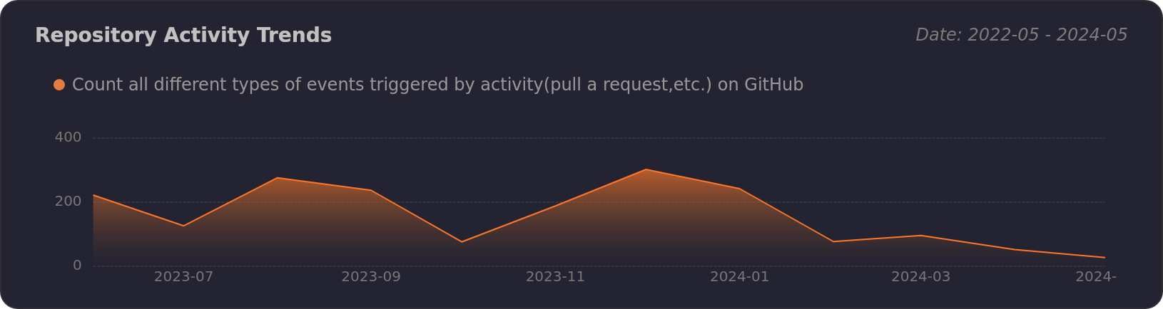
|
|
|
|---|---|
|
|
|
|
🛣️ Ecosystem
- ProComponents - Designed for Enterprise-Level Application, Use Ant Design like a Pro!.
- ProEditor - The Ultimate Editor UI Framework and Components.
- ProFlow - A Flow Editor Framework base on React-Flow.
- ProChat - Components Library for Quickly Building LLM Chat Interfaces.
📝 License
Copyright © 2023 - present AFX & Ant Digital.
This project is MIT licensed.