The AI-first, fully typed styling library for React







Docs · Start with AI · Playground · Showcase · Blog · Releases
Box Kite styles React in TypeScript. Every CSS property is a prop on Box, every value it takes is a type, and the CSS is
written for you at runtime — one shared class per value, no stylesheet to import, no class names to invent, no build plugin.
It is built to be written by an AI: the rules and a reference measured from the engine ship inside the package, an MCP server checks a prop bag against the real engine, and the compiler refuses a value the library would not render.
import Button from '@box-kite/react/components/button';
import Flex from '@box-kite/react/components/flex';
import { H2, P } from '@box-kite/react/components/semantics';

export function PlanCard() {
  return (
    <Flex d="column" gap={3} p={6} md={{ p: 8 }} borderRadius={3} shadow="md"
          bgColor="white" theme={{ dark: { bgColor: 'slate-900' } }}>
      <H2 fontSize={20} fontWeight={600}>Pro plan</H2>
      <P color="slate-600">Every value on this card is checked by the compiler.</P>
      <Button hover={{ bgColor: 'indigo-600' }}>Upgrade</Button>
    </Flex>
  );
}
Each prop becomes one shared class: p={6} is padding: 1.5rem, md wraps it in a media query, theme scopes it to the dark
subtree, and the same value anywhere else in the app reuses the same rule.
⚡ Quick start
Start a new Vite + React app with a design, a sample page and the agent setup already in it:
npm create @box-kite@latest
Or add it to the app you have:
npm install @box-kite/react
React 18 or newer, and no third-party dependencies: the install is Box Kite and its own engine, nothing else. TypeScript is optional, but it is where the library shines.
✨ Why Box Kite
🤖 AI-firstThe package carries its own |
🔒 Typed down to the valueEvery prop accepts a closed set: palette tokens, scale steps, keywords. A typo is a compile error with a “Did you mean”, not a silently missing style. |
🧩 Zero config, zero dependenciesNo CSS files, no PostCSS, no bundler plugin, no provider — and no third-party packages in your lockfile. Styles are generated on demand and deduplicated by content. |
🖥️ Server ComponentsRenders in a React Server Component with no |
♿ Accessible componentsDialog, Menu, Tabs, Combobox, DatePicker, DataGrid and more — each with the ARIA and keyboard of its APG pattern, swept by axe in CI. |
🎨 Modern CSS, as propsOKLCH palette, themes, container queries, |
🤖 Built for AI agents
A model's memory of a CSS-in-JS API is usually a memory of a different API — the prop names here collide with Tailwind's and Chakra's while the numbers mean something else. So Box Kite does not rely on what a model remembers:
| What | How you get it |
|---|---|
AGENTS.md + docs/ inside the npm package | Automatic — node_modules/@box-kite/react/AGENTS.md, with every prop and the CSS it writes |
Project wiring (AGENTS.md, CLAUDE.md, MCP) | npm create @box-kite@latest -- --agents-only — merges into an existing repo, and updates on a rerun |
| Skill for Claude Code, Cursor, Codex, Copilot… | npx skills add box-kite/box-kite |
| MCP server — no key, no network | claude mcp add box-kite -- npx -y @box-kite/mcp (or the stdio config your editor takes) |
| llms.txt and markdown docs | box-kite.dev/llms.txt — append .md to any docs URL |
check_styles runs your props through the real engine. A value the library does not accept writes no rule and no class
name — by design, so a typo never emits a broken declaration. The MCP tool makes that visible before anything renders:
✅ p         → .p-4{padding:1rem}
❌ bgColor   does not accept "blue-550" — no rule and no class name were written.
✅ fontSize  → .fontSize-14{font-size:0.875rem}
⚠️ href      an HTML attribute, not a style prop. Written at the top level it typechecks
             and is then dropped — it goes in props={{ "href": … }}.
The dev console is written as a prompt. Each warning says what rendered and the line to write instead, so an agent reading a test run fixes itself:
[box-kite] bgColor="bleu-500" wrote no CSS: bgColor does not take that value, so the prop
           was dropped along with its class. Did you mean "blue-500"?
[box-kite] fontSize={4} is 4px text: fontSize's divider is 16, not the spacing scale's 4,
           so the number is the pixel size. For 16px write fontSize={16}.
And a UI a model writes at runtime is a first-class citizen. catalog() turns every component and every value its props
take into JSON Schema — the shape structured output, json-render and A2UI want — and <SpecRenderer> renders what comes back,
checking each node against an allow-list you control. toolPart() and a2uiToSpec() read AI SDK, assistant-ui, CopilotKit,
AG-UI and A2UI, and <ToolCallCard>, <ApprovalCard>, <Reasoning> and <StreamingText> draw an agent's turn.
→ Generative UI · Agent components ·
Interop
🔒 Typed down to the value
Props are not string. Colours are palette tokens (with an optional /opacity), spacing is a scale, keywords are unions — so
the editor autocompletes them and the compiler catches the rest:
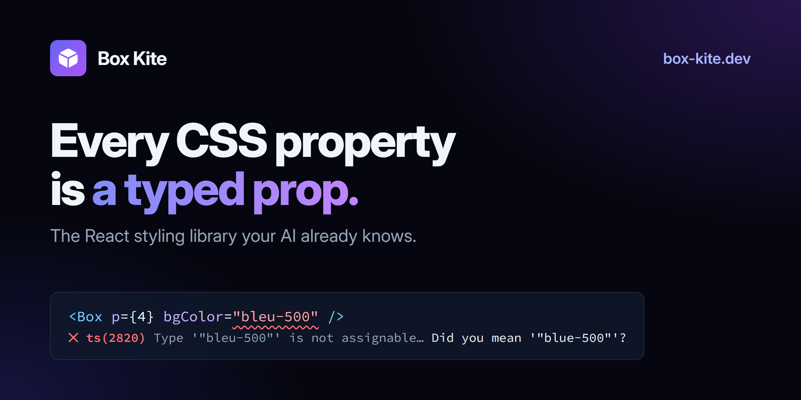
<Box bgColor="bleu-500" />
//   ~~~~~~~ ts(2820): Type '"bleu-500"' is not assignable… Did you mean '"blue-500"'?

<Box display="flexx" />
//   ~~~~~~~ ts(2820): … Did you mean '"flex"'?

<Box opacity={50} />
//   ~~~~~~~ ts(2322): Type '50' is not assignable to type '0 | 1 | 0.1 | 0.2 | …'

<Button variant="primaryy">Save</Button>
//      ~~~~~~~ ts(2322): a component's variants are typed too

<Box css={{ mixBlendMod: 'multiply' }} />
//          ~~~~~~~~~~~ ts(2561): … Did you mean to write 'mixBlendMode'?
- Hover a prop, see its CSS. Every prop's JSDoc carries an example such as
p={4} → padding: 1rem— generated by running the engine, so the editor can never teach a scale the library stopped using. - Your own tokens join the types.
Box.extend()adds variables, props and values; onedeclare modulemakes them autocomplete like the built-ins.Box.components()variants are typed the same way. - The escape hatch is typed too.
css={{ … }}is checked againstcsstypeand still compiles to a shared class — never astyleattribute.
📐 The scales
The one thing worth learning by heart — the divider is per prop:
| Prop | Scale | Example |
|---|---|---|
p, m, gap, width, borderRadius | ÷4 (quarter rem) | p={4} → 1rem (16px) |
fontSize | ÷16 | fontSize={14} → 0.875rem (14px) |
b (border width), lineHeight | px | b={1} → 1px |
animationDuration, transitionDelay… | ms | transitionDuration={150} → 150ms |
| colours | tokens + /opacity | bgColor="blue-500/40" → color-mix(…) |
Three conventions follow from "every visual value is a prop": the element comes from the component (<Flex>, <Button>,
<H1>, <Path>), HTML attributes go in props (<Link props={{ href: '/about' }}>), and there is no style={{ }}.
🧱 Components
Every component is a Box underneath — same props, same theming, same variants — and each is its own entry point, so a
Textbox never pulls the DataGrid into your bundle.
| Area | Components |
|---|---|
| Layout & content | Flex, Grid, H1–H6, P, Link, Nav…, List, Svg + every SVG element, Icon, Skeleton |
| Forms | Button, Textbox, Checkbox, Switch, RadioGroup, Combobox, Slider, Form |
| Dates | DateField, Calendar, DatePicker, TimeZoneSelect — over a zone-safe date module |
| Overlays | Dialog, Popover, Menu, Tooltip, Toaster — in the top layer, no portal, no z-index |
| Disclosure | Tabs, Accordion, Progress |
| Data & dashboards | DataGrid (sort, filter, group, edit, paste, virtualized), DashboardGrid, Sparkline, Gauge, ChartContainer |
| AI | ToolCallCard, ApprovalCard, Reasoning, StreamingText, markdownComponents, SpecRenderer |
The behaviour behind them ships on its own as @box-kite/react/a11y — focus return, roving focus, dismissal and controllable
state — for the widgets you build yourself.
🖥️ Server Components
// app/page.tsx — a Server Component. No 'use client', no provider, no CSS import.
import Flex from '@box-kite/react/components/flex';
import { H1 } from '@box-kite/react/components/semantics';

export default function Page() {
  return (
    <Flex d="column" gap={2} p={6}>
      <H1 fontSize={24}>Rendered on the server</H1>
    </Flex>
  );
}
The react-server export condition resolves to a hook-free build of Box; each rule comes back as a <style href precedence>
element that React 19 hoists into <head> and dedupes, so it is stream-safe and the cascade is held by @layer, not by element
order. → How it works ·
measured against CSS modules ·
a whole Next.js app
📦 Packages
| Package | What it is |
|---|---|
@box-kite/react | Box, every component and hook; depends on @box-kite/core and nothing else |
@box-kite/core | the styling engine with no framework and no dependencies — createStyleEngine().classNames(props) (example) |
@box-kite/mcp | the MCP server: docs search, props, components, rules and check_styles |
@box-kite/create | npm create @box-kite — a Vite + React app with a design and the agent setup |
📚 Learn more
- Documentation — every prop and component, with live demos
- Start with AI — build an app in three prompts with Claude Code, Cursor, Codex or Copilot
- Built for AI — what ships for agents, and why
- Theming, Extending, Escape hatch
BOX_KITE_AI_CONTEXT.md— the whole surface on one page
🤝 Contributing
Issues and pull requests are welcome — start with CONTRIBUTING.md, which covers the architecture and the framework-free core boundary. Questions go to SUPPORT.md, vulnerabilities to SECURITY.md.
If Box Kite saves you time, a ⭐ on GitHub helps other people find it.
License
MIT © Maxim Procopenco