Brightlayer UI React Native Progress Icons

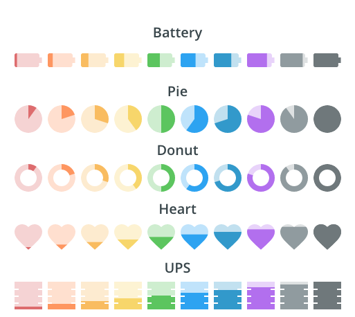
This is a library of icons with dynamic fill capabilities that can be used to show progress (similar to a traditional progress spinner or bar). These can be used to show health, battery life, etc.
Currently, we have icons available for:
- battery
- heart
- pie
- signal
- ups
- BatteryLarge
Installation
To install the Brightlayer UI progress icons from NPM as a dependency for your project, you can run the following command in your project root:
yarn add @brightlayer-ui/react-native-progress-icons
Peer Dependencies
In order to use this library, you must also have react-native-svg installed in your project. You can add it by running:
yarn add react-native-svg
Installation with Expo
If you are using Expo, the Expo client app already includes the necessary native code for react-native-svg.
Install the JavaScript dependency with:
npx expo install react-native-svg
See the Expo docs for more information.
Using the progress icons in your application
The progress icon components can be imported and used like you would use any other component.
import {Battery, Heart, Pie, Signal, BatteryLarge} from '@brightlayer-ui/react-native-progress-icons';

<Battery percent={100} size={36} color={'green'} charging={true} outlined={true}/>
<Heart percent={50} size={18} color={'pink'} outlined={true}/>
<Pie percent={50} size={48} color={'blue'} ring={4} outlined={true}/>
<Signal percent={75} size={48} color={'teal'} outlined={true}/>
<BatteryLarge percent={56} size={28} color={'yellow'} outlined={true}/>
API
Shared Properties
These props are available on all of the progress icons in this package.
| Prop Name | Description | Type | Required | Default |
|---|---|---|---|---|
| backgroundColor | Background color for the unfilled area | string | no | |
| color | The color used for the icon fill | string | yes | |
| labelColor | Label text color | string | no | |
| labelPosition | Where to display the text label | 'top' | 'bottom' | 'center' | 'right' | 'left' | no | center |
| labelSize | Size of the label in px | number | no | size/4 |
| outlined | Whether to use the outlined style | boolean | no | false |
| percent | The amount to fill the icon (0-100) | number | no | 100 |
| showPercentLabel | Option to show percentage overlay | boolean | no | false |
| size | The size of the icon (in px) | number | no | 24 |
Any other props supplied will be provided to the root element (Svg).
Battery Properties
The battery supports all of the shared properties above and the following additional properties:
| Prop Name | Description | Type | Required | Default |
|---|---|---|---|---|
| charging | Whether to show the charging indicator | boolean | no | false |
Pie Properties
The pie supports all of the shared properties above and the following additional properties:
| Prop Name | Description | Type | Required | Default |
|---|---|---|---|---|
| ring | The thickness of the outer ring (1 = thin ring, 10 = full circle ) | number | no | 10 |