
Bryntum Grid Enterprise
Bryntum Grid is a high-performance JavaScript data grid component. It integrates smoothly with React, Vue, Angular, or plain vanilla JS.
For more information about all features, visit the Bryntum Grid site.
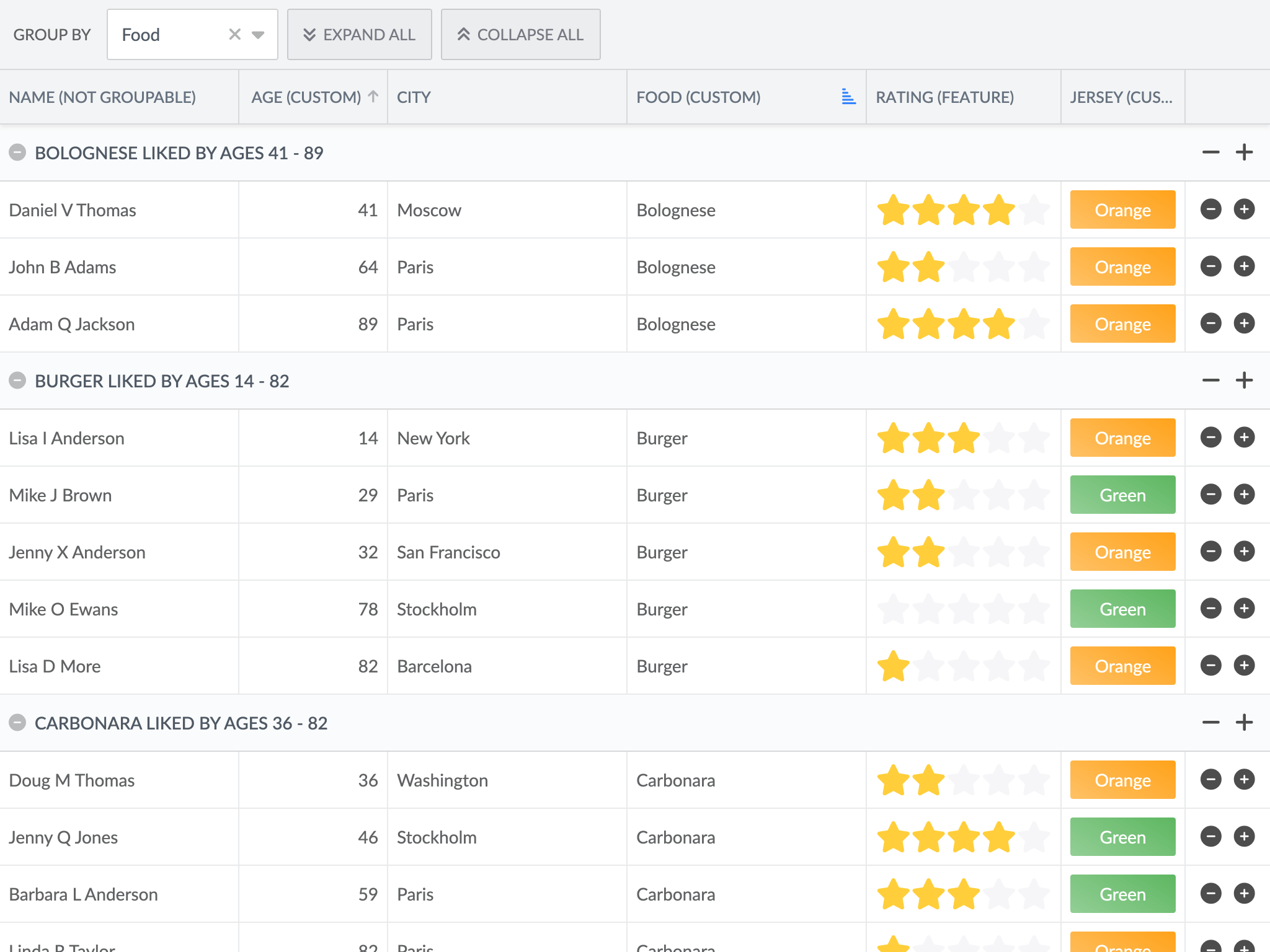
Tiers
Every Bryntum product ships in three tiers. The tier is part of the package name.
| Tier | Package | Contains |
|---|---|---|
| Community | @bryntum/grid-community | The free feature set |
| Business | @bryntum/grid-business | Community plus the licensed Business features |
| Enterprise | @bryntum/grid-enterprise | Every feature |
Which tier do I need? Your tier must hold every feature you use. Enterprise holds every feature, including the ones you add later. See Features per tier below or the feature availability guide.
Use one tier in one application. Two tiers of the same product install two copies of the Bryntum core, which breaks themes, locales and shared state.
Install
npm install @bryntum/grid-enterprise
The package declares its Bryntum dependencies, so npm installs them for you.
Use
Add an element with id="app" and a height to the page, then render the component into it:
import { Grid } from '@bryntum/grid-enterprise';

new Grid({
    appendTo : 'app',
    columns  : [
        { text : 'Name', field : 'name', flex : 1 },
        { text : 'City', field : 'city', flex : 1 }
    ],
    data : [
        { id : 1, name : 'Don A Taylor', city : 'Moscow' },
        { id : 2, name : 'John B Adams', city : 'Paris' }
    ]
});
See the JavaScript quick start for a complete setup.
The package exports its own classes only. Import a class of another product from that product's
package, add that package to your package.json at the same version, and import the package of
every product whose features you configure.
CSS
grid.css holds the rules of Bryntum Grid and of every product it is built on. Import it and one theme, taken
from the package of the highest product level you use. The Font Awesome 6 icons come from the Core package. Leave them
out if you replace the icons:
/* Font Awesome icons (optional) */
@import '@bryntum/core-enterprise/fontawesome/css/fontawesome.css';
@import '@bryntum/core-enterprise/fontawesome/css/solid.css';
/* Structural CSS */
@import '@bryntum/grid-enterprise/grid.css';
/* Theme */
@import '@bryntum/grid-enterprise/svalbard.css';
When the application combines several Bryntum products, import the thin stylesheets instead: core.thin.css and the
<name>.thin.css of each product level you use, each from its own package. Then import one theme, taken from the
package of the highest product level you use:
/* Font Awesome icons (optional) */
@import '@bryntum/core-enterprise/fontawesome/css/fontawesome.css';
@import '@bryntum/core-enterprise/fontawesome/css/solid.css';
/* Structural CSS */
@import '@bryntum/core-enterprise/core.thin.css';
@import '@bryntum/grid-enterprise/grid.thin.css';
/* Theme */
@import '@bryntum/grid-enterprise/svalbard.css';
Grid is built on Core. To combine Grid with another product, add the thin stylesheets of that product and of every
product it is built on that is not in the list yet: scheduler.thin.css for Scheduler, scheduler.thin.css and
gantt.thin.css for Gantt, scheduler.thin.css and calendar.thin.css for Calendar, taskboard.thin.css for
TaskBoard. Take the theme from the package of the highest product level, for example @bryntum/calendar-enterprise for
Grid with Calendar.
Load one theme only. Two themes in one page fight over the same variables.
Framework wrappers
| Framework | Package | Guide |
|---|---|---|
| React | @bryntum/grid-react-enterprise | React quick start |
| Angular | @bryntum/grid-angular-enterprise | Angular quick start |
| Vue | @bryntum/grid-vue-enterprise | Vue quick start |
Features per tier
A ✓ marks each tier that includes a feature. Views, widgets, columns, models and stores are not listed.
| Feature | Community | Business | Enterprise |
|---|---|---|---|
AI | — | — | ✓ |
CellCopyPaste | — | ✓ | ✓ |
CellEdit | ✓ | ✓ | ✓ |
CellMenu | ✓ | ✓ | ✓ |
CellTooltip | — | ✓ | ✓ |
Charts | — | — | ✓ |
ColumnAutoWidth | ✓ | ✓ | ✓ |
ColumnDragToolbar | — | ✓ | ✓ |
ColumnPicker | ✓ | ✓ | ✓ |
ColumnRename | — | ✓ | ✓ |
ColumnReorder | ✓ | ✓ | ✓ |
ColumnResize | ✓ | ✓ | ✓ |
FillHandle | — | — | ✓ |
Filter | — | ✓ | ✓ |
FilterBar | ✓ | ✓ | ✓ |
Group | — | ✓ | ✓ |
GroupSummary | — | — | ✓ |
HeaderMenu | ✓ | ✓ | ✓ |
LockRows | — | — | ✓ |
MergeCells | — | — | ✓ |
PdfExport | — | — | ✓ |
PinColumns | — | ✓ | ✓ |
Print | — | — | ✓ |
QuickFind | ✓ | ✓ | ✓ |
RegionResize | ✓ | ✓ | ✓ |
RowCopyPaste | — | ✓ | ✓ |
RowEdit | — | — | ✓ |
RowExpander | — | — | ✓ |
RowReorder | — | — | ✓ |
RowResize | — | — | ✓ |
Search | ✓ | ✓ | ✓ |
Sort | ✓ | ✓ | ✓ |
Split | — | — | ✓ |
StickyCells | — | ✓ | ✓ |
Stripe | ✓ | ✓ | ✓ |
Summary | — | — | ✓ |
Tree | ✓ | ✓ | ✓ |
TreeGroup | — | ✓ | ✓ |
AI coding assistants
This package ships CLAUDE.md and AGENTS.md with notes for AI coding agents. For grounded, version-correct answers,
connect the Bryntum MCP server and install the
Bryntum agent skills.
Links
License and copyright
The Enterprise tier of Bryntum Grid is commercially licensed. Bryntum Grid runs in trial mode until you register a license key. See the Bryntum Grid End User License for the full text of the license.
Copyright © 2009-2026, Bryntum. All rights reserved.