常见诊所.js
整个诊所的共同功能.
目录
用户
getLoggingPaths(toolName, toolSpecificFiles=[])
创建用于构建工具日志信息路径的函数 。 返回函数返回对象映射虚拟路径名称到实际路径名称,例如:
{
  '/systeminfo': '{pid}.clinic-{toolName}/{pid}.clinic-{toolName}-systeminfo'
}
参数 :
toolName- 名为Clinic.js工具.toolSpecificFiles- 要生成的文件名的阵列, 在默认值之上(/, (中文(简体) ),/systeminfo) (中文(简体) ). 若为toolName是“ 博士” , 默认为['/traceevent', '/processstat']。 。 。 . 若为toolName是“ bubbleprof ” , 默认为['/traceevent', '/stacktrace']。 。 。 .
checkForTranspiledCode(fileName)
用于检查文件内容以获取转录代码的函数 。 检查还包括搜索一个源地图注释.
参数 :
fileName- 正在传递的文件的路径.
脚本
buildJs(opts = {})
返回浏览器捆绑( 可读流)
使用量
const buildJs = require('@clinic/clinic-common/scripts/build-js')

const scriptFile = buildJs({
  basedir: __dirname, (String)
  debug: this.debug, (Boolean)
  fakeDataPath, (String)
  scriptPath, (String)
  beforeBundle: b => b.doSomethingWithBundle() (Function)
})
{\fn黑体\fs22\bord1\shad0\3aHBE\4aH00\fscx67\fscy66\2cHFFFFFF\3cH808080}你觉得呢 debug 选项将确保捆绑包含源图
如果 fakeDataPath 未提供,确保单独提供 dataFile 页:1 主模板。 。 。 .
buildCss(opts = {})
返回 PostCSS 组合( 保证)
使用量
const buildCss = require('@clinic/clinic-common/scripts/build-css')

const styleFile = buildCss({
  stylePath, (String)
  debug: this.debug (Boolean)
})
{\fn黑体\fs22\bord1\shad0\3aHBE\4aH00\fscx67\fscy66\2cHFFFFFF\3cH808080}你觉得呢 debug 选项将确保捆绑包含源图
模板
使用模板 stream-template 将流、承诺和字符串插入共同模板,而无需先缓冲.
mainTemplate(opts = {})
返回流图( 可读流)
使用此模板来构建带有常见的染色体,包括一个头和弹出托盘的工具输出.
这将需要结合共同的UI使用 样式 和托盘 行为。 。 。 .
使用量
const mainTemplate = require('@clinic/clinic-common/templates/main')

const outputFile = mainTemplate({
  htmlClass: '', (String)
  favicon: 'URI', (String)
  title: 'Title', (String)
  styles: styleFile, (Readable Stream)
  data: dataFile, (Readable Stream)
  script: scriptFile, (Promise)
  headerLogoUrl: 'https://github.com/somewhere', (String)
  headerLogoTitle: 'Logo title', (String)
  headerLogo: logoFile, (String)
  headerText: 'Text', (String)
  toolVersion: '1.2.3', (String)
  uploadId: 'ID', (String)
  head: 'extra <head> content', (String)
  body: 'extra <body> contents' (String)
})
💡 opts.data 可以提供将分析的JSON输出放入自己的脚本标记. 未提供分析数据时,应在 scriptFile 由用户进行.
样式
可导入 CSS 在使用时包含 mainTemplate 与《京都议定书》 buildCss 脚本可以确保它与特定工具的样式捆绑在一起. 这为信头和托盘增加了一些全局样式. CSS使用BEM来写来避免特异性,并具有以下可被推翻的CSS变量:
html {
  --nc-colour-text: white;
  --nc-colour-code: #E9F100;
  --nc-colour-notification-dot: #2165E5;
  --nc-colour-tray-backdrop: rgba(0, 0, 0, 0.6);
  --nc-colour-tray: #292d39;
  --nc-colour-header-background: #292d39;
}
使用量
@import '@clinic/clinic-common/styles/styles.css';

.your {
  tool: styles;
}
标准
CSS 应使用使用 贝姆 作为更好的封装和较低规格的命名公约.
里面,所有班级都有卖家 .nc- 以避免类别名称与第三方或工具特定样式相撞。 对于基于工具的样式,所有样式都应遵循相同的惯例,对工具前缀如下:
.ncd- Clinic.js Doctor
.ncb- Clinic.js Bubbleprof
.ncf- Clinic.js Flame
细目
/* Block: Tray component  */
.nc-tray { ...

/* Element: Tray inner component */
.nc-tray__inner { ...
图标
返回一个字典对象,其密钥是图标名称,其值是 svg 文件内容. 用于内置 svg 文件 .
使用示例 :
const icons = require('@clinic/clinic-common/icons')

console.log(icons.activity)

output:
`<svg class="icon-img activity-svg" width="24" height="24" viewBox="0 0 24 24" fill="none" xmlns="http://www.w3.org/2000/svg">
<path fill-rule="evenodd" clip-rule="evenodd" d="M10.7069 3.00248C11.1545 3.03412 11.5262 3.36 11.6161 3.79959L14.2191 16.5255L15.7076 12.796C15.8593 12.4159 16.2272 12.1667 16.6364 12.1667H21C21.5523 12.1667 22 12.6144 22 13.1667C22 13.7189 21.5523 14.1667 21 14.1667H17.314L14.8379 20.3707C14.6741 20.7811 14.2603 21.0353 13.8202 20.996C13.3801 20.9568 13.0179 20.6333 12.9294 20.2004L10.3742 7.70839L8.30541 13.5029C8.1633 13.9009 7.78629 14.1667 7.36364 14.1667H3C2.44772 14.1667 2 13.7189 2 13.1667C2 12.6144 2.44772 12.1667 3 12.1667H6.65884L9.69459 3.66375C9.84545 3.24118 10.2593 2.97084 10.7069 3.00248Z" fill="#7A7F8F"></path>
</svg>`
或者您可以单独导入所需的图标 :
const cog = require('@clinic/clinic-common/icons/cog')
...
`<span class="my_icon_wrapper">${cog}</span>`
Basic 样式可以通过在您主 ass 文件( 如果您使用) 中添加以下行来导入页面 邮政进口:
@import "@clinic/clinic-common/icons/style.css";
这将增加以下规则:
  /* SVG icons */
  svg.icon-img {
    /* Default to same size as adjacent text */
    width: 1em;
    height: 1em;
    display: block;
  }
使用图标作为 BG 图像
也可以使用图标作为背景图像.
在你身边 style.css 导入所需的图标,即:
@import "@clinic/clinic-common/icons/cog.css";
这将生成以下 css 可变 数字 :
html {
    --cog-icon: url(data:image/svg+xml;utf8,<svg width="24" height="24" viewBox="0 0 24 24" fil…2 19.0006 14.7857 18.9737 14.8485L18.0545 14.4545Z" fill="#7A7F8F"></svg>);
}
现在你可以像这样使用它:
.settings-button{
  background-image: var(--cog-icon);
  width: 24px;
  height: 24px;
...
}
图像
可以嵌入 Base64-Encoded 图像.
scripts/build-images.js 揭露两种方法:
  path(sourceDir, exportDir)
  // and
  file(filePath, exportDir)
支持的文件扩展名为:
png jpeg jpg 财务报告和审定财务报表 gif
使用实例 :
  // in your npm script
  const buildImg = require('@clinic/clinic-common/scripts/build-images')
  buildImg.file('my/amazing/image.jpg', 'visualizer/assets/images')

  // in your .js file you first import the image
  const myImage = require('visualizer/assets/images/image.js')

  // and then you use it
  `<img src=${myImage} ... />
构成部分
一套基础组件和帮助者. 所有组件样式都是 @imported 内 style.css 并且可以进口如下:
@import "@clinic/clinic-common/base/style.css";
每个组件可单独导入:
const button = require('@clinic/clinic-common/base/button.js')
或者您可以同时导入多个组件 :
const { button, checkbox, contextOverlay } = require('@clinic/clinic-common/base')
每个组件都是返回 HTML 元素的函数
按钮
  // button({label, classNames = [], leftIcon = '', rightIcon = '', disabled = false, onClick, title})
  myForm.appendChild(button({
    label: 'Submit',
    title: 'Click me!',
    classNames: ['submitBtn', 'primaryButton'],
    leftIcon: submitIcon,
    onClick: () => validateAndSubmit()
  }))
样式可以通过定义您 CSS 中的 CSS vars 来自定义
  --nc-button-bgColor
  --nc-button-color
  --nc-button-fontSize
  --nc-button-bgHover
  --nc-button-hoverOutline
链接
  // link({ label, classNames = [], leftIcon = '', rightIcon = '', href, title = '', target = '' })
  div.appendChild(link({
    label: 'Documentation',
    title: 'Click me!',
    href: '/docs',
    classNames: ['openDocs'],
    rightIcon: externalLink
  }))
样式可以通过定义您 CSS 中的 CSS vars 来自定义
  --nc-link-bgColor
  --nc-link-color
  --nc-link-fontSize
  --nc-link-bgHover
  --nc-link-hoverOutline
降级
// dropdown({ label, classNames = [], disabled = false, expandAbove = false, content })
  div.appendChild(dropdown({
    classNames: ['key-v8'],
    label: checkbox({
      leftLabel: 'V8',
      onChange: e => {
        this.setCodeAreaVisibility('all-v8', e.target.checked)
      }
    }),
    content: `<span>This is some content. ${greetings}</span>`,
    expandAbove: true
  }))
样式可以通过定义您 CSS 中的 CSS vars 来自定义
  --nc-checkbox-bgColor
  --nc-checkbox-hoverColor
  --nc-checkbox-hoverOutline
  --nc-checkbox-borderColor
  --nc-checkbox-checkedIconColor
  --nc-checkbox-indeterminateIconColor
复选框
  // checkbox({ leftLabel, rightLabel, classNames = [], checked = false, disabled = false, indeterminate = false, onChange })
  checkbox({
    classNames: ['key-core'],
    leftLabel: `<span class='after-bp-1'>Node JS</span>
      <span class='before-bp-1'>Node</span>`,
    onChange: e => this.setCodeAreaVisibility('core', e.target.checked)
  })
样式可以通过定义您 CSS 中的 CSS vars 来自定义
  --nc-dropdown-borderColor
  --nc-dropdown-color
  --nc-dropdown-bgColor
  --nc-dropdown-contentBg
  --nc-dropdown-contentBorderColor
重叠
显示给定的覆盖符 msg 位于目标Element 或目标Rect旁边
若为 目标元素 财务报告和审定财务报表 目标矩形 为: null||undefined 然后将覆盖内容集中在页面上.
  // const options = {
  //   msg,
  //   targetElement,
  //   targetRect,
  //   outerRect,
  //   offset,
  //   pointerCoords,
  //   verticalAlign = 'bottom'
  // }

    overlay.show({
      msg: this.wrapper,
      classNames: ['wt-container'],
      offset: { y: 10, height: 20 },
      targetElement: document.querySelector('.my-cool-element'),
      showArrow: true
    })
走过去
用于显示UI特性分步向导的类.
const wt = new Walkthrough({ steps = [], showBackdrop = false, showControls = true, onProgress })
WT 揭露下列方法:
  `start`
  `next`
  `end`
  `skipTo`
steps 是一个对象阵列,每个步骤都有以下属性:
attachTo: 用于识别所描述元素的 css 选择器msg: 要显示的消息的 HTML 元素或字符串模板
onProgress(index) 当行走组件状态发生变化时,会被触发.
// steps definition example
const steps = [
  {
    attachTo: '#selection-controls',
    msg: `
    <div>
      <div class="step-1">
        ${flame}
        Hello, and welcome to Flame!
      </div>
    </div>
    `
  },
  {
    attachTo: '.frame-dropdown',
    msg: `
    <div>
      <p>Do you like Flame?</p>
      <img style="width:400px; height: 225px; display:block;" src="https://images.pexels.com/photos/750225/pexels-photo-750225.jpeg?auto=compress&cs=tinysrgb&dpr=1&w=500" />
      ${docs}
    </div>`
  }
]
行走按钮
用于激活行道的工具的标准化按钮
  // walkthroughButton(steps, onProgress, [label])
  const hdtw = walkthroughButton(wtSteps, index => {
    this.pushHistory()
  })

  // hdtw.WtPlayer -> the embeded walkthrough player
  // hdtw.button -> the button instance to append to the DOM

  // label defaults to 'How does this work'
帮助者
一套有用的函数. 目前载有:
toHtml(data)数据可以是字符串,函数或HTMLElement. 输出为 HTML 元素
  const myHtml = helpers.toHtml(`<span>${greetings}</span>`)
  // or
  const myHtml = helpers.toHtml(getGreetings)
旋转器
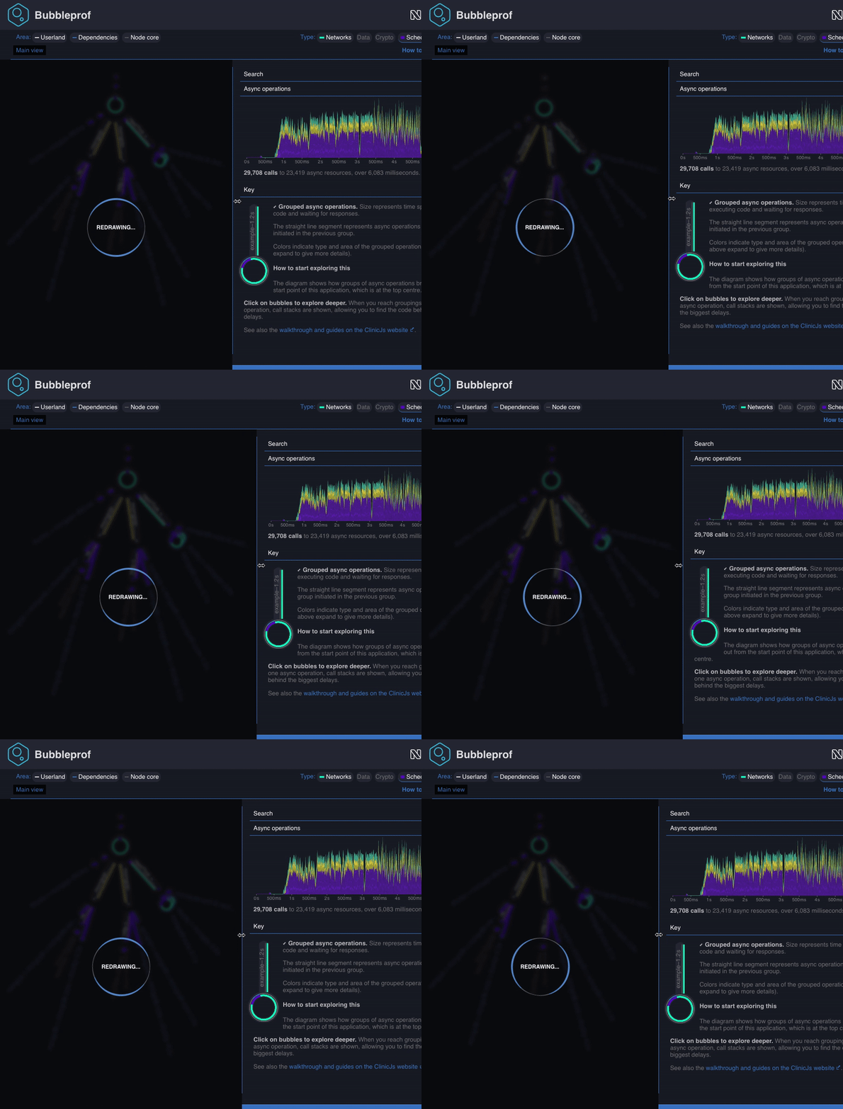
添加 loading spinner 请导入您的应用程序 @clinic/clinic-common/spinner 在你身边 main.js 和样式.cs文件到您的 style.css
示例 主要为.js
require('@clinic/clinic-common/spinner')
样式.css
@import "@clinic/clinic-common/spinner/style.css";
这将在加载页面时显示加载旋转器 . 如果您需要稍后显示自旋器, 也许当应用程序忙于进行一些计算时, 您可以在程序上将自旋器打开和关闭, 如下例所示 :
const spinner = require('@clinic/clinic-common/spinner')

...
const redrawSpinner = spinner.attachTo(document.querySelector('#myHtmlContainerNode'))
redrawSpinner.show('Melting the North pole down...')

// when finished
redrawSpinner.hide()
旋转边框默认为白色, 您可以设置 cs s var 来自定义 --spinner-border-color 在您的阴道中:
html {
/* this will set the colour for the page-loading spinner*/
  --spinner-border-color: --my-fancy-primary-color;
}

#myHtmlContainerNode {
  /* this will set the colour for the in-page spinner*/
  /* this is optional and inherits from `html` if not defined*/
  --spinner-border-color: --my-fancy-secondary-color;
}
将自旋器附加到一个元素中,将产生一个新的实例: spinner 可以在开关/关闭后使用。 当显示自旋器时,自旋器所附带的元素会变得模糊并被一个暗箱所覆盖.