

⚛️ ➕ Primer Addons
Additional components for Primer React.
This repository contains additional React.js components for the @primer/react toolkit. The components are compliant with the Primer theming framework and aims to respect the Primer design system.
See them live:
- Gallery — every component on its page, in every theme and colour mode: https://primer-addons.datalayer.tech (
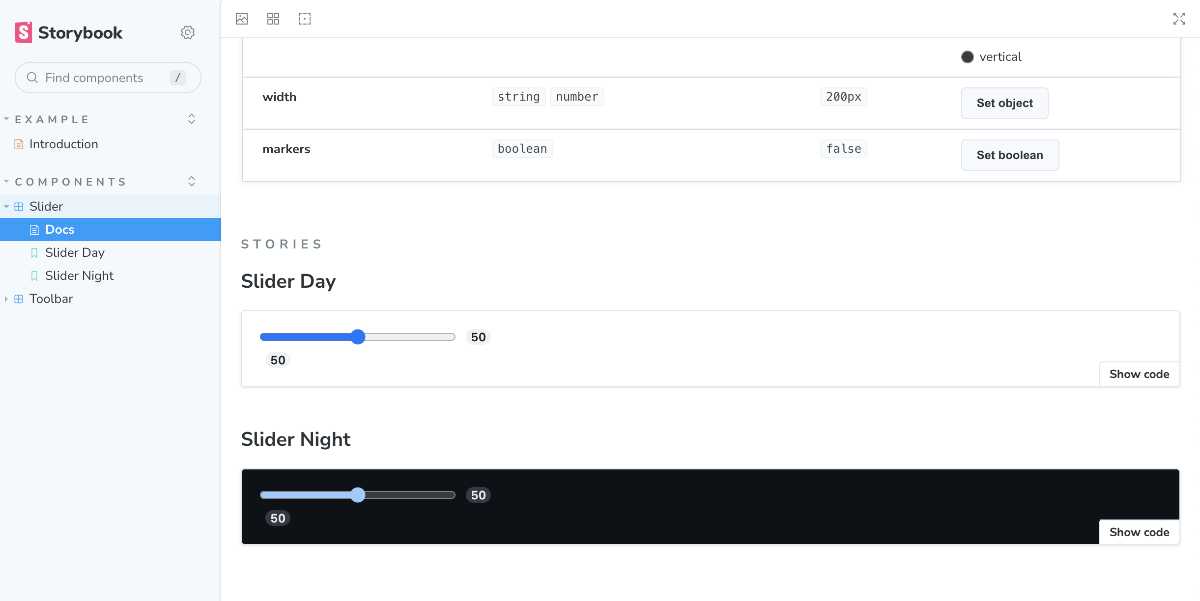
make deploy-gallerypublishes it). - Storybook — each component's options, story by story: https://primer-addons.datalayer.tech/storybook/ (
make deploy-storybook).
This project has been shared in a discussion on the Primer React main repository.
Current Addons
- Appearance controls, menus, theme previews and collaborator palettes
- Box
- Calendar Picker
- Card
- Circle Icon
- Closeable Flash
- Color Swatch and Color Picker
- Content Loader
- Date Picker
- Entity Avatar
- Hover Card
- Datalayer logos and text marks
- Sheet
- Side Overlay
- Slider
- Sliding Panel
- Toolbar and Floating Toolbar
The components use the active theme's semantic tokens rather than fixed
visual values. For example, toolbar icon buttons and dropdown triggers read
--theme-radius-control: they retain the regular Primer corner in the default
themes and become fully rounded controls in loop.
Reactor Plugins
Three plugins for hosts built on @datalayer/reactor, imported by path so a page without a reactor never pulls it in:
import { AppearancePlugin, PageLayoutPlugin, ThemePlugin } from '@datalayer/primer-addons/lib/reactor';
ThemePluginkeeps Primer's portals in the application's color mode and toggles that mode by command (Mod+Alt+C).AppearancePluginputs the appearance menu — color mode, theme, the theme's description and a preview of it, the control the Datalayer header wears — in a slot,headerby default, and bringsThemePluginalong as a dependency.PageLayoutPluginarranges a host's slots as a page: what plugins put inpagelies on a centred sheet over a quiet canvas,page-bandis docked above it at the sheet's width (or floats over it as a card),page-chipssit under the band, andpage-panelis a side panel opened from a toggle in the header. The layout (PageLayout), its toggle and its signals (pageLayoutPanelOpen,openPagePanel()…) are exported too, for a host that wires the parts itself — the Loop of@datalayer/agent-runtimesdoes, with the notebook as the page and the conversation as the panel.
The gallery example is a Reactor app built on the three: npm run gallery locally, live at https://primer-addons.datalayer.tech.
Box
Box is this package's own, not Primer's deprecated one: the same prop names — space (p, mx, gap…), colour (color, bg), border (border, borderColor, borderRadius, borderTop…), layout, flex and grid, position, type, boxShadow, opacity, cursor, transition, transform, listStyle, and as — without styled-components.
import { Box } from '@datalayer/primer-addons';

<Box as="section" display="flex" flexDirection="column" gap={2} p={3}
  bg="canvas.default" border="1px solid" borderColor="border.default" borderRadius="large"
  gridTemplateColumns={['1fr', null, 'repeat(3, 1fr)']}
  hover={{ bg: 'canvas.subtle' }} focusVisible={{ outline: '2px solid' }}>
  …
</Box>
- Tokens are Primer's CSS variables, with no fallback. A colour path is the variable Primer's own theme reads first for it (
bg="canvas.subtle"isvar(--bgColor-muted),borderColor="border.default"isvar(--borderColor-default),boxShadow="shadow.medium"isvar(--shadow-resting-medium)); a radius by name is Primer's (small,medium,large,full) or the theme's shape (control,card,bubble,frame); a weight by name is the theme's weight variable. Space, font sizes, radii by index and sizes are Primer's theme scales in pixels (p={3}is 16px). The theme provider sets every variableBoxemits, in every theme — a test holds it — so a theme that wants another hairline or corner sets it on Primer's variable (thelooptheme's hairline is its--borderColor-default, its card corner its--borderRadius-large), never a call site withvar(--loop-…, var(--…)). - Responsive values are one per breakpoint, Primer's (544, 768, 1012, 1280px),
nullto skip one. - States take a style of their own:
hover,focus,focusVisible,focusWithin,active, andreducedMotion. - One class per style. The props are resolved and hashed into one class whose rules are inserted once into a stylesheet of the document, or of the shadow root the element is in. No styled-components: this package's own copy once shipped beside Primer's and, wherever a bundler did not dedupe them,
Boxrendered with no theme. sxstill works, typed, while the call sites move to props: its keys are read as the props are (the same tokens) and its nested blocks —'&:hover','& svg','@media (…)','@keyframes …'— become rules of the same class, after the props'. No styled-components there either: Primer'sBoxon styled-components 6 passedsxon to the DOM. What a codemod cannot move to props (nested selectors, keyframes) stays insx.
The sources: src/components/box/Box.tsx (the design), boxCss.ts (the props and their scales, the stylesheet), boxTokens.ts (the tokens, generated from Primer's theme), src/theme/css/primerBaseVars.ts (Primer's variables no theme sets).
Theme accents
Six soft accents, and an application takes one — over any theme: datalayer, spatial, lovely, matrix, earth, sand, ivory, sun and loop alike (decided 2026-10-07; they coloured loop alone before). The gallery's Theme Accents page shows the six in whatever theme and colour mode the gallery wears, beside the theme's own, with its tokens read back. Each is five values — the accent, the text that sits on it, the stage (the tint behind a hosted application), a quiet tint (the agent's bubble, a draft) and the accent as text (a link, a suggested question) — the last three each with a light and a dark value.
| Name | Accent | Text on it | Stage (light / dark) | Quiet (light / dark) | As text (light / dark) |
|---|---|---|---|---|---|
green (mint, the default) | #7ADBB8 | #06281E | #DDF5EC / #10261F | #F0FAF6 / #17211D | #248462 / #8FE5C6 |
rose | #F6A5C1 | #3A0A1C | #FCE3EC / #2B141C | #FDF2F6 / #22181C | #B83A6B / #F6A5C1 |
sky | #8CCBF9 | #06243B | #DFF0FD / #0F2333 | #F0F8FE / #161E25 | #1F6FB0 / #8CCBF9 |
lime | #BEDC55 | #1F2A00 | #EEF6CC / #1E2609 | #F7FBE6 / #1C2014 | #5F7A00 / #BEDC55 |
sun | #F8D469 | #2E2200 | #FDF3CD / #2A2209 | #FEF9E7 / #221F14 | #8A6A00 / #F8D469 |
violet | #C0AEF6 | #1C0F47 | #ECE7FD / #1B1533 | #F6F3FE / #1C1A27 | #6B53C9 / #C0AEF6 |
themeAccents holds them, themeAccentNames lists them in the order a picker shows them (type ThemeAccentName), and themeAccentVars(name, mode) turns one into everything it colours, as custom properties an application sets on its root:
- the accent's own, which every theme sets (its default from its own colours — its accent fill, the text of its filled button, its subtle accent tint as the stage, its subtle canvas as the quiet tint;
loop's are mint's):--theme-accent,--theme-accent-on,--theme-stage,--theme-quiet, and--theme-stage-gradient, the stage lit from the stage tint at the top to the quiet tint at the bottom; - Primer's accent:
--bgColor-accent-emphasis,--borderColor-accent-emphasis,--fgColor-accent,--fgColor-link,--borderColor-accent-muted,--bgColor-accent-muted, and--datalayer-icon-fg; - the filled button:
--button-primary-bgColor-rest,-hover,-active, their borders,--button-primary-fgColor-rest,--button-primary-iconColor-rest,--buttonCounter-primary-fgColor-rest, and the legacy--color-btn-primary-bg,--color-btn-primary-hover-bg; - a checked switch:
--control-checked-bgColor-rest,-hover,-active,--control-checked-fgColor-rest,--controlKnob-borderColor-checked; - the selected tab's underline,
--underlineNav-borderColor-active.
So nothing on an application's page keeps the theme's default accent beside its own. The theme's focus ring (--focus-outlineColor) is kept: it is drawn to show around every accent. An unknown name is refused.
An application names its accent in its Appspec, as interface.accent (one of the six names), and its host applies it, whatever theme the application wears. An application that names none is not recoloured: it wears its theme's own colours — mint in loop (decided 2026-10-07).
import { getThemeConfig, themeAccentVars } from '@datalayer/primer-addons';

const config = getThemeConfig(app.interface.theme.variant);
<DatalayerThemeProvider theme={config.primerTheme} themeStyles={config.themeStyles}
  baseStyles={app.interface.accent ? themeAccentVars(app.interface.accent, mode) : undefined}>
The source: src/theme/colors/themeAccents.ts.
The color palette
useColorPalette() returns one ColorPalette object, resolved for the current theme and color mode (a new one when either changes); getColorPalette(theme, mode) gives the same without a hook. It holds two categories of colors, and isLight, whether the mode is light. The gallery's Color Palette page shows both in whatever theme and mode the gallery wears.
- Roles, what each theme's own design uses, by role (
paletteRoleNames, typePaletteRoleName):bg,bgPanel,bgAlt,primary,secondary,accent,glow,pop,spark,blaze,surge,flame,gold,textLight,textMuted. What a role is changes with the theme (surgeis blue in one theme and sage in another). Use them for a page's own design. - Hues, named colors a spec or a person picks, the same names in every theme (
hueNames, typeHueName):red,orange,amber,yellow,lime,green,emerald,teal,cyan,sky,blue,indigo,violet,purple,fuchsia,pink,rose,slate,gray,stone. A hue keeps its hue in every theme: deep on a light background, bright on a dark one. Use them for a color a spec or a person picks, such as an agent's color.
paletteColorNames lists both, roles first (type PaletteColorName).
Roles, for a page's own design:
import { useColorPalette } from '@datalayer/primer-addons';

const palette = useColorPalette();
<Box style={{ background: palette.bgPanel, color: palette.textLight }}>
  <Text style={{ color: palette.primary }}>Title</Text>
</Box>
Hues, for a color that is picked: a spec gives a palette name (an agent's color: indigo), or a hex where no name fits. usePaletteColor() returns a function that resolves it in the current theme and mode; resolvePaletteColor(value, palette) does the same with a palette in hand. A palette name gives its value, a hex is returned as is, and nothing or anything else is undefined, so the caller draws its own default. isPaletteColorName and isHexColor (#RGB or #RRGGBB) check a value first.
import { isHexColor, isPaletteColorName, resolvePaletteColor, usePaletteColor } from '@datalayer/primer-addons';

const colorOf = usePaletteColor();
const agentColor = colorOf(agent.color) ?? 'var(--fgColor-accent)';
// 'indigo' -> the theme's indigo, '#0969da' -> '#0969da', 'nope' -> undefined

resolvePaletteColor('teal', palette);
isPaletteColorName('rose'); // true
isHexColor('#abc');         // true
The source: src/theme/palettes/ColorPalette.tsx and src/theme/colors/hueColors.ts.
The loop theme
loop is one of the variants of the theme registry (ThemeVariant, themeConfigs), beside datalayer, spatial, lovely, matrix, earth, sand, ivory and sun: the look of an application built in LOOP — one accent, neutral everything else. A white (near-black in dark mode) canvas, a deep-grey ink, hairlines, soft shadows, round corners and one filled button in the accent. Success, attention and danger are kept for verdicts and rules only. The gallery shows it on the Theme Accents page when the gallery wears it. Its accent is mint, green of the theme accents.
import { DatalayerThemeProvider, loopTheme, loopThemeStyles } from '@datalayer/primer-addons';

<DatalayerThemeProvider theme={loopTheme} themeStyles={loopThemeStyles} colorMode="auto">
  {app}
</DatalayerThemeProvider>
The sources: src/theme/colors/loopColors.ts (colours), src/theme/themes/loopTheme.ts (the theme), src/theme/css/createThemeCSSVars.ts (what every theme sets), src/theme/DatalayerThemeProvider.tsx and src/utils/Portals.tsx (how a theme's stylesheet is applied).
Shape, shadow, type and motion
Every theme sets these, so that a component reads its shape — and how a link reads in a message — the way it reads its colour (shapeVars, DEFAULT_THEME_SHAPE). The eight other themes take the defaults — today's corners and no motion at all — and keep every other value they had, which themeShape.test.ts holds by a snapshot of each.
| Token | Default (every other theme) | loop |
|---|---|---|
--theme-radius-control | var(--borderRadius-medium, 6px) | 999px |
--theme-radius-card | var(--borderRadius-medium, 6px) | 20px |
--theme-radius-bubble | var(--borderRadius-large, 12px) | 22px |
--theme-radius-frame | var(--borderRadius-large, 12px) | 28px |
--theme-hairline | var(--borderWidth-thin, 1px) | the same |
--theme-shadow | var(--shadow-resting-small, none) | the frame's shadow, per mode |
--theme-motion-status | 0ms | 120ms |
--theme-motion-message | 0ms | 200ms |
--theme-motion-pane | 0ms | 320ms |
--theme-motion-easing | ease | cubic-bezier(0.2, 0, 0, 1) |
--theme-message-link | var(--fgColor-accent, #0969da) | currentColor: a link in a message is plain, the colour of its words, and underlined |
The loop theme's own, beside them (loopShapeVars, loopShadows, loopMotionVars, loopTypeVars):
- Radii:
--loop-radius-control(999px),--loop-radius-card(20px),--loop-radius-bubble(22px),--loop-radius-frame(28px); Primer's own--borderRadius-small,-medium,-largeare made rounder (10, 14, 20px). - The face of an application, at three sizes and no other:
--loop-face-large(72px, a page),--loop-face-medium(40px, a header or a card),--loop-face-small(20px, a line of a list). - Shadow: one level,
--loop-shadow-frame. In light mode a surface floats on a soft, low shadow; in dark mode, where a shadow shows little, on a hairline of light and a deeper shadow. Primer's--shadow-resting-*and--shadow-floating-*take the same hand, so a menu or a dialog floats as a frame does.--loop-hairlineis the line between two surfaces (7% of the ink in light, 10% of white in dark). - Motion: three durations for three things —
--loop-motion-status(a status changing),--loop-motion-message(a message arriving),--loop-motion-pane(a pane opening) — and one easing,--loop-motion-easing. Nothing else moves; a component honoursprefers-reduced-motionitself. - Type: one face, Inter — open licence (SIL OFL 1.1) and variable — then a metric-matched fallback, then the system sans-serif (
loopFontFamily:"Inter Variable", "Inter Fallback", ui-sans-serif, system-ui, …). Two weights, 400 and 600 (loopFontWeights; Primer's light weight is 400 and its medium 600), and five sizes, one line-height for each (loopTypeScale, every line a multiple of 4px): 2rem/1.25 (display, title large), 1.25rem/1.4 (title medium, subtitle), 1rem/1.5 (title small, body large), 0.875rem/1.4286 (body medium, the theme's body), 0.75rem/1.3333 (body small, caption) — set on Primer's shorthands and on its size and line-height tokens alike, and held byloopType.test.ts. The titles are set tighter and the tracking is a token a component applies:--loop-tracking-display(-0.02em),--loop-tracking-title(-0.012em),--loop-tracking-body(0). - The face, from the page's own origin: a page wearing the theme imports
@datalayer/primer-addons/style/loop-face.cssonce. It declaresInter Variablefrom@fontsource-variable/inter— the upright variable file, latin and latin-ext only,font-display: swap— which the page's bundler emits as its own asset, so the face is fetched from the page's origin and never from a third party; andInter Fallback, a local Arial (or Liberation Sans or Arimo, metric-compatible with it) drawn to Inter's measure —size-adjust: 107.4%,ascent-override: 90.2%,descent-override: 22.48%,line-gap-override: 0%, next/font's values for Inter, computed by Capsize — so the text paints in the fallback first and does not move when Inter arrives. A page that does not import it shows the system face. - Space: no scale of its own — Primer's, in steps of 4 and 8 (
sx1 to 6 are 4, 8, 16, 24, 32, 40px), and the air of the look comes from where it is spent: a frame 24px from the edge of its stage, 16px inside a conversation (the header, the messages, the composer), 24px around a pane of work, 8px between two pills, and one hairline (--theme-hairline) where two surfaces meet instead of a gap and a border. - The stage, lit:
--theme-stage-gradient, from the stage tint at the top to the quiet tint at the bottom, both the accent's — mint's inloop(every theme sets it, see Theme accents). - The focus ring:
--focus-outlineColor, the deep mint#0F6B4Fin light mode and a mid grey#636363in dark mode.
The reference screens
The tokens above are drawn together on four reference screens (LOOP T-01) — a conversation, a conversation beside its work, the activity of a worker and an approval — each in the nine themes of the registry and in both modes. They are built from the real chat components of @datalayer/agent-runtimes, which depends on this package, so they live there: as stories (src/stories/loop/LoopReference.stories.tsx, Loop/Reference screens) and as pictures that a test compares in Chrome (npm run test:pictures in agent-runtimes, T-16; TESTING.md there says how to run it and how to accept a change). A change of token here shows there as a picture that differs: accept it, or fix it.
The controls, as pills
Every Primer control takes its corners from one token, --borderRadius-medium, which cards and list items take too — so "the controls alone are pills" cannot be said with a custom property. A theme may therefore carry a stylesheet of its own, ThemeStyles.css, written relative to :scope (buildThemeStyles(light, dark, { css })). loop is the only theme that has one (loopControlsCss): buttons, text inputs, selects, segmented controls, button groups (their two ends), toggle switches and underline tabs are pills; a multi-line text area keeps --borderRadius-medium, and menus and overlays keep the card's radius. The selectors match the stable prefixes of Primer's class names (loopControlsSelectors), and a test reads each back from the installed @primer/react, so an upgrade that renames one fails the build.
How DatalayerThemeProvider applies it:
- It stamps its own element with a unique
data-datalayer-theme-scopeand injects one<style data-datalayer-theme-stylesheet>into the document's head, wrapping the theme's stylesheet in@scope (<its element>) to (<any other provider's element>)— so the rules stop at a provider nested inside, and a widget in its own theme keeps its shapes (scopeThemeCss,injectThemeStylesheet). - The outermost provider owns Primer's portal root (
__primerPortalRoot__, where menus, overlays and dialogs are drawn) and scopes the stylesheet to it too; a nested provider leaves the portal root alone. - The stylesheet is removed when the theme changes and when the provider unmounts; it is injected in a layout effect, so the first paint is already in the theme's shapes. A theme without one gets nothing injected.
themeStylesheet.test.tsx tests each of these.
The rules of clean
The look is kept by eight rules, written here once and applied to every screen in review (LOOP T-17, Q-09) — a screen that breaks one is changed, or the rule is, never let through as an exception:
- One accent per application. Its own (
interface.accent), on everything the accent colours (themeAccentVars); never a second hue beside it. Success, attention and danger are a verdict's colours, and only a verdict's. - No gradient on a surface. A frame, a card, a bubble, a pill, a button and a menu are flat. The one gradient is the stage behind the frame, lit by the accent's own two tints (
--theme-stage-gradient), and a stage may as well be flat (--theme-stage). - No border where space separates. Air first; where two surfaces meet, one hairline (
--theme-hairline,--loop-hairline), never a gap and a border both, never a box drawn round a group that space already groups. - No shadow beyond the one level.
--loop-shadow-frame(--theme-shadow): a frame, a menu and a dialog float on it; nothing else has a shadow of its own. - Two weights. 400 and 600 (
loopFontWeights), in the five sizes ofloopTypeScale— by name insxtoo, whereloopTheme.fontWeightsmakes Primer'slightandnormalthe 400,semiboldandboldthe 600. - One filled button per screen. The action that matters is the filled pill in the accent; every other is quiet — outlined, or invisible until hovered.
- A control is a line icon. Octicons, at one weight, in the ink: no colour on a control, no emoji on a button.
- An identity is an emoji. An application, an agent and a character are shown by their face (the emoji or the drawing of T-19), never by a line icon.
Motion obeys the same spirit: three things move — a message arriving, a status changing, a pane opening — at --theme-motion-message, -status and -pane, and nothing else does.
What a test can hold, a test holds: no gradient but the stage's, the one shadow a component asks the theme for, two weights (the tokens and sx's names) and a link plain in a message (loopClean.test.ts); the sizes (loopType.test.ts); the three durations (loopContrast.test.ts); the pills (themeStylesheet.test.tsx); in the products that wear the theme, the screens' colours are scanned against these rules too (the landing's studioVerdictColors.spec.ts). The rest — space against borders, one filled button — is the reviewer's, against the reference screens (T-16).
Contrast, as tested
src/theme/__tests__/loopContrast.test.ts fails the build when, for any of the six accents, in either mode:
- the text on a bubble and on a filled pill (the accent's
onon the accent) is under 4.5 to 1 (WCAG AA for body text); - the ink on the stage or on the quiet tint, light and dark, is under 4.5 to 1;
- the focus ring is under 3 to 1 against the page or around a pill of any accent — but on the subtle dark surface, the one place the dark ring falls short, where it holds 2.7 to 1;
- the filled button — rest, hovered, pressed — or the accent's text on white is under 4.5 to 1, or the accent's fill and the filled button stop being one colour;
- the secondary text is under 4.5 to 1 on white or on near-black;
- the accent as text is under 4.5 to 1 on white, on near-black or on its dark quiet tint — and, but for mint, whose text the theme had first, on its light quiet tint.
The same test holds the motion to three durations and one easing.
What a host may override
Today a host overrides through the provider: baseStyles is merged on top of the theme's properties, so it may set an accent (themeAccentVars), or any --loop-* or --theme-* property, for the element and — for the outermost provider — the portal root; and it may pass a theme of its own to themeStyles, built with buildThemeStyles. A person's choice in an appearance menu (useThemeStore) is the host's to honour.
Not built yet (LOOP T-13): the theme travelling inside an embedded application's web component as CSS variables isolated from the host page's styles, with the accent, the face and the mode as the only things the host overrides. Until then an embedded application is themed as any React tree under DatalayerThemeProvider is, and the host page's own CSS is not kept out.
Develop
Install the dependencies.
npm i
Start the storybook.
npm run storybook
Start the playground.
npm dev
About Primer Design
- Design system https://primer.style
About Primer Icons
About Primer React
- GitHub repository https://github.com/primer/react
- Documentation https://primer.style/react
- Storybook https://primer.style/react/storybook
About Primer Brand
- GitHub repository https://github.com/primer/brand
- Documentation https://primer.style/brand
- Storybook https://primer.style/brand/storybook
Releases
Primer Addons is released in Npm.js.
What each version brought, with the LOOP boxes it carries, is in the changelog.