@docs.plus/extension-hyperlink



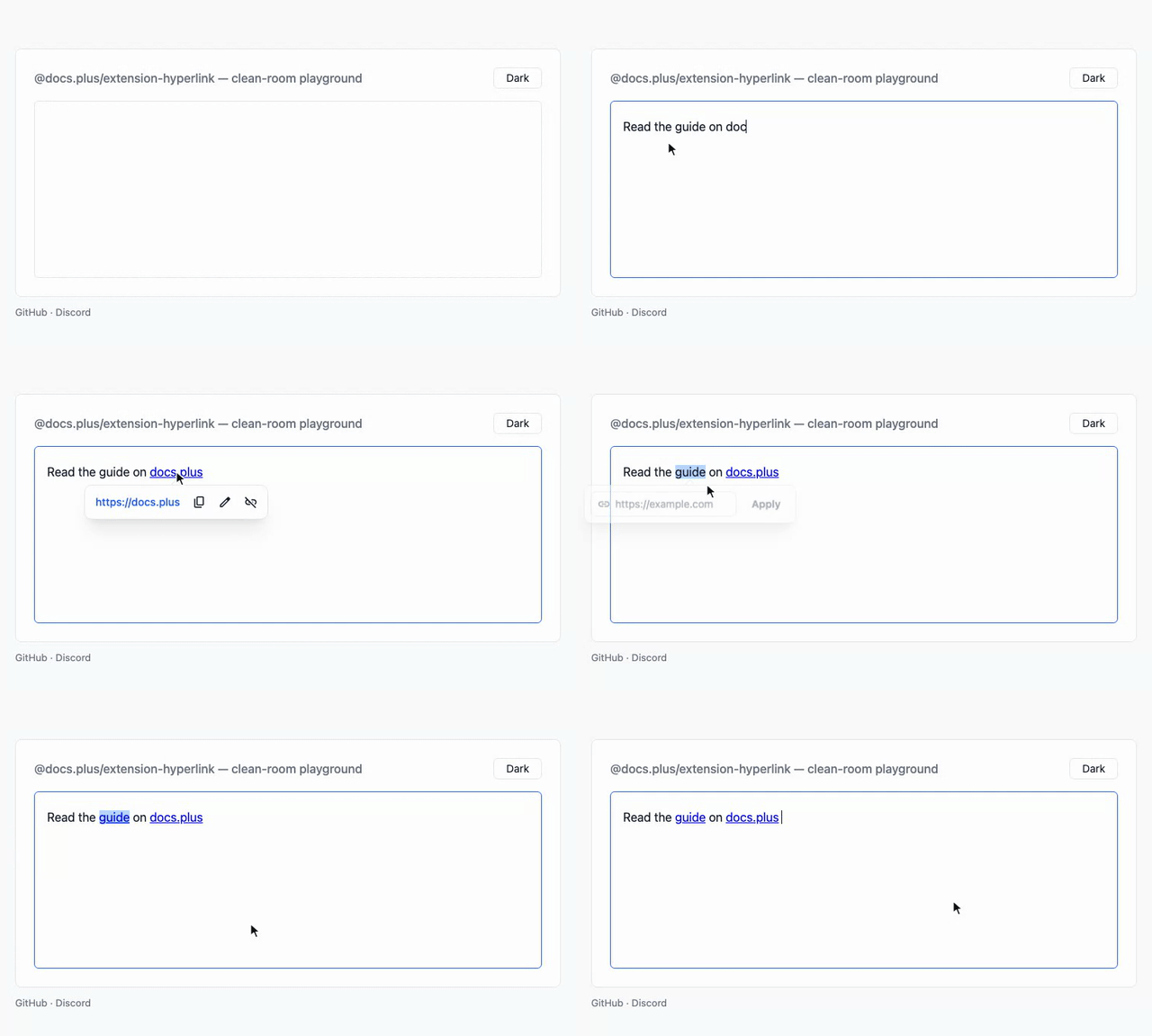
Tiptap hyperlink mark with optional prebuilt popovers for creating, previewing, and editing links.
It replaces the @tiptap/extension-link mark that StarterKit v3 bundles.

Why use it
- Autolink covers more than web URLs. As you type, bare domains get
https://, emails becomemailto:, and E.164 phones becometel:. App schemes from a catalog of 47, such aswhatsapp://, autolink too. - The link UI is included. Prebuilt create, preview, and edit popovers ship with the package.
Mod-kopens the create-link form with no configuration. Inside a link,Mod-kopens that link's preview whenpopovers.previewHyperlinkis set, andAlt-Enteropens the link. Mod-click opens a link in a new tab. Every open uses a new tab until you set thenavigateoption.@tiptap/extension-linkbinds no keyboard shortcut. - Every boundary checks the scheme.
isSafeHrefblocksjavascript:,data:,vbscript:,file:, andblob:on parse, import, write, serialize, and navigation. An embedded tab or newline cannot hide a scheme from the gate. - Your
@tiptap/extension-linkconfiguration ports over.isAllowedUritakes the same(uri, ctx)shape as@tiptap/extension-link, so an existing policy works unchanged.setLink,unsetLink, andtoggleLinkstay as aliases.[label](url)round-trips with@tiptap/markdown.
Install
npm install @docs.plus/extension-hyperlink
Or use pnpm add @docs.plus/extension-hyperlink, yarn add @docs.plus/extension-hyperlink, or bun add @docs.plus/extension-hyperlink.
Requires @tiptap/core ^3.32.2 and @tiptap/pm ^3.32.2. A Tiptap 3 release before 3.32.2 is not supported.
This package imports no React, Vue, or Next.js code. Use it from a plain page, Vite, React, Vue, Svelte, Next.js, Nuxt, or SvelteKit. Create the editor in the browser.
React Native has no DOM. Load the editor in a web view.
Installs two runtime dependencies, @floating-ui/dom and linkifyjs. The popover engine and the tooltip ship inside dist, so they add no third package.
Upgrading from 2.2? No export or option was removed, and stored JSON and Yjs documents load as before. Some behaviour changed, such as Mod-click, Mod-k inside a link and two HTML parse rules. See Migrating from 2.2 to 2.3.
Upgrading from 1.x? Option names, command names, and CSS class names all changed — see Migrating from 1.x.
Quickstart
Run this Quickstart in your browser first, with nothing to install. The app lives in examples/vanilla.
The host page needs one mount point: <div id="editor"></div>. The snippet also imports @tiptap/starter-kit. Add it with npm install @tiptap/starter-kit when your app has none yet.
import { Editor } from '@tiptap/core'
import StarterKit from '@tiptap/starter-kit'
import {
  Hyperlink,
  createHyperlinkPopover,
  editHyperlinkPopover,
  previewHyperlinkPopover
} from '@docs.plus/extension-hyperlink'
import '@docs.plus/extension-hyperlink/styles.css'

const editor = new Editor({
  element: document.querySelector('#editor'),
  content: '<p>Try <a href="https://example.com">this link</a>.</p>',
  extensions: [
    // Disable StarterKit's bundled link mark — see Caveats.
    StarterKit.configure({ link: false }),
    Hyperlink.configure({
      popovers: {
        previewHyperlink: previewHyperlinkPopover,
        editHyperlink: editHyperlinkPopover,
        createHyperlink: createHyperlinkPopover
      }
    })
  ]
})
The styles.css import is optional. Without it, the prebuilt popovers render unstyled, and every popover shows with no fade, the hovercard included. The snippet also styles no document link — see Popovers and Style document links.
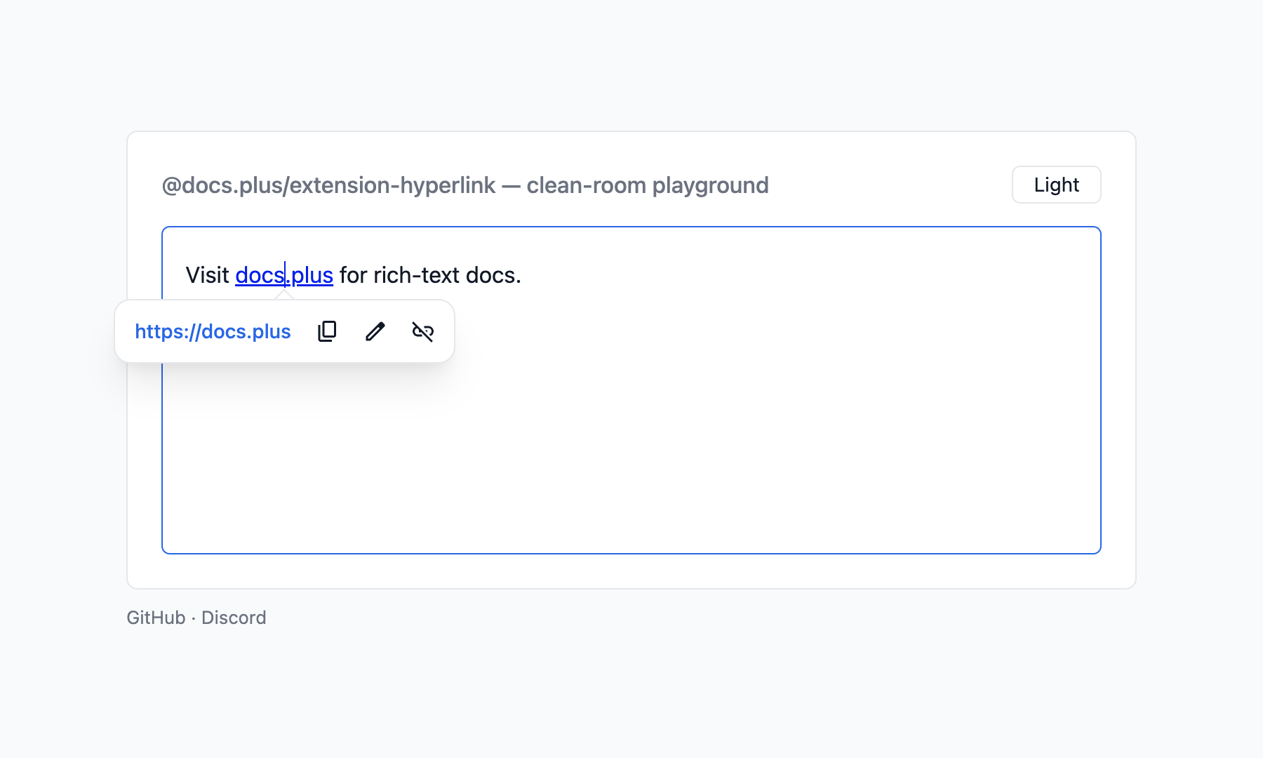
You should see a paragraph with one link. Click the link to open the preview popover, with copy, edit, and remove actions. Type example.org and a space, and the text becomes a link. Select a word and press Mod-k (Cmd on macOS, Ctrl elsewhere) to open the create-link form.
To show a card when the pointer rests on a link, add the hovercard option. See Show a card on hover.
Caveats
StarterKit.configure({ link: false })is required, not stylistic. StarterKit v3 bundles@tiptap/extension-linkby default. The two marks collide on thesetLink/unsetLink/toggleLinkcommand names. Yourextensionsarray order then decides which mark each command writes, with no warning. If you keep Link only to load storedlinkmarks, parsed and pasted HTML still giveshyperlink. This package'sa[href]rule runs at priority 51, above Link's default 50.- A click on a link, and
Mod-kinside a link, needpopovers.previewHyperlink. The three openers,openPreviewHyperlink,openEditHyperlinkandopenCreateHyperlink, fall back to the prebuilt factory when a slot isnull. The click handler andMod-kdo not. LeavepreviewHyperlinkatnull, and a click on a link opens no popover.Mod-kinside a link then does nothing, and it never opens the create form there. linkOnPaste: falsedoes not stop every paste from linking. The linkify paste rule stays registered, so a pasted bare URL still becomes a link. To stop that path too, setshouldAutoLink: () => false, which every autolink path consults.HTMLAttributes.targetreaches the DOM.HTMLAttributes: { target: '_blank' }does emit<a target="_blank">. A browser-driventarget="_blank"navigation skips the click gate. Leavetargetatnulland let the click handler open the link.- Markdown keeps only the link
href. Export writes[text](href), and import reads the href alone, so a linktitleis lost both ways. A customrelis lost too, and import sets the defaultrel.target,classandimagenever reach Markdown, by design. - A link icon needs CSS for
.hyperlink-icon. Withoutstyles.cssor your own rule, the icon shows at its natural size.styles.csssizes it only inside.ProseMirror, so an icon fromlinkIconForoutside an editor needs your own rule. Without such a rule, a Tailwind host also breaks the line, because preflight setsimgandsvgtodisplay: block. Thestyles.cssrule wins over preflight inside.ProseMirror. linkIconmust return a fresh element with no text.nullgives a plain link with no error. Any other result, or a throw, gives a plain link and one console error for thatlinkIconfunction.- A host mark above
priority: 1000splits one link into two icons. That mark renders outside the link. When it covers part of a link, the<a>splits in two, and each part gets an icon. Hyperlink.extend({ addMarkView })replaces the icon mark view. To keep the icon, callthis.parent?.()and wrap its result.- Legacy
linkmarks get no icon. Only thehyperlinkmark renders through the icon mark view. - Parsed HTML drops every
.hyperlink-iconelement. The rule runs even withlinkIconunset, so content inside an element with that class is lost on load and paste. - A
{ light, dark }pair has limits. It needsstyles.cssor your own.hyperlink-iconsize, or the span has zero width. A bad URL shows a blank 1em box. Browsers before Chrome 150, Firefox 150 and Safari 27 show the light image. - A transient image failure hides that icon until reload. This holds for an
<img>icon fromlinkIconFetcheror from an image URL entry inlinkIconMap. Each helper never requests a failed URL again, until the page reloads or you build a new helper. A{ light, dark }pair keeps no such list. - A pointer already resting on a link gets no hovercard. The card starts only on
pointerover. When a link renders under a still pointer, no card shows until the pointer leaves the link and comes back. - The hovercard sees only this bundle's popovers. It opens no card while a preview, create or edit popover of this package is mounted. A popover from another bundle, such as
@docs.plus/extension-hypermultimedia, does not stop it.
The full list, with the reason for each, is in Caveats.
Common tasks
Set a link from your own button
Every command lands on editor.commands and on editor.chain(). On editor.commands, each returns boolean, and false marks a no-op.
editor.chain().focus().setHyperlink({ href: 'https://example.com' }).run()
editor.getAttributes('hyperlink').href // read the current href
setHyperlink returns false when href is empty, when the composed gate rejects it, or when the schema cannot apply the mark there. See Commands for the full list.
Open the create-link form
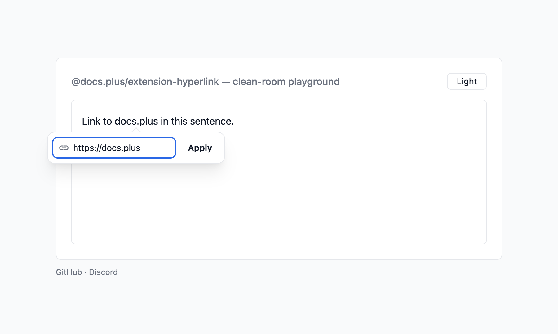
Outside a link, Mod-k calls this command. Call it from your own toolbar button too:
editor.commands.openCreateHyperlinkPopover()
openCreateHyperlinkPopover opens UI, so editor.can().openCreateHyperlinkPopover() reports availability without mounting anything. With nothing selected, the prebuilt form inserts the typed URL as its own link text.
Style document links
The styles.css stylesheet skins the popovers and the hovercard's tooltips. The mark renders a plain <a> with no class, so style your document links yourself:
Hyperlink.configure({ HTMLAttributes: { class: 'my-link' } })
a.my-link {
  color: #2563eb;
  text-decoration: underline;
}
For theme tokens, dark mode, and class names, see Styling.
Show an icon before each link
linkIcon takes a sync function. It receives { href } and returns a fresh element, or null for a plain link:
Hyperlink.configure({
  linkIcon: ({ href }) => {
    const icon = document.createElement('span')
    icon.style.background = href.startsWith('https:') ? '#16a34a' : '#9ca3af'
    return icon
  }
})
The icon goes first inside each <a>, and the link text sits in a <span> after it. Only an href that passes isSafeHref reaches the function. validate and isAllowedUri do not run for icons. styles.css sizes the icon to 1em. See Options.
Two helpers build that function for you. linkIconMap is an offline table from domain to icon. linkIconFetcher builds one <img> per link from the link's origin, for example through your own favicon route. Chain them with ??, so a map hit wins and the fetcher helper never runs for it:
import { Hyperlink, linkIconFetcher, linkIconMap } from '@docs.plus/extension-hyperlink'

const icons = linkIconMap({ 'example.com': '/icons/example.svg' })
const favicons = linkIconFetcher({
  src: (origin) => `/favicon?origin=${encodeURIComponent(origin)}`
})
Hyperlink.configure({ linkIcon: (ctx) => icons(ctx) ?? favicons(ctx) })
linkIconFetcher takes two options: src and tile. src gets the link's origin, such as https://example.com or https://example.com:8080, with no path and no trailing slash. It must return an image URL string. Your route may answer with any image the browser can draw. If src throws, the link stays plain, and the package logs one console error. Links that share an icon URL share one request. Each <img> has alt="", a 16 × 16 fallback size and referrerPolicy="no-referrer". It stays hidden until it loads, so a failed load shows no icon. To skip a link, wrap the fetcher in your own function that returns null. tile: true paints a light square behind each icon on a dark color-scheme. On a light scheme the tile is clear. linkIconMap keys are bare hostnames: www. is ignored, a subdomain matches its parent key, and the href port does not count. Both helpers cover http: and https: links only. A mailto:, tel: or app link has no web origin, so each helper returns null for it. When every function in the ?? chain returns null, the link stays plain. To give those links an icon, chain your own function that reads href.
The favicons function above also works as the hovercard's siteIcon. A map entry may also be a { light, dark } pair of image URLs, or a function that returns an element. See Link icons.
Show a card on hover
The hovercard option shows a card when a mouse pointer rests on a link. Your fetchMetadata returns the title, description and picture, and the package makes no request of its own:
import { Hyperlink } from '@docs.plus/extension-hyperlink'
import '@docs.plus/extension-hyperlink/hovercard.css'
import '@docs.plus/extension-hyperlink/styles.css' // the card's tooltips

Hyperlink.configure({
  hovercard: {
    fetchMetadata: async ({ href }) => {
      const res = await fetch(`/metadata?url=${encodeURIComponent(href)}`)
      if (!res.ok) return null
      const page = await res.json()
      // Map your server's fields to HovercardData. `image` is `{ url }`, not a string.
      return {
        title: page.title,
        description: page.description,
        image: page.image ? { url: page.image } : undefined
      }
    }
  }
})
The built-in card shows the picture, the title, the description and a link line with Copy link. On an editable link whose text is its own URL, the line also shows Use page title. To draw your own card, add render. See Hovercard for the data contract, render, the timing and the keys.
Name pasted links after their page
The pasteTitle option swaps a pasted bare URL for the page title. The link appears at once with the URL, and your fetchTitle returns the title:
import { Hyperlink } from '@docs.plus/extension-hyperlink'

Hyperlink.configure({
  pasteTitle: {
    fetchTitle: async ({ href, signal }) => {
      const res = await fetch(`/metadata?url=${encodeURIComponent(href)}`, { signal })
      if (!res.ok) return null
      const data = await res.json()
      return typeof data.title === 'string' ? data.title : null
    }
  }
})
The swap is its own undo step, so one Mod-z restores the URL. Mod-Shift-v pastes the raw URL, and shouldFetch can follow a user setting. With no answer in 4 s, the URL stays. See Paste title for the rules, the title cleaning and a safe backend.
Gallery
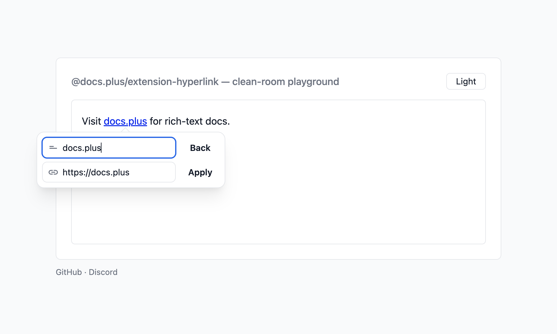
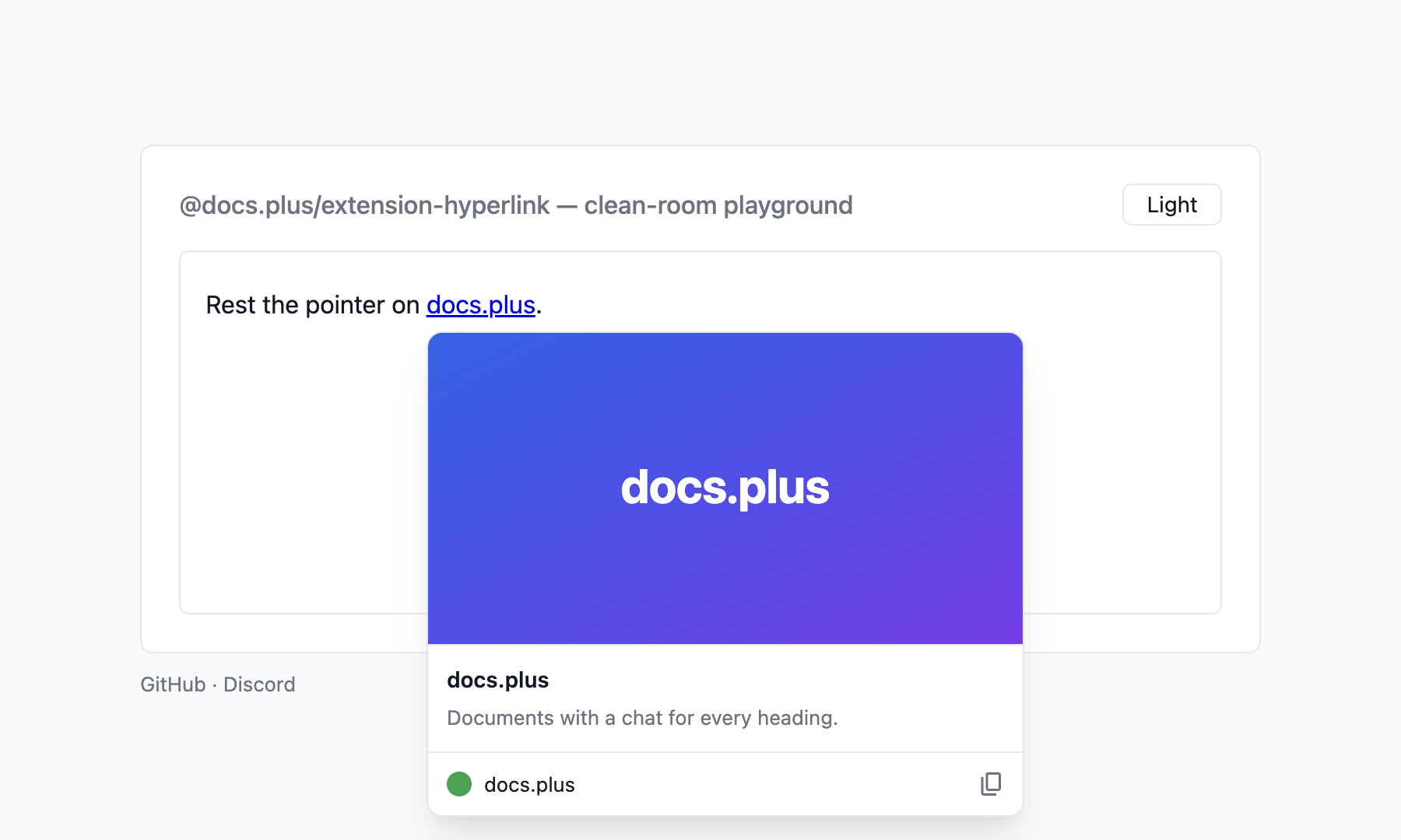
Prebuilt create, preview, and edit popovers (styles.css + popovers config), and the built-in hovercard (hovercard.css + hovercard option). Each screenshot has a light and a dark version, and follows your system preference.
Create — Mod+K
Preview — click a link
Edit — preview → Edit
Hovercard — rest the pointer on a link
Documentation
| Guide | What it covers |
|---|---|
| API reference | Options, commands, keyboard shortcuts, the full caveats list, server bundles, and TypeScript exports |
| Popovers | The three popover slots, factory option shapes, openers, and custom popovers |
| Hovercard | The link card on hover: the built-in card, the data contract, custom render, timing, and keys |
| Paste title | A pasted URL named after its page: when it runs, the resolver contract, undo and a safe backend |
| Styling | The stylesheet, --hl-* theme tokens, dark mode, and class names |
| URL handling | Href normalization, scheme classification, and Markdown round-trip |
| Security | The dangerous-scheme gate at each boundary, and the exported safety helpers |
| Advanced | The floating-popover primitive, the UI controller, and the tooltip primitive |
| Migration | What to check from 2.2 to 2.3, and the renamed options, commands, CSS classes, and popover APIs from 1.x |
| Changelog | Every release and its breaking changes |
| For AI coding agents | This README as plain Markdown for your agent. The docs are also on Context7 |
Part of docs.plus
This extension is built for and maintained by docs.plus. docs.plus is a free, real-time collaboration tool that lets communities organize knowledge hierarchically, with a chat thread on every heading. docs.plus runs these packages from source in production, so every release is exercised there before it reaches npm.
- Website: docs.plus
- Project README: docs-plus/docs.plus
- Sibling extensions and recommended pairings: extensions/README.md
Contributing
Bug reports and PRs welcome. Setup, test commands, and the playground harness live in CONTRIBUTING.md.
License
MIT — see LICENSE.