@drewswiredin/backstage-plugin-assistants
AI Assistants for your developer portal. Every answer comes from your catalog and docs. Every Backstage action runs as the user.
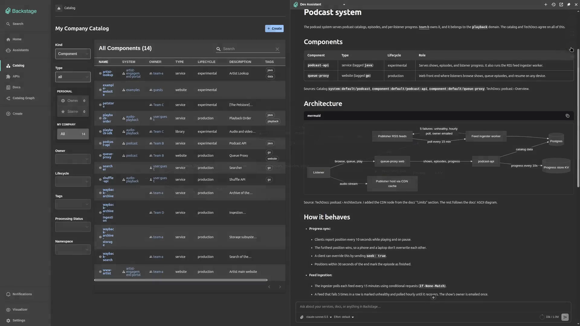
This is the frontend plugin of AI Assistants for Backstage, for the new
frontend system: a collapsible, multi-conversation chat page at /assistants,
a panel that opens beside any page and can read that page, a composer for the
home page, and the in-app editor where admins create assistants. The
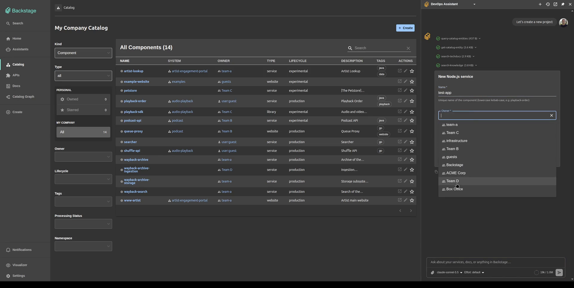
conversation renders generative UI: forms built from your scaffolder field
extensions, Mermaid diagrams with fullscreen pan and zoom, download chips for
generated files, and approval cards (Allow, Always allow, Deny) for gated
tools, which show a write to a repository as its branch, path, and a diff.
Tools from an MCP server connected per user run with the user's own sign-in;
a "Connect GitHub" chip beside the model picker signs them in. For a server
that runs its own OAuth the chip opens that server's sign-in in a popup, then
shows "✓ " with an × to disconnect. When an MCP server stops mid-call to
ask for input, the question appears on the tool call as a form. It pairs with:
@drewswiredin/backstage-plugin-assistants-backend, the backend (required)@drewswiredin/backstage-plugin-assistants-common, shared types and permissions (installed transitively)
Requirements
- Backstage 1.56 or later, on the new frontend system
(
@backstage/frontend-defaultscreateApp) and the new backend system (@backstage/backend-defaults). - Node 22.12 or later.
- React 18 and
react-router-dom^6.30.2 (peer dependencies). - A plugin database for the backend: SQLite, Postgres, or MySQL.
- A model provider and API key: OpenAI, Anthropic, Azure OpenAI / AI Foundry, or any OpenAI-compatible endpoint such as OpenRouter.
- Recommended:
@backstage/plugin-signalsin the app and@backstage/plugin-signals-backendin the backend. The frontend uses Signals for live status when the app has them and polls when it does not.
Install
From your Backstage repo root:
# in the app package
yarn --cwd packages/app add @drewswiredin/backstage-plugin-assistants

# in the backend package
yarn --cwd packages/backend add @drewswiredin/backstage-plugin-assistants-backend
The -common package is pulled in transitively. On release day, pin the
version (yarn add @drewswiredin/backstage-plugin-assistants@<version>);
Yarn's package-age gate otherwise resolves to the previous release for three
days.
Wire up
Frontend
Add the plugin to your app's features. Its "Assistants" nav item is registered
automatically; no extra nav code is needed. (/alpha is Backstage's export
convention for new-frontend-system plugins, not a stability marker.)
// packages/app/src/App.tsx
import { createApp } from '@backstage/frontend-defaults';
import assistantsPlugin from '@drewswiredin/backstage-plugin-assistants/alpha';

export default createApp({
  features: [
    assistantsPlugin,
    // ...your other features
  ],
});
The page mounts at /assistants; ?assistant=<id> opens it on a given
assistant, and /assistants/threads/<id> opens one conversation. In an app
with app.packages: all, the plugin is discovered without the features
entry.
For live working and unread status, add Signals to the app (and
@backstage/plugin-signals-backend to the backend); without it the page polls
every 10 seconds:
import signalsPlugin from '@backstage/plugin-signals/alpha';

export default createApp({
  features: [assistantsPlugin, signalsPlugin],
});
Panel
The panel puts a floating button in the lower right of every page. It opens a side panel with one conversation at a time, beside the page rather than over it: the page content makes room for it. "Open in Assistants" moves the conversation to the full page; nothing is copied.
The panel wraps the app layout, which is the app plugin's own extension
point, so it ships as a module for the app plugin. Add it to your features
to turn it on:
import assistantsPlugin, {
  assistantsPanelModule,
} from '@drewswiredin/backstage-plugin-assistants/alpha';

export default createApp({
  features: [assistantsPlugin, assistantsPanelModule],
});
The panel opens the default assistant, the one every signed-in user gets (designated in the editor with "Make default"). A user who can access more than one assistant picks another from the menu on the assistant's name in the panel header; the pick is remembered in that browser and starts a fresh conversation. If the picked assistant goes away, the panel falls back to the default. The history button in the header lists that assistant's earlier conversations; picking one continues it in the panel. The model and reasoning effort pickers sit in the composer, as on the page.
Ctrl+/ (⌘/ on macOS) toggles the panel. A click on the page or Esc
collapses it to a strip at the right edge with the conversation kept, unless
it is pinned: the pin in the header keeps it open while you work on the page,
for example to follow steps it gave you, and is remembered in this browser.
The strip's left edge is lit in the assistant's color; it glows onto the page
in a slow pulse while the assistant is working and holds the glow while a
reply is unread, as the dot on its icon does. Close (the x) removes the strip and brings the button back.
Backstage dialogs
and drawers, such as the entity inspector or a Kubernetes pod, open beside the
panel instead of over it, and clicking or typing in the panel leaves them
open.
Dragging the left edge resizes the panel, double-clicking it goes back to the
default width, and below tablet width it fills the screen. The panel remembers your last quick conversation in this browser; only
"+" and "Open in Assistants" start fresh. Tools, approvals, forms, and
attachments work as on the page. The button is hidden on the Assistants page
itself and for users without assistant.use.
The panel tells the assistant which page it sits beside (the path, the title,
and the catalog entity when the page is one), and the assistant can read the
page itself with the built-in read_current_page tool: headings, text,
buttons, links, tabs, form fields, tables, alerts, graph labels, TechDocs
content, any open dialog, and the lines of a log around a term. So "what does this mean" and "which button do I
press" work on any page, with no per-plugin code. The tool shows as a chip in
the conversation when it runs. To turn it off for the whole app:
app:
  extensions:
    - assistant-client-tool:assistants/read-current-page: false
The assistant also knows what this Backstage instance offers through the
built-in describe_portal tool: the installed plugins, every page with its
path, and the tabs on a catalog entity's page (Kubernetes, CI, API
definitions, and so on), read from the app tree every new-frontend-system app
builds. So "what's in Backstage" and "where do I find our API docs" get an
answer, with links, from any page, and without the visualizer plugin. Turn it
off the same way, with
assistant-client-tool:assistants/describe-portal: false.
Homepage
A composer for an app that uses @backstage/plugin-home. It is the panel's
own surface with the conversation hidden, so the composer is the same one the
page and the panel use. The first send creates the conversation and hands it
to the panel, which opens and continues it, and the composer starts over; in
an app without the panel the conversation opens on the Assistants page.
It ships behind its own entry point, /home, and needs
@backstage/plugin-home-react in your app. That package is an optional peer
dependency, so the plugin never pulls it in and an app without a home page
never loads it, but your package manager won't install it for you either. Add
it next to @backstage/plugin-home:
yarn --cwd packages/app add @backstage/plugin-home-react
Then add the module to your features:
import { assistantsHomeModule } from '@drewswiredin/backstage-plugin-assistants/home';

export default createApp({
  features: [assistantsPlugin, assistantsPanelModule, assistantsHomeModule],
});
The module adds one widget, AssistantComposer. Its look is set with
variant:
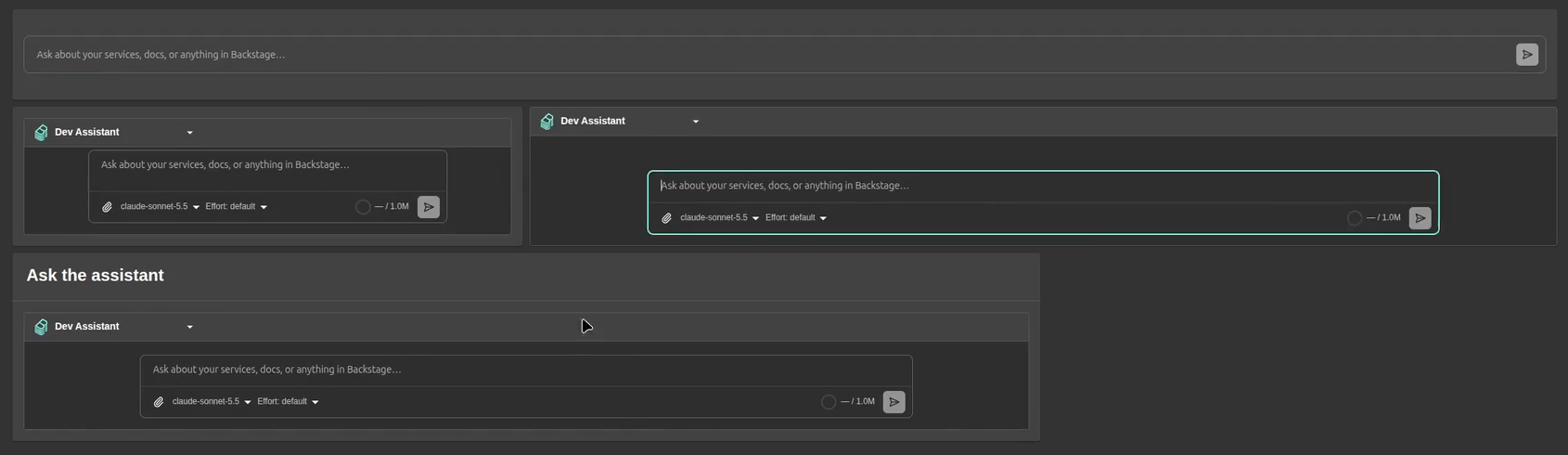
variant | Looks like | Grid rows |
|---|---|---|
bar | The composer alone on one row, like a search bar: no header, no assistant picker, no model picker. It uses the user's last picked assistant, else the default one. | 2 |
padded (default) | The assistant picker and the full composer (attachments, model, reasoning effort), framed inside the card's padding. | 3 |
full | The same, filling the card edge to edge. | 3 |
titled | padded under a card header, like the other home cards. title sets the header text (default "Ask the assistant"). | 4 |
width sets the composer's width as a percentage of the card, 20 to 100: 100
by default for bar, like a search bar, and 80 for the others.
Configure the widget and place it on the home page's grid by its name:
app:
  extensions:
    - home-page-widget:assistants/AssistantComposer:
        config:
          variant: bar
          width: 100
    - page:home:
        config:
          defaultConfig:
            - component: AssistantComposer
              column: 0
              row: 0
              width: 12
              height: 2 # the variant's grid rows
The composer's hint text is the assistant's own "Composer placeholder", set in
the editor, else "Ask about your services, docs, or anything in Backstage…".
For the bar, a placeholder such as "Ask anything about our systems…" on the
default assistant makes it read like a search box. A user's saved home layout
wins over defaultConfig until they choose "Restore defaults".
To render it somewhere else, such as inside your own card or page, use the component the entry point exports:
import { AssistantComposer } from '@drewswiredin/backstage-plugin-assistants/home';

<AssistantComposer variant="padded" width={90} />;
full assumes the home card's 16 px content padding; the other variants fit
any container.
Backend
// packages/backend/src/index.ts
backend.add(import('@drewswiredin/backstage-plugin-assistants-backend'));
app-config
Add an assistants block to app-config.yaml. It holds the platform surface
only: providers, MCP servers, and the approval gate. A minimal working example,
using OpenRouter and the built-in catalog/TechDocs read tools, plus the
backend.actions.pluginSources entry that exposes those tools to assistants:
assistants:
  defaultModel: openrouter:anthropic/claude-sonnet-5
  builtinActions: true # registers the built-in catalog/TechDocs read tools
  providers:
    openrouter:
      type: openai-compatible
      apiKey: ${OPENROUTER_API_KEY}
      baseUrl: https://openrouter.ai/api/v1
      models:
        - name: anthropic/claude-sonnet-5
          contextWindow: 1000000

backend:
  actions:
    pluginSources:
      - assistants # plus catalog / scaffolder etc. for their actions
Without assistants in backend.actions.pluginSources, an assistant's tools
resolve to an empty list.
Set the key in your environment (never commit it):
export OPENROUTER_API_KEY=sk-or-...
See the
backend README
for everything else: model providers, MCP servers, the approval gate, and
permissions. Per-assistant settings (prompt, access, tools, models) are not
config; they are managed in the in-app editor. Tool availability depends on
which action-providing plugins are installed in your backend; the built-in
read tools are provided by builtinActions.
First run
On first start the backend seeds one assistant, open to every signed-in user,
with the three built-in read tools, and makes it the default. Open
/assistants and talk to it, or press Ctrl+/ on any page if the panel is
installed.
Users with the assistant.manage permission see a gear in the chat sidebar
that opens the editor to create, edit, and delete assistants, and to choose
the default assistant with "Make default". Exactly one assistant is the
default: it is open to every signed-in user, listed first, and cannot be
deleted or restricted until another is made the default. Under
create-app's default allow-all permission policy every signed-in user holds
both assistant.use and assistant.manage; grant them to the right users in
your permission policy, as described in the
backend README.
Customize the sidebar
The plugin's nav entry has the id page:assistants; in a custom
NavContentBlueprint, take() it to place it yourself. Its icon carries a
live dot: amber while any of the user's conversations is working, red while
one is unread, wherever it started.
The auto-registered nav entry is not permission-gated: a user without
assistant.use still sees it and lands on a "You are not permitted to use
assistants" page. To hide the plugin entirely for them, take() the entry
and render it behind a usePermission(assistantUsePermission) check:
// packages/app/src/modules/nav/Sidebar.tsx
import type { ReactNode } from 'react';
import { Sidebar, SidebarItem } from '@backstage/core-components';
import { NavContentBlueprint } from '@backstage/plugin-app-react';
import { usePermission } from '@backstage/plugin-permission-react';
import { assistantUsePermission } from '@drewswiredin/backstage-plugin-assistants-common';

function IfAssistantsAllowed({ children }: { children: ReactNode }) {
  const { allowed } = usePermission({ permission: assistantUsePermission });
  return allowed ? <>{children}</> : null;
}

export const SidebarContent = NavContentBlueprint.make({
  params: {
    component: ({ navItems }) => {
      const nav = navItems.withComponent(item => (
        <SidebarItem icon={() => item.icon} to={item.href} text={item.title} />
      ));
      const assistants = nav.take('page:assistants');
      return (
        <Sidebar>
          {nav.take('page:catalog')}
          <IfAssistantsAllowed>{assistants}</IfAssistantsAllowed>
          {nav.rest({ sortBy: 'title' })}
        </Sidebar>
      );
    },
  },
});
A sidebar item you build yourself gets the same dot from
<AssistantsNavIcon />.
Reference
Root entry exports
The plugin itself is the default export of the ./alpha subpath, which also
exports assistantsPanelModule (see Panel). The ./home subpath
exports assistantsHomeModule, the AssistantComposer component, and its
AssistantComposerVariant type (see Homepage). The package root
exports what a host app needs to integrate with it:
| Export | Purpose |
|---|---|
rootRouteRef | Route ref for the /assistants page. |
threadRouteRef | Sub-route ref for one conversation, /assistants/threads/:threadId. |
assistantsApiRef | API ref for the backend client (AssistantsApi): assistant list, threads, status. |
AssistantsNavIcon | Nav icon with a live working/unread dot; the nav entry's icon, for a sidebar item you build yourself. |
AssistantsApi, ConversationStatusRow, ThreadPatch (types) | The client interface and its row/patch shapes. |
AssistantClientToolBlueprint, clientToolDataRef | Contribute a client tool (see Client tools). |
clientToolsApiRef, ClientToolsApi (type) | The registry of contributed client tools, read by every surface that runs a conversation. |
usePanelControl, PanelControl, PanelOpenOptions (types) | Open the panel from a page component, on a conversation or with a first message; undefined in an app without the panel. |
AssistantClientTool, ClientToolAuthRequirement, ClientToolContext, ClientToolRenderProps, ClientToolInterrupt (types) | The client tool contract; ClientToolInterrupt is the approval or connect prompt a custom render receives. |
Chat page
- Conversations: one list per assistant; a row's menu renames, pins, or deletes it, and pinned conversations sort first.
- Assistant details: the info button shows an assistant's description, tools grouped by source, and models.
- A new conversation opens on a welcome with the assistant's description and its starter suggestions; a suggestion sends immediately.
- Replies have Copy, Copy as rich text (for Teams, Outlook, email), and Regenerate, with a picker between regenerated branches. Reasoning shows in a collapsible block; a tool call without its own UI shows its input and output on expand.
- The composer holds the model and reasoning effort pickers, takes images
(picked or pasted) and text and code files up to 7 MB each, shows a context
gauge against the model's
contextWindow, and stops a running reply. A stopped reply ends with "Request interrupted"; a dropped connection with "Connection lost". - Attached images and SVG files open in a fullscreen pan-and-zoom preview.
Generative UI
Four built-in client tools are always available and need no config:
render_form: an inline form; the submitted values become the tool result.download_file: a download chip for a text file the assistant generates (CSV, JSON, Markdown, code, SVG), with Copy for text files.read_current_page: the page the user is looking at, as an outline (see Panel). An app can turn it off.describe_portal: this instance's plugins, pages, and entity tabs (see Panel). An app can turn it off.
Mermaid code blocks render as diagrams themed to the Backstage light or dark mode, with a fullscreen pan-and-zoom view. Markdown renders with GitHub Flavored Markdown, so tables, task lists, and strikethrough come through.
Forms and scaffolder pickers
Assistants can show an inline form (the render_form tool) built from
Backstage scaffolder field extensions (owner, entity, and repo pickers, plus
any custom field), resolved at runtime from the app. With
@backstage/plugin-scaffolder registered the pickers populate from the
catalog; without it, forms render with plain inputs.
A scaffolder template's parameters render as-is, ui:field and ui:options
included, so an assistant can show a template's own form in the conversation and
run the template with the submitted values. The backend README covers
the actions that flow needs.
Client tools
A client tool runs in the user's browser with the user's own credentials, so
an assistant can use a system the frontend already talks to as the user
(a Kubernetes cluster, Azure DevOps, GitHub, an internal API behind the
user's OAuth session). Any plugin or app module contributes one with
AssistantClientToolBlueprint; the assistants plugin sends its declaration
to the backend on every turn, runs its execute when the model calls it, and
returns the result to the model. The credential never leaves the browser.
import { createFrontendModule } from '@backstage/frontend-plugin-api';
import { microsoftAuthApiRef } from '@backstage/core-plugin-api';
import { AssistantClientToolBlueprint } from '@drewswiredin/backstage-plugin-assistants';

const recentBuilds = AssistantClientToolBlueprint.make({
  name: 'recent-builds',
  params: defineParams =>
    defineParams<{ project: string; top?: number }, { builds: unknown[] }>({
      name: 'azure-devops__get_recent_builds',
      title: 'Recent builds',
      description: 'The latest Azure DevOps builds of a project.',
      inputSchema: {
        type: 'object',
        properties: {
          project: { type: 'string' },
          top: { type: 'number', description: 'How many; default 10.' },
        },
        required: ['project'],
      },
      attributes: { readOnly: true },
      auth: {
        kind: 'oauth',
        system: 'Azure DevOps',
        apiRef: microsoftAuthApiRef,
        scopes: ['499b84ac-1321-427f-aa17-267ca6975798/user_impersonation'],
      },
      execute: async ({ project, top = 10 }, { credential, signal }) => {
        const res = await fetch(
          `https://dev.azure.com/my-org/${project}/_apis/build/builds?$top=${top}&api-version=7.1`,
          { headers: { Authorization: `Bearer ${credential}` }, signal },
        );
        if (!res.ok) throw new Error(`${res.status} ${res.statusText}`);
        const { value } = await res.json();
        return {
          builds: value.map((b: any) => ({
            id: b.id,
            status: b.status,
            result: b.result,
          })),
        };
      },
    }),
});

export const assistantToolsModule = createFrontendModule({
  pluginId: 'assistants',
  extensions: [recentBuilds],
});
Add the module to the app's features, then give an assistant the tool by
name in the editor's Tools section, under "Browser tools". The contract:
nameis<namespace>__<tool>; the namespace keeps a plugin's tools apart from Backstage actions and MCP servers.description(at most 4000 characters) andinputSchema(a JSON Schema object, at most 8 KB) are what the model sees.attributes.readOnlyanddestructivemirror Backstage action attributes. A tool that is not read-only, or is destructive, asks the user for approval on every call; there is no "always allow". A read-only tool asks when the backend'srequireApprovalnames it.authis optional.oauthnames a Backstage OAuth API and scopes;customsupplies anacquire({ apis, interactive })for a plugin that manages its own credentials (for example Kubernetes' auth-provider API). The runtime acquires silently first; when that yields nothing it shows a Connect control and acquires on the click, so no popup is blocked. The credential reaches onlyexecute.execute(input, { apis, credential, signal })returns a JSON-serializable result.apisis the app's API holder, so a tool can call any frontend API (catalogApiRef, a plugin's own API) rather than fetch directly. A thrown error, a timeout (timeoutMs, default 30 s, at most 120 s), a declined approval, or a dismissed Connect each become an{ _error: true, code, message }result the model explains.renderis optional for a tool withexecute(the call otherwise shows its input and output) and required for a tool without one, whose card supplies the result withaddResult; that is howrender_formworks.isAvailable({ apis })hides a tool that cannot work in this app.
Keep results small and explicit: return the fields the model needs, never a raw object dump, and never a secret. Everything a tool returns is untrusted input to the model.
With a model whose provider runs its own tool loop (an agent SDK or CLI a
backend module adds; see the
backend README),
the turn can't pause for the browser, so it holds the call open instead: a
tool's execute runs at once and its result returns to the same turn, and a
card tool such as render_form returns its addResult. A tool that would
ask first (one that writes, or one that needs Connect) is declined on such a
model, and the model is told why. Approval cards for the backend's gated tools
work as usual.
Dependency versions
The @assistant-ui/* set, assistant-cloud, and the AI SDK (ai,
@ai-sdk/react) are declared as caret ranges matching what upstream declares
for itself, so a consumer resolves a single copy of each. Upstream moves the
family in lockstep; bump them as a group.
License
Apache-2.0. Includes MIT-licensed components from assistant-ui, listed in
THIRD_PARTY_NOTICES.md, shipped with this package.