React Native Pickers


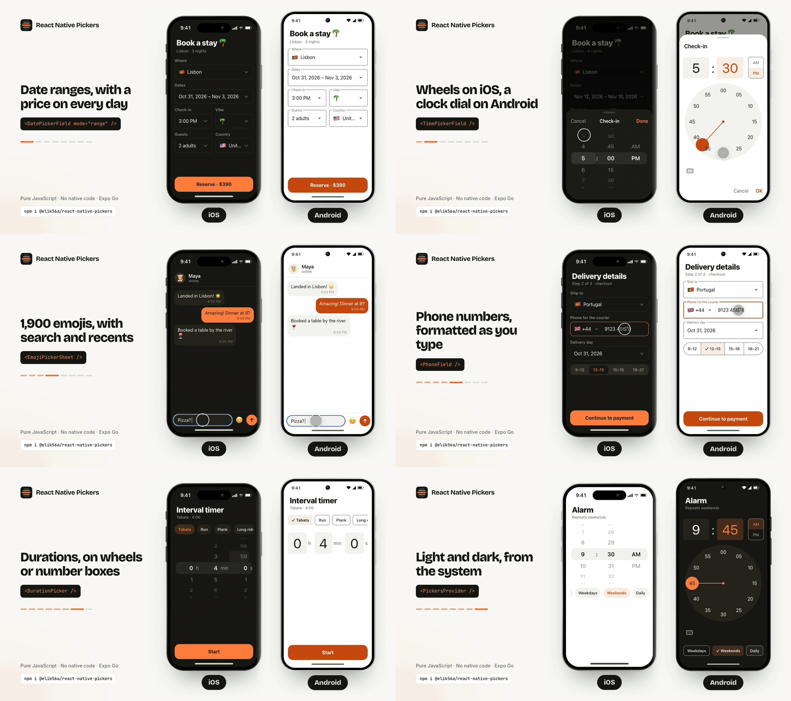
Every picker a React Native app needs, in one package with zero native code. Wheel, time, duration, date, month, week strip, expandable calendar, date range, date & time, select, country, phone number, time zone, segmented control, emoji and color pickers, a slider, a star rating and an OTP code input, plus bottom sheets, action sheets, menus and the form fields to put pickers in. Native on iOS, Android and the web, and every detail is yours to customize.
Documentation & live examples · Showcase · Quick start · llms-full.txt · Changelog
Why this one
- Native on every platform. The iOS design on iPhone, Material Design on Android and a web design in the browser, from one code path. Prefer one look everywhere? Set
design="ios"once. - Zero native code. Pure JavaScript on React Native core APIs. Works in Expo Go, bare React Native and React Native Web, ships in OTA updates. No Reanimated, Gesture Handler or SVG.
- Yours to customize. Theme tokens with automatic dark mode, a style slot for every visual part, and render props for full control. Your settings always win over the design.
- Built for forms. Every picker comes inline, in a bottom sheet or modal with Cancel / Done, and as a form field that opens it and shows the value, with error and helper text from React Hook Form, Formik or Zod.
- Real features built in. Date ranges with min/max nights, multiple dates, marked dates and prices, searchable selects with server search, a country picker with flags and dialing codes, a phone number field, a time zone picker, 1,923 emojis with skin tones and recents.
- International and accessible. Names, the 12/24h clock and the week start come from
Intlfor any locale; layouts flip for RTL. VoiceOver and TalkBack support throughout, and full keyboard use on the web. - Typed. Generic value types and mode-discriminated unions:
mode="range"gives you a typed{ start, end }.
Install
npm install @elik56a/react-native-pickers
Or yarn add, pnpm add, npx expo install. Needs react >= 18 and react-native >= 0.72. Nothing else: no pod install, no rebuild, no config plugin.
Quick start
import { useState } from 'react';
import { View } from 'react-native';
import {
  DatePickerField,
  SelectPicker,
  TimePickerField,
} from '@elik56a/react-native-pickers';
import type { DateRange } from '@elik56a/react-native-pickers';

const ROOMS = [
  { label: 'Single', value: 'single' },
  { label: 'Double', value: 'double' },
  { label: 'Suite', value: 'suite' },
];

export default function Booking() {
  const [stay, setStay] = useState<DateRange>({ start: null, end: null });
  const [arrival, setArrival] = useState<Date | undefined>();
  const [room, setRoom] = useState<string | null>(null);

  return (
    <View style={{ gap: 16, padding: 16 }}>
      <DatePickerField
        label="Stay"
        mode="range"
        value={stay}
        onConfirm={setStay}
        minDate={new Date()}
        placeholder="Add dates"
      />
      <TimePickerField
        label="Arrival"
        value={arrival}
        onConfirm={setArrival}
        minuteInterval={15}
      />
      <SelectPicker
        label="Room"
        options={ROOMS}
        value={room}
        onChange={setRoom}
      />
    </View>
  );
}
Each field opens its picker in a bottom sheet on iOS and Android and in a dropdown on the web, in that platform's design, and shows the confirmed value formatted for the locale.
Components
| Component | What it is |
|---|---|
WheelPicker | 3D scrolling wheel: infinite loop, disabled items, tap-to-type |
MultiWheelPicker | Several wheels sharing one selection band: durations, units, compound values |
TimePicker | Wheels, a Material clock dial or columns to click; 12h / 24h from locale, intervals, min / max |
TimeRangePicker | A start and an end time: opening hours, shifts, overnight ranges, min / max length |
DatePicker | Calendar (single, range, multiple, several ranges) or day / month / year wheels |
MonthPicker | A month and year, like a card's expiry: wheels on iOS, a grid of months in Material and on the web |
WeekStrip | One week of days in a row, with marked days; swipe or arrows to change weeks |
ExpandableCalendar | A week that opens into its month with a drag down or its handle, for schedule screens |
Timeline | A day or week view: events by the hour, overlaps side by side, all-day events, a now line and tap to add |
Agenda | Events as a list day by day: iOS sticky day bands or Google Calendar's schedule, in step with a calendar |
DurationPicker | A length of time, like a timer or a workout: wheels, Material number boxes or columns to click, the value in seconds |
DateTimePicker | Day and time together: one row of wheels, or a calendar with the time under or beside it |
SelectPicker | Field that opens a searchable list: single or multi-select, chips, groups, icons, server search, new options from the search |
SelectList | The same list, inline |
CountryPicker | About 250 countries with flags and dialing codes, localized names, preferred countries on top |
LanguagePicker | 86 languages with flags, each under its own name (Español, 日本語) with its name in the user's language below, right-to-left detection |
PhoneField | Phone number input: a country code button, the number formatted as it's typed, an E.164 value |
CurrencyPicker | 154 currencies with flags, codes and symbols, names in the user's language, search by name, code or symbol |
AmountField | Money input grouped as it's typed in the locale's format, the currency's decimal places, a currency button, a large amount for checkout screens |
TimeZonePicker | Every IANA time zone with its GMT offset, sorted by offset, the device's zone on top |
HorizontalList | Segmented control or chips that scroll sideways and reveal the next item |
ColorPicker | iOS's Grid / Spectrum / Sliders, Google's swatch circles, or the browser's spectrum; hex with opacity and a copy button |
Slider | iOS's knob, Material 3's handle with a value bubble, or a range input; one thumb or a range, steps, icons |
OtpField | A verification code in a box per character: SMS autofill on iOS, Android and the web, paste, a PIN mode |
Rating | Star rating: tap or drag, half steps, a read-only score with any fraction, your own icon |
EmojiPicker | 1,923 emojis: categories, search, skin tones (long-press for one emoji's), recents, version filtering |
BottomSheet | Animated sheet with drag-to-dismiss, for your own content |
Menu | A dropdown or long-press context menu of actions by its trigger; pure JS, so it runs in Expo Go and on the web |
ActionSheet | A list of actions such as Share or Delete: iOS cards or Material rows, destructive and disabled actions |
| Picker sheets | DatePickerSheet, TimePickerSheet, TimeRangePickerSheet, DateTimePickerSheet, DurationPickerSheet, MonthPickerSheet, ColorPickerSheet, WheelPickerSheet, EmojiPickerSheet: a picker in a sheet with Cancel / Done |
| Picker fields | DatePickerField, TimePickerField, TimeRangePickerField, DateTimePickerField, DurationPickerField, MonthPickerField, ColorPickerField, WheelPickerField, EmojiPickerField, PickerField: a form field that opens the picker |
Inline, in a sheet, or behind a field
Every picker comes three ways, with the same props.
// Inline: changes as the user scrolls or taps
<DatePicker value={date} onChange={setDate} />

// In a sheet: keeps a draft, commits on Done, discards on Cancel
<DatePickerSheet
  visible={open}
  onClose={() => setOpen(false)}
  value={date}
  onConfirm={setDate}
/>

// Behind a field: owns the open state, shows the confirmed value
<DatePickerField label="Date" value={date} onConfirm={setDate} />
Sheets open as a bottom sheet, or as a centered modal on wide web windows (presentation="bottomSheet" | "modal"). Fields and SelectPicker also open as a dropdown under the field, their default on the web (presentation="dropdown"), or expand inline under it, pushing the content below, like the iOS Settings app (presentation="inline"). PickerField wraps any sheet of your own in a field.
Button text is yours too: confirmLabel, cancelLabel and showCancel on any sheet or field.
Designs: native on each platform
By default each platform gets its own design (design="auto"). A design changes shapes and layout, never your colors:
ios | material | web | |
|---|---|---|---|
| Fields | label above | outlined, the label floats onto the border | label above, compact, focus ring |
| Cancel / confirm | beside a centered title, Done | after the content, OK | after the content, Done |
| Single select | ✓ beside the chosen option | a radio on every option | ✓ beside the chosen option |
| Calendar | chosen day tinted | chosen day filled, today ringed | chosen day a filled square |
| Time | wheels | a clock dial | columns of hours and minutes to click |
| Date & time | one row of wheels | calendar, time fields under it | calendar, time columns beside it |
| Press | dims | ripple | dims |
Pick one design for the whole app, or for one component:
// The iOS look on Android and the web too
<PickersProvider design="ios">
  <App />
</PickersProvider>

// One component
<TimePicker design="material" value={time} onChange={setTime} />
Or keep the design and change one choice with its own prop: display="wheel" on TimePicker, timeDisplay and timePosition on DateTimePicker, confirmLabel on any sheet. See the designs guide.
Upgrading from 0.10? Android and the web now get the Material and web designs. Set
<PickersProvider design="ios">to keep the previous look everywhere.Upgrading from 0.12?
EmojiPickerfollows the design too: on iOS and Android its category bar moves to the bottom, like the platform's emoji keyboard. SetcategoryBarPosition="top"to keep it on top.
Customize anything
Theme your whole app once. It's optional: light and dark defaults follow the OS.
import { PickersProvider } from '@elik56a/react-native-pickers';

<PickersProvider
  colorScheme="auto" // 'auto' | 'light' | 'dark'
  design="auto" // 'auto' | 'ios' | 'material' | 'web'
  theme={{
    colors: { primary: '#FF5A5F' },
    radius: { md: 8 },
    typography: { fontFamily: 'Inter' },
  }}
  darkTheme={{
    colors: { primary: '#FF8A8E', background: '#000' },
  }}
>
  <App />
</PickersProvider>
| Token group | Keys |
|---|---|
colors | background surface sheet text textSecondary textDisabled primary onPrimary primaryMuted border backdrop indicator handle hover ripple danger |
radius | sm md lg full sheet |
spacing | xs sm md lg xl |
typography | fontFamily fontFamilyMedium sizes weights |
animation | duration |
Any component also takes theme and design for a local override.
Slot styles reach every visual part, so you never fork:
<DatePicker
  styles={{
    selectedDay: { borderRadius: 8 },
    dayText: { fontFamily: 'Inter' },
    rangeBand: { backgroundColor: '#FFE4E6' },
  }}
/>
Render props replace a part and keep its behavior and accessibility:
| Component | Render props |
|---|---|
| Wheels | renderItem, renderIndicator |
HorizontalList | renderItem, renderArrow |
| Calendar | renderDay, renderArrow |
SelectPicker, SelectList | renderOption, renderGroupHeader, renderLoading, renderTrigger, renderChevron |
EmojiPicker | renderEmoji |
Rating | renderIcon |
| Fields | renderTrigger, renderChevron |
Good to know
-
Controlled or uncontrolled. Pass
value+onChange, ordefaultValue.SelectPicker,SelectListandHorizontalListare controlled-only: updatevalueinonChange. -
onChangeis for user changes only. Settingvaluein code moves the picker silently. Wheels fireonChangewhen they settle andonValueChangingon every row, andSlideron release and on every step, which is the place for haptics. -
Sheets commit on Done.
onConfirmgets the value; Cancel, the backdrop and dragging down discard the draft. -
Fast under load. Drags, scrolls and animations run on the UI thread, so they stay at 60 fps while JavaScript is busy. See the benchmarks against
@gorhom/bottom-sheet, Quidone's wheel picker andreact-native-calendars. -
Dates are local time. Days are compared by local year, month and day. Serialize them with
toDateKey(date)('YYYY-MM-DD'), nottoISOString(). -
Smaller native bundles. Metro doesn't tree-shake, so on native, import from a feature subpath (React Native 0.79+):
import { DatePicker } from '@elik56a/react-native-pickers/date';Subpaths:
/wheel/time/duration/date/calendar/month/datetime/select/country/timezone/list/emoji/color/slider/rating/otp/action/sheet/core.
API at a glance
The full API reference lists every prop. These are the ones you'll reach for.
WheelPicker<T>
| Prop | Type | Default |
|---|---|---|
items | (T | { label, value, disabled? })[] | |
value | T | |
onChange | (value, index) => void, when the wheel settles | |
onValueChanging | (value, index) => void, on every row | |
loop | boolean | false |
itemHeight | number | 40 |
visibleItems | number (odd) | 5 |
variant | '3d' | 'flat' | '3d' |
keyboardInput | boolean: tap the selected row to type | true |
isEqual | (a, b) => boolean, for object values | Object.is |
MultiWheelPicker takes columns: { key, items, value, onChange, flex?, width?, loop?, suffix? }[] and an optional separator.
TimePicker
| Prop | Type | Default |
|---|---|---|
value | Date (the date part is kept) | now |
onChange | (date) => void | |
display | 'wheel' | 'dial' | 'input' | 'list' | from the design |
format | '12h' | '24h' | 'auto' | 'auto', from locale |
minuteInterval | number | 1 |
showSeconds | boolean | false |
minTime / maxTime | Date (time of day) | |
locale | string | device |
MonthPicker, WeekStrip and ExpandableCalendar
MonthPicker picks a month and year; the value is a Date on the first of the month. Wheels on iOS, a grid of months under the year in Material and on the web (display), with minDate / maxDate, yearRange, monthFormat and locale. MonthPickerField shows October 2026.
WeekStrip is one week of days in a row: value, onChange(date), swipe or arrows to page, onWeekChange(weekStart), and the calendar's markedDates, minDate / maxDate, isDateDisabled, firstDayOfWeek and renderDay.
ExpandableCalendar is a WeekStrip that opens into its month with a drag down or the handle under it, and folds back into the week of the day picked: the same props, plus expanded / defaultExpanded / onExpandedChange and onMonthChange.
Timeline and Agenda
Both take one flat array of events, { id, title, start: Date, end: Date, allDay?, color?, subtitle? }, extended with your own fields as you like.
Timeline is a calendar's day view, or up to a week side by side (numberOfDays): events placed by the hour, side by side where they overlap, all-day events over the grid and a line at the current time. A swipe pages by days (date / onDateChange), onEventPress opens an event and onSlotPress({ start, end }) adds one where the grid was tapped. startHour, endHour, hourHeight, format and renderEvent shape it.
Agenda lists the same events day by day: a sticky band per day on iOS, the date beside each day's events in Material and on the web. It scrolls to selectedDate and reports the day at the top with onVisibleDateChange, so it stays in step with an ExpandableCalendar above it.
const [day, setDay] = useState(new Date());

<ExpandableCalendar value={day} onChange={setDay} />
<Agenda events={events} selectedDate={day} onVisibleDateChange={setDay} style={{ flex: 1 }} />
// or a day view
<Timeline events={events} date={day} onDateChange={setDay} onSlotPress={addEvent} style={{ flex: 1 }} />
ColorPicker
| Prop | Type | Default |
|---|---|---|
value | hex string, such as '#E4572E' | '#2196F3' |
onChange | (color) => void, with '#RRGGBB' | |
display | 'tabs' | 'swatches' | 'spectrum' | from the design |
colors | (string | { value, label? })[] | 24 named colours |
showCustom | boolean: the grid, spectrum, sliders and hex field | true |
showAlpha | boolean: an opacity slider, '#RRGGBBAA' values | false |
onCopy | (hex) => unknown: the copy button; the browser's clipboard on the web |
ColorPickerField shows a swatch and the hex code.
Slider
| Prop | Type | Default |
|---|---|---|
value | number, or [number, number] with range | min |
onChange | (value) => void: on release, or a key or screen-reader step | |
onValueChanging | (value) => void: every step while dragging | |
min / max / step | number; step={0} for any value | 0 / 100 / 1 |
range | boolean: two thumbs | false |
showSteps | boolean: a dot per step | false |
marks / snapToMarks | (number | { value, label? })[]: dots with labels / only the marks can be picked | / false |
valueLabel | 'never' | 'drag' | 'always': the value bubble | 'drag' in Material |
minimumIcon / maximumIcon | ReactNode beside the track |
OtpField
| Prop | Type | Default |
|---|---|---|
value | string: the code so far | '' |
onChange | (code) => void: as the user types, deletes or pastes | |
onComplete | (code) => void: once the last cell is filled | |
length | number | 6 |
inputMode | 'numeric' | 'text' | 'numeric' |
secureTextEntry | boolean: dots, for a PIN | false |
error / helperText | string | boolean / string: red boxes, the message under them |
Rating
| Prop | Type | Default |
|---|---|---|
value | number | 0 |
onChange | (value) => void: on a tap, the end of a drag, or a key step | |
max / step | number; step={0.5} for half stars | 5 / 1 |
readOnly | boolean: shows any fraction, no touches | false |
size / color / emptyColor | star size and colours | 32 / gold / theme border |
renderIcon | ({ index, filled, color, size }) => ReactNode | ★ |
DurationPicker
A length of time, such as a timer or a workout, rather than a time of day. The value is a number of seconds.
| Prop | Type | Default |
|---|---|---|
value | number (seconds) | 0 |
onChange | (seconds) => void | |
display | 'wheel' | 'input' | 'list' | from the design |
showHours / showSeconds | boolean | true / false |
min / max | number (seconds) | 0 / 23 h 59 min 59 s |
minuteInterval / secondInterval | number | 1 |
labels | { hours?, minutes?, seconds? } | h, min, s |
DurationPickerField shows the confirmed duration as 1 h 30 min, and formatDuration(seconds) writes it the same way.
DatePicker
mode | value | onChange | Extra props |
|---|---|---|---|
'single' (default) | Date | null | (date) | |
'range' | { start, end } | (range) | minRangeDays maxRangeDays allowSingleDayRange presets |
'multiple' | Date[] | (dates) | maxSelections |
'ranges' | DateRange[] | (ranges) | maxRanges |
| Prop | Type | Default |
|---|---|---|
display | 'calendar' | 'wheel' | 'calendar' |
minDate / maxDate | Date | |
isDateDisabled | (date) => boolean | |
markedDates | { 'YYYY-MM-DD': { dots?, label?, textColor?, disabled? } } | |
locale | string | device |
firstDayOfWeek | 0–6 (0 = Sunday) | from locale |
onMonthChange | (month) => void |
DateTimePicker
| Prop | Type | Default |
|---|---|---|
value | Date | now |
onChange | (date) => void | |
display | 'wheel' | 'calendar' | 'wheel' in the iOS design, else 'calendar' |
minDate / maxDate | Date (date and time) | |
timePosition | 'beside' | 'below' | 'beside' on the web |
timeDisplay | 'wheel' | 'dial' | 'input' | 'list' | from the design |
minuteInterval | number | 1 |
calendarProps | calendar props such as markedDates |
SelectPicker<T> and SelectList<T>
| Prop | Type | Default |
|---|---|---|
options | { label, value, description?, icon?, group?, disabled?, keywords? }[] | [] |
value | T | null, or T[] with multiple | |
onChange | (value, option) => void | |
multiple | boolean, with maxSelected and chips | false |
searchable | boolean | more than 8 options |
loadOptions | (query) => Promise<options>: search a server | |
clearable / onClear | boolean / () => void | false |
error / helperText / required | string | boolean / string / boolean: the field turns red with the message under it | |
presentation | 'auto' | 'bottomSheet' | 'modal' | 'dropdown' | 'inline' | 'auto': dropdown on the web |
loadOptions waits for a pause in typing, shows a loader and ignores answers to older queries:
<SelectPicker
  label="City"
  loadOptions={(query) => api.searchCities(query)}
  value={city}
  onChange={setCity}
/>
CountryPicker
A SelectPicker with about 250 countries built in. The value is the ISO code ('IL'), and search matches English and native names, ISO codes and dialing codes.
| Prop | Type | Default |
|---|---|---|
value / onChange | CountryCode, or CountryCode[] with multiple | |
preferred | CountryCode[]: pinned on top | |
countries / exclude | CountryCode[] | all |
showDialCode | boolean | false |
locale | string: names via Intl.DisplayNames, English fallback | device locale |
getCountry('IL') returns { code, name, nativeName, dialCode, flag, keywords }.
LanguagePicker
A SelectPicker with 86 languages built in, for an app's language setting. Each shows under its own name, such as Español, with its name in the user's language below. The value is a BCP 47 tag ('es', 'pt-BR', 'zh-Hant').
| Prop | Type | Default |
|---|---|---|
value / onChange | LanguageCode, or LanguageCode[] with multiple | |
preferred | LanguageCode[]: pinned on top | |
languages / exclude | LanguageCode[] | all |
locale | string: names via Intl.DisplayNames, English fallback | device locale |
showFlag / flags | boolean / { en: 'GB' } to change some flags | true |
isRtlLanguage('ar-EG') tells whether a language is written right to left, and getLanguage('he') returns { code, name, nativeName, country, rtl }.
PhoneField
A phone number input: a flag and calling code button that opens the country list, then the number, grouped the way the country writes it. The value is E.164 ('+972541234567'); a pasted +44… number switches the country.
| Prop | Type | Default |
|---|---|---|
value / onChange | string (E.164), onChange(value, { country, nationalNumber, valid }) | |
country / defaultCountry / onCountryChange | CountryCode | 'US' |
preferred / countries / exclude / locale | as CountryPicker | |
label / placeholder | string | an example in the country's format |
parsePhone('+44 7911 123456') returns { country: 'GB', nationalNumber: '7911123456' }.
CurrencyPicker and AmountField
CurrencyPicker is a SelectPicker with 154 currencies built in, each with its flag, code and symbol; the value is an ISO 4217 code ('EUR'). AmountField is a money input: the amount grouped as it's typed in the locale's format ($1,234.50, 1.234,50 €), with the currency's decimal places. The value is a number, or null when empty.
| Prop | Type | Default |
|---|---|---|
value / onChange | number | null | |
currency / defaultCurrency / onCurrencyChange | CurrencyCode | 'USD' |
variant | 'field', or 'large': big and centered, for checkout and send-money screens | 'field' |
showCurrencyPicker | boolean: a flag and code button that opens CurrencyPicker | false |
locale | string: separators and the symbol's side | device locale |
getCurrency('JPY') returns { code, name, symbol, decimals, country }; decimals turns an amount into minor units.
TimeZonePicker
A SelectPicker with every IANA time zone built in, each with its city, GMT offset and name, sorted by offset with the device's zone on top. The value is the IANA name ('Europe/Lisbon'); old names like 'Asia/Calcutta' are accepted and reported as the new ones.
| Prop | Type | Default |
|---|---|---|
value / onChange | string, or string[] with multiple | |
preferred | string[]: pinned on top | the device's zone |
timeZones | string[] | all |
date | Date: the moment offsets are for | now |
getDeviceTimeZone(), getTimeZoneOffset(id) (minutes) and formatGmtOffset(330) → 'GMT+5:30' are exported too.
HorizontalList<T>
| Prop | Type | Default |
|---|---|---|
items | { label, value, disabled?, icon? }[] | |
value | T | |
onChange | (value, item) => void | |
variant | 'segmented' | 'chips' | 'segmented' |
iconPosition | 'left' | 'right' | 'top' | 'bottom' | 'left' |
showArrows | boolean: ‹ › buttons that scroll the list | false |
arrowPosition | 'outside' | 'overlay': beside the list or over its edges | 'outside' |
EmojiPicker
| Prop | Type | Default |
|---|---|---|
onSelect | (emoji, data) => void | |
columns / height | number | 8 / 380 |
categories / exclude | which to show, in order / characters to hide | all |
maxEmojiVersion | number: hide emojis older devices can't render | |
skinTone / onSkinToneChange | 0–5, from the ✋ button; a long press picks one emoji's tone | 0 |
recent / onRecentChange | string[]: persist with your own storage | [] |
categoryBarPosition | 'auto' | 'top' | 'bottom': auto is bottom on iOS and Android, top on the web | 'auto' |
Sheets, fields, BottomSheet, ActionSheet and Menu
| Component | Props |
|---|---|
| Picker sheets | visible onClose value onConfirm title confirmLabel cancelLabel showCancel presentation sheetProps, plus the picker's props |
| Picker fields | the sheet's props without visible, plus label placeholder displayValue clearable onClear disabled error helperText required presentation renderTrigger renderChevron |
BottomSheet | visible onClose title headerLeft headerRight footer height enableSwipeToClose expandable showHandle presentation |
ActionSheet | visible onClose actions ({ label, onPress, description, icon, selected, destructive, disabled }) title message showCancel cancelLabel presentation; onPress runs after the sheet closes |
Menu | actions children (the trigger, or ({ open }) => …) title align width presentation ('menu' | 'sheet') openOnLongPress disabled onOpen onClose |
useActionSheet() | returns { show, hide, actionSheet }: render actionSheet once and call show({ title, actions }) from any handler, no provider |
Utilities
| Area | Exports |
|---|---|
| Dates | toDateKey addDays addMonths isSameDay formatDate getRangePresets |
| Times | formatTimeRange getTimeRangeSeconds formatDuration |
| Countries, phones, time zones | getCountry parsePhone isValidPhone toE164 getDeviceTimeZone formatGmtOffset |
| Colours | normalizeHex hexToHsv hsvToHex withAlpha |
| Emoji | getAllEmojis searchEmojis findEmoji withSkinTone |
| Theme | usePickerTheme createTheme resolveDesign |
| Sheets | useDraft: draft state for your own sheets |
Platforms
| Platform | Support |
|---|---|
| Expo Go, dev builds, EAS | ✅ |
| Bare React Native (iOS, Android), New Architecture, Hermes | ✅ |
| React Native Web, Expo Router web, Next.js | ✅ |
| Windows, macOS | Untested; core components only, uses the Material design |
To preview iOS or Android behavior in a browser (Storybook, a design system), set <PickersProvider platform="ios">.
For AI assistants
The complete documentation is one Markdown file, llms-full.txt, with an index at llms.txt. It also ships inside the package at node_modules/@elik56a/react-native-pickers/llms-full.txt, matching the installed version. A short cheat sheet for code generation is on the For AI assistants page.
Learn more
- Guides: designs · theming · styling with slots · render props · i18n & RTL · accessibility · haptics · forms · TypeScript
- Recipes: hotel booking range · birthday · alarm time · duration · country and phone number · server search · flight search form · chat emoji · filters sheet
- Coming from another library? Migration maps the props of
@react-native-community/datetimepicker,react-native-date-picker,react-native-modal-datetime-picker,react-native-calendars,react-native-picker-select,react-native-dropdown-picker,react-native-element-dropdown,@react-native-picker/picker, the native segmented control,react-native-ui-datepicker,react-native-calendar-strip,react-native-modal-selector,reanimated-color-picker,react-native-country-picker-modal,react-native-phone-number-input,rn-emoji-keyboard,@react-native-community/slider,react-native-otp-entry,react-native-ratings,@gorhom/bottom-sheet,react-native-modal,@expo/react-native-action-sheet,zeegoand more. Comparison shows when to choose something else.
Contributing
Issues and pull requests are welcome. See CONTRIBUTING.md for setup, the example app and the docs site.
Emoji data comes from emojibase (MIT).
License
MIT © Eliyahu Kriel