电网
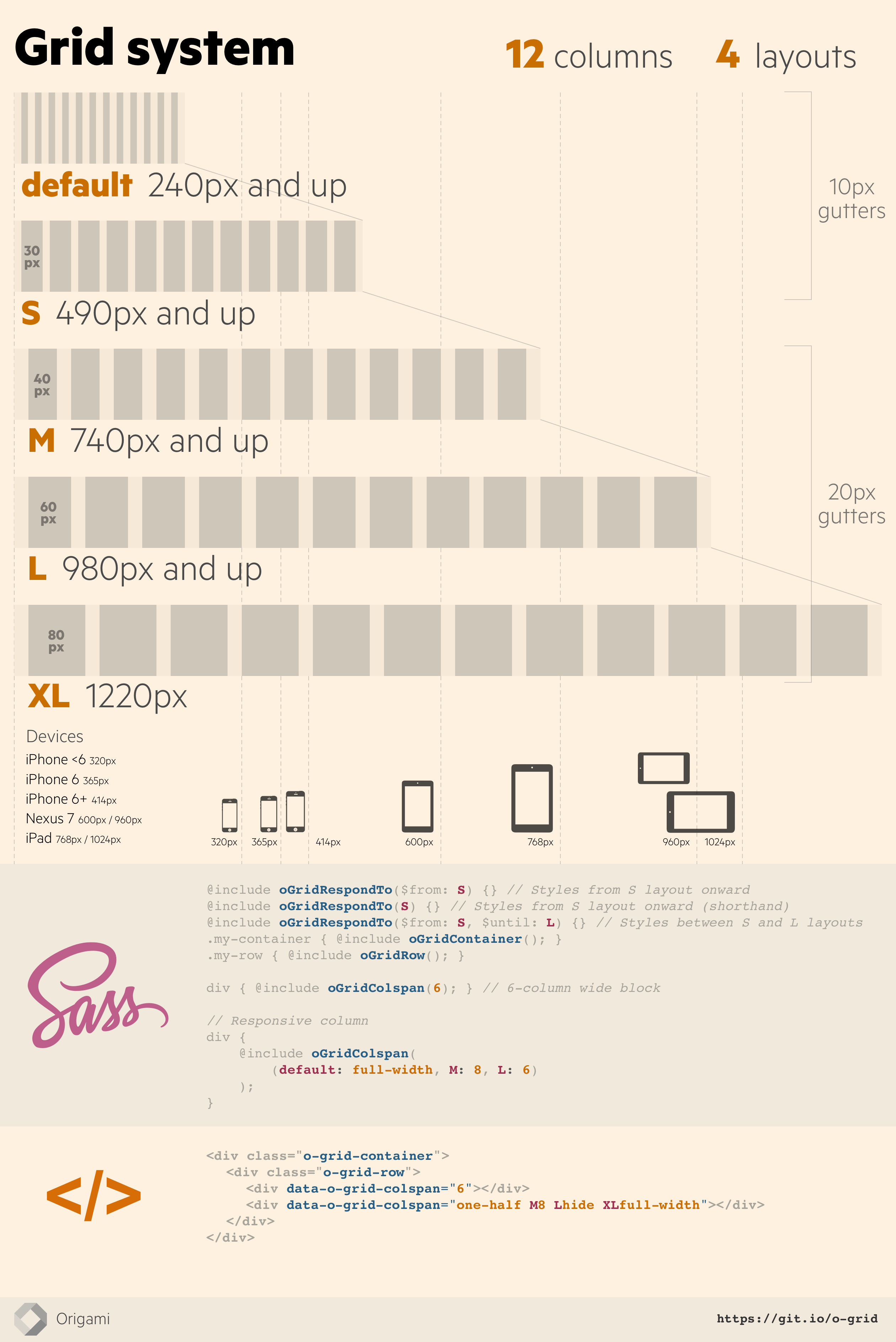
一个12个专栏的响应性弹性框网格系统,用于提供文件、模板和组件.
这个组件是Sass样式的集合来构建12个列网格系统,其中有一些JavaScript帮助器.
我们的网格包括:
- 12个栏,大小相同.
- 5个布局(断点)来支撑各种大小的设备.
- 宽度可变的沟口,根据当前布局进行调整.
- 默认最大页宽为1220px.
使用量
检查出来 如何将 Origami 组件纳入您的项目 开始 o-grid。 。 。 .
快速启动
// your-app/main.scss
@import '@financial-times/o-grid/main';
@include oGrid();
// your-app/main.js

// Return the current layout (e.g. default, S, M, L, XL)
import oGrid from '@financial-times/o-grid';
let currentLayout = oGrid.getCurrentLayout();
console.log(currentLayout);

// Return the current gutter (e.g. 10px, 20px)
import oGrid from '@financial-times/o-grid';
let currentGutter = oGrid.getCurrentGutter();
console.log(currentGutter);
网格维度
常规设置
- 最小宽度: 240px
- 最大宽度: 1220px
- 宽度( 列之间的间距) :
- 小屏幕上显示 10px
- 在更大的屏幕上显示 20px
- 栏数:12
布局大小
- 默认 240px - - ) (中文(简体) )
- 小型( S) 490px - 739px (英语)
- 中 (男) 740px - 979px (英语)
- 大型( L) 980px到 1219px (英语)
- 额外大( XL) 1220px (英语)
交接笔记
工程师可能选择使用o-grid Origami组件来构建一个基于网络的项目来适应我们的网格,并对布局变化做出反应,但这在每一种情景中可能并不在技术上合适,特别是在适合旧浏览器倒回更简单的布局的情况下.
重要的是,不要对这些用户使用的设备或最常见的屏幕大小作出假设。 最好专注于您设计的内容,并在设计时可用的空间发生变化时根据需要进行调整,而不是等待撞击特定的断点.
标记
公用事业类
<div class="o-grid-container">
    <div class="o-grid-row">
        <!-- two divs, spanning a total of 12 columns -->
        <div data-o-grid-colspan="8">A div, 8 columns wide</div>
        <div data-o-grid-colspan="4">Another div, 4 columns wide</div>
    </div>
</div>
响应栏
每个布局设置一列数 :
<div class="o-grid-container">
    <div class="o-grid-row">
        <div data-o-grid-colspan="6 L8" class="first-column">
            Half by default, then 8 columns wide on Large layout and up
        </div>
        <div data-o-grid-colspan="6 L4" class="second-column">
            Half by default, then 4 columns wide on Large layout and up
        </div>
    </div>
</div>
div {
    @include oGridContainer();

    > div {
        @include oGridRow();
    }
}

.first-column {
    // Half by default, then 8 columns wide on Large layout and up
    @include oGridColspan((default: 6, L: 8));
}
.second-column {
    // Half by default, then 4 columns wide on Large layout and up
    @include oGridColspan((default: 6, L: 4));
}
使用数字
{0-12}- 默认需要跨行数S{0-12}- 在小布局上和上行所要覆盖的列数M{0-12}- 中度布局和上行所要覆盖的列数L{0-12}- 在大布局和上行所要跨行数XL{0-12}- 在额外的大布局上和上行需要跨行的列数
<div data-o-grid-colspan="6 L8"></div>
div { @include oGridColspan((default: 6, L: 8)); }
使用关键字
hideone-halfone-third, (中文(简体) ),two-thirdsone-quarter, (中文(简体) ),three-quarters
<div data-o-grid-colspan="one-half Ltwo-thirds"></div>
div { @include oGridColspan((default: one-half, L: two-thirds)); }
实例
所有大小的全宽列,但大屏幕和上行除外,在9个列上横跨:
<div data-o-grid-colspan="full-width L9"></div>
div { @include oGridColspan((default: full-width, L: 9)); }
半宽柱成为中屏幕上和上方的全宽:
<div data-o-grid-colspan="one-half M12"></div>
div { @include oGridColspan((default: one-half, M: 12)); }
随着屏幕变小,一个列逐渐占据了更大部分水平空间:
<div data-o-grid-colspan="4 M3 L2 XL1"></div>
div { @include oGridColspan((default: 4, M: 3, L: 2, XL: 1)); }
有一栏 width: auto 在小屏幕上,然后取出中屏幕上一半的可用空间并上:
<div data-o-grid-colspan="M6"></div>
div { @include oGridColspan((M: 6)); }
萨斯
包括所有样式 oGrid 混合剂.
@include oGrid();
选项
o-grid 可通过将选项传送到 oGrid 混合剂.
@include oGrid($opts: (
    'bleed': true,
    'shuffle-selectors': true,
    'friendly-selectors': true,
    'surface': ('current-layout', 'layout-sizes'),
    'rows': ('compact')
));
如果你不想用的话 o-grid 标记的样式 surface 选项可以独立包含,以便启用 JavaScript 特性:
// Surface current breakpoint and gutter size information to JavaScript.
// Supports `getGridBreakpoints` and `enableLayoutChangeEvents`
// JavaScript methods.
@include oGridSurfaceLayoutSizes();

// Surface grid breakpoints to JavaScript.
// Supports the `getCurrentLayout` and `getCurrentGutter` JavaScript methods.
@include oGridSurfaceCurrentLayout();
高级用途
公用事业
隐藏元素
hide 栏中,请再次显示它L)布局大小,并藏于最大(XL)布局大小:
<div data-o-grid-colspan="hide L12 XLhide"></div>
div { @include oGridColspan((default: hide, L: 12, XL: hide)); }
居中设置一列
center 栏和 uncenter 纵然如此L)布局大小:
<div data-o-grid-colspan="center Luncenter"></div>
.my-column {
    @include oGridCenter;

    @include oGridRespondTo(L) {
        @include oGridUncenter;
    }
}
推和拉列
<div data-o-grid-colspan="8 push4"></div>
<div data-o-grid-colspan="4 pull8"></div>
// Content is first in the source
.content {
    @include oGridColspan(8);
    @include oGridPush(4); // outputs left: -33.333333333%;
}

// Sidebar comes second in the source but appears first on the left
.sidebar {
    @include oGridColspan(4);
    @include oGridPull(8); // outputs right: -66.666666667%;
}
回应:
<div data-o-grid-colspan="L8 Lpush4"></div>
<div data-o-grid-colspan="L4 Lpull8"></div>
// Content is first in the source
.content {
    @include oGridColspan((L: 8));
    @include oGridRespondTo(L) {
        @include oGridPush(4); // outputs left: -33.333333333%;
    }
}

// Sidebar comes second in the source but appears first on the left
.sidebar {
    @include oGridColspan((L: 4));
    @include oGridRespondTo(L) {
        @include oGridPull(8); // outputs right: -66.666666667%;
    }
}
在列前添加空格
<div data-o-grid-colspan="8 offset4"></div>

<div data-o-grid-colspan="L8 Loffset4"></div>
div {
    @include oGridColspan(8);
    @include oGridOffset(4); // outputs margin-left: 33.333333333%;
}

div {
    @include oGridColspan((L: 8));

    @include oGridRespondTo(L) {
        @include oGridOffset(4); // outputs margin-left: 33.333333333%;
    }
}
收缩( 无粘结)行
要清除一行列之间的沟槽,请使用 o-grid-row--compact 类或 oGridRowCompact() 组合 :
<div class="o-grid-row o-grid-row--compact">
    <div data-o-grid-colspan="6">Look 'ma, no gutters</div>
    <div data-o-grid-colspan="6">Look 'pa, no gutters here either</div>
</div>
div {
    @include oGridContainer();

    > div {
        @include oGridRow();
        @include oGridRowCompact('.column');
    }

    .column {
        @include oGridColspan((default: full-width, S: 3));
    }
}
全出血容器
要从电网容器的左右两侧取出沟槽,请使用 o-grid-container--bleed 课。 请注意,不可能为单行清除外沟,而是需要启动一个新的容器.
<div class="o-grid-container o-grid-container--bleed">
    <div class="o-grid-row o-grid-row--compact">
        <div data-o-grid-colspan="6">Look 'ma, no gutters</div>
        <div data-o-grid-colspan="6">Look 'pa, no gutters here either</div>
    </div>
</div>
响应列帮助器
简而言之,下面的例子不会显示给Internet Explorer带来支持的输出代码.
将列属性赋予元素
el { @include oGridColspan(); }
产出:
// Fallbacks for Internet Explorer omitted in this example
el {
    position: relative;
    float: left;
    box-sizing: border-box;
    flex: 1 1 0%;
    padding-left: 10px;
}
@media (min-width: 46.25em) {
    el {
        padding-left: 20px;
    }
}
给元素加宽
el { @include oGridColspan($span: 4); }
产出:
el {
    position: relative;
    float: left;
    box-sizing: border-box;
    flex: 1 1 0%;
    padding-left: 10px;
    display: block;
    flex-basis: 33.33333%;
    min-width: 33.33333%;
    max-width: 33.33333%;
    width: 33.33333%;
}
@media (min-width: 46.25em) {
    el {
        padding-left: 20px;
    }
}
不同布局的响应宽度
el {
    @include oGridColspan((
        default: full-width,
        M: 6
    ));
}
产出:
el {
    position: relative;
    float: left;
    box-sizing: border-box;
    flex: 1 1 0%;
    padding-left: 10px;
    display: block;
    flex-basis: 100%;
    min-width: 100%;
    max-width: 100%;
    width: 100%;
}
@media (min-width: 46.25em) {
    el {
        display: block;
        flex-basis: 50%;
        min-width: 50%;
        max-width: 50%;
        padding-left: 20px;
    }
}
响应布局辅助工具
@include oGridRespondTo($from, $until) {
    // Styles
}
要创建与网格相同的断点对应的样式,这个萨斯混音可以用来将样式包装在适当的媒体查询中. 应该通过 S, (中文(简体) ), M, (中文(简体) ), L 或者说 XL 视何种布局大小,样式应适用于例如.
@include oGridRespondTo(S) {
    .o-example-module .item-subheading {
        font-size: 0.5em;
    }
}
.o-example-module .item-subheading {
    @include oGridRespondTo(XL) {
        color: red;
    }
}
.o-example-module .item-subheading {
    @include oGridRespondTo($until: L) {
        width: auto;
    }
}
它依赖 萨斯MQ 以输出移动先@ 媒体查询.
$from 包容性,但 $until 实值 独家 -比如说. @include oGridRespondTo(S, L) 匹配断点 S 财务报告和审定财务报表 M,但不会 L。 。 。 .
盖特斯
el {
    margin-left: oGridGutter();

    @include oGridRespondTo(L) {
        margin-left: oGridGutter(L);
    }
}
产出:
el {
    margin-left: 10px;
}

@media (min-width: 61.25em) {
    el {
        margin-left: 20px;
    }
}
无风格 一行或一列
.un-rowify {
    @include oGridResetRow;
}

.de-columnify {
    @include oGridResetColumn;
}
变量
网格使用的一些变量(参见: 可变.cs)可用于自定义网格系统.
以下是最有用的:
// Show the currently active breakpoint and output loaded settings
$o-grid-debug-mode: true;

// Gutters (distance between 2 columns), in pixels
$o-grid-gutters: (default: 10px, M: 20px);

// Grid mode
// - fluid: full width up to the largest layout's width
// - snappy  fluid width until the layout defined in $o-grid-start-snappy-mode-at (default: M),
//           and then snaps into a larger fixed layout at each breakpoint
// - fixed: always fixed-width with the layout defined by
//          $o-grid-fixed-layout (default: L)
$o-grid-mode: fluid (default) | snappy | fixed;

// Default layouts
$o-grid-layouts: (
    S:  490px,
    M:  740px,
    L:  980px,
    XL: 1220px,
);
添加布局
需要添加其他断点/放出点的产品应当使用帮助器 oGridAddLayout()数字 :
@import '@financial-times/o-grid/main';

// Add various layouts
@include oGridAddLayout(
    $layout-name: XS,
    $layout-width: 360px
);
@include oGridAddLayout(
    $layout-name: P,
    $layout-width: 600px,
    $gutter-width: 24px
);

// Layouts are now:
//   XS: 360px,
//   S: 490px,
//   P: 600px,
//   M: 740px,
//   L: 980px,
//   XL: 1220px

// Include all o-grid styles, including:
// - Surface the layout currently displayed to make it readable in JS
// - Generate grid helpers classes and data attributes.
@include oGrid();
抓取模式
随着取景口变大,容器大小可以在固定宽度之间相接:
<!-- Make the whole document snappy -->
<body class="o-grid-snappy">
    <div class="o-grid-container">
        <div class="o-grid-row">
            …
        </div>
    </div>
</body>

<!-- Make a container snappy -->
<div class="o-grid-container o-grid-container--snappy">
    <div class="o-grid-row">
        …
    </div>
</div>
调试模式
启用调试模式以查看页面右上角当前活动断点( 基于 sass-mq的出场点 特性).
$o-grid-debug-mode: true;

Java 脚本帮助工具
getCurrentLayout()
返回当前显示的布局名称.
import oGrid from '@financial-times/o-grid';

console.log(oGrid.getCurrentLayout());
// > default | S | M | L | XL
CSS必须包含这样JavaScript可以检索布局信息. 如果使用 萨斯 编辑 oGrid 混合,确保 surface 选项 包含 current-layout;或 包括 oGridSurfaceCurrentLayout 如果您的项目没有使用任何 o- grid 标记, 请混合 .
getCurrentGutter()
返回当前显示的沟道宽度.
import oGrid from '@financial-times/o-grid';

console.log(oGrid.getCurrentGutter());
// > 10px | 20px
CSS必须包含这样JavaScript可以检索布局信息. 如果使用 萨斯 编辑 oGrid 混合,确保 surface 选项 包含 current-layout;或 包括 oGridSurfaceCurrentLayout 如果您的项目没有使用任何 o- grid 标记, 请混合 .
getGridBreakpoints()
返回所有可用网格断点的大小.
import oGrid from '@financial-times/o-grid';

console.log(oGrid.getGridBreakpoints());
// > { "layouts": { "S": "490px", "M": "740px", "L": "980px", "XL": "1220px" } }
CSS必须包含这样JavaScript可以检索布局信息. 如果使用 萨斯 编辑 oGrid 混合,确保 surface 选项 包含 layout-sizes;或 包括 oGridSurfaceLayoutSizes 如果您的项目没有使用任何 o- grid 标记, 请混合 .
enableLayoutChangeEvents()
启用匹配点火的媒体查询 o-grid.layoutChange 更改布局时的事件.
import oGrid from '@financial-times/o-grid';

oGrid.enableLayoutChangeEvents();
CSS必须包含这样JavaScript可以检索布局信息. 如果使用 萨斯 编辑 oGrid 混合,确保 surface 选项 包含 layout-sizes;或 包括 oGridSurfaceLayoutSizes 如果您的项目没有使用任何 o- grid 标记, 请混合 .
网格书签
-
使用此 URL 创建新书签 :
javascript:(function(){var s=document.createElement("script");s.src="https://unpkg.com/@financial-times/o-grid@^6.0.0/bookmarklet/bookmarklet.js";document.head.appendChild(s);}()); -
装入一个网站
-
单击书签( 上方应显示)
-
检查网格上布局的校正

移徙
| 状态 | 主要版本 | 最后一个小版本 | 移徙指南 |
|---|---|---|---|
| 活动 | 单位3 | 不详 | 迁移到 o3 |
| 维护 | 6个 | 不详 | 迁移到 v5 |
| 已贬值 | 页:1 | 不详 | 迁移到 v5 |
| 已贬值 | 页:1 | 4.5 国家 | 迁移到 v4 |
| 已贬值 | 3个 | 3.2 国家 | - 说吧 |
| 已贬值 | 2个 | 2.4 国家 | - 说吧 |
| 已贬值 | 1个 | 1.4 (中文(简体) ) | - 说吧 |
联系人
如果您对本部分有任何问题或评论,或需要帮助使用本部分,请 提出问题访问 #origami - 支持 或电子邮件 折纸支持。 。 。 .
许可证
版权 (c)2016金融时报有限公司. 版权所有.
该软件在以下 麻省理工学院许可证。 。 。 .