
FlowDrop™


Build beautiful workflow editors in minutes, not months.
An awesome workflow editor built with Svelte 5 and @xyflow/svelte.
You own the backend. You own the data. You own the orchestration.
Quickstart • Features • Integration • Docs
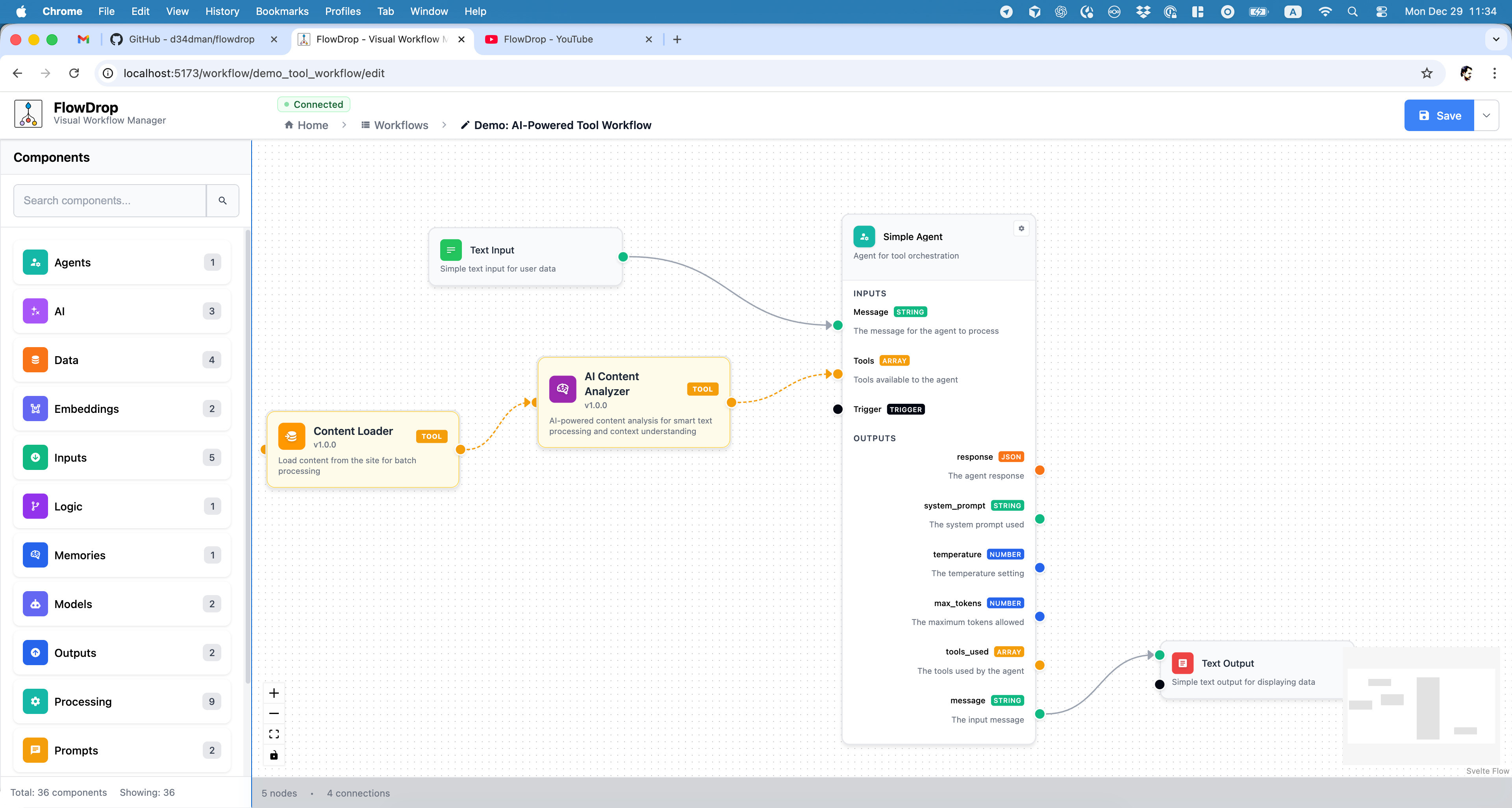
Build AI-powered workflows with drag-and-drop simplicity. Connect nodes, configure inputs/outputs, and visualize your entire pipeline.
Why FlowDrop?
Most workflow tools are SaaS platforms that lock you in. Your data lives on their servers. Your execution logic runs in their cloud. You pay per workflow, per user, per run.
FlowDrop is different.
FlowDrop is a pure visual editor. You implement the backend. You control the orchestration. Your workflows run on your infrastructure, with your security policies, at your scale.
No vendor lock-in. No data leaving your walls. No surprise bills.
npm install @flowdrop/flowdrop
Note: FlowDrop supports multiple editor instances per page — each mount gets its own isolated state container. See Architecture Notes for details.
You get a production-ready workflow UI. You keep full control of everything else.
Quickstart
<script lang="ts">
  import { App } from '@flowdrop/flowdrop';
  import '@flowdrop/flowdrop/styles/base.css';
</script>

<App />
5 lines. One fully-functional workflow editor.
Features
| Visual Editor Only | Pure UI component. No hidden backend, no external dependencies |
| You Own Everything | Your data, your servers, your orchestration logic, your security policies |
| Backend Agnostic | Connect to any API: Drupal, Laravel, Express, FastAPI, or your own |
| 8 Built-in Node Types | From simple icons to complex gateway logic |
| Framework Flexible | Use as Svelte component or mount into React, Vue, Angular, or vanilla JS |
| Deploy Anywhere | Runtime config means build once, deploy everywhere |
Architecture Notes
- Multiple instances per page. Each mount gets its own
FlowDropInstancestate container (workflow, undo/redo history, playground sessions, registries, API context, drafts), so editors on the same page are fully isolated. In 2.0 there are no module-level store APIs — resolve state withgetInstance()inside the component tree or the mount handle's.instanceoutside it. The first mount without aninstanceIdbecomes the page-default instance; passinstanceIdto additional mounts to scope their draft/panel storage keys. Theme and settings remain page-global by design. - Svelte 5 required. FlowDrop uses Svelte 5 runes (
$state,$derived,$effect) throughout. Svelte 4 is not supported. - Modern browsers only. The library targets ES2020+ and does not include polyfills for older browsers.
Node Types
FlowDrop ships with 8 beautifully designed node types:
| Type | Purpose |
|---|---|
default | Full-featured nodes with inputs/outputs |
simple | Compact, space-efficient layout |
square | Icon-only minimal design |
tool | AI agent tool nodes |
gateway | Conditional branching logic |
terminal | Start/end workflow points |
note | Markdown documentation blocks |
idea | Conceptual BPMN-like flow nodes |
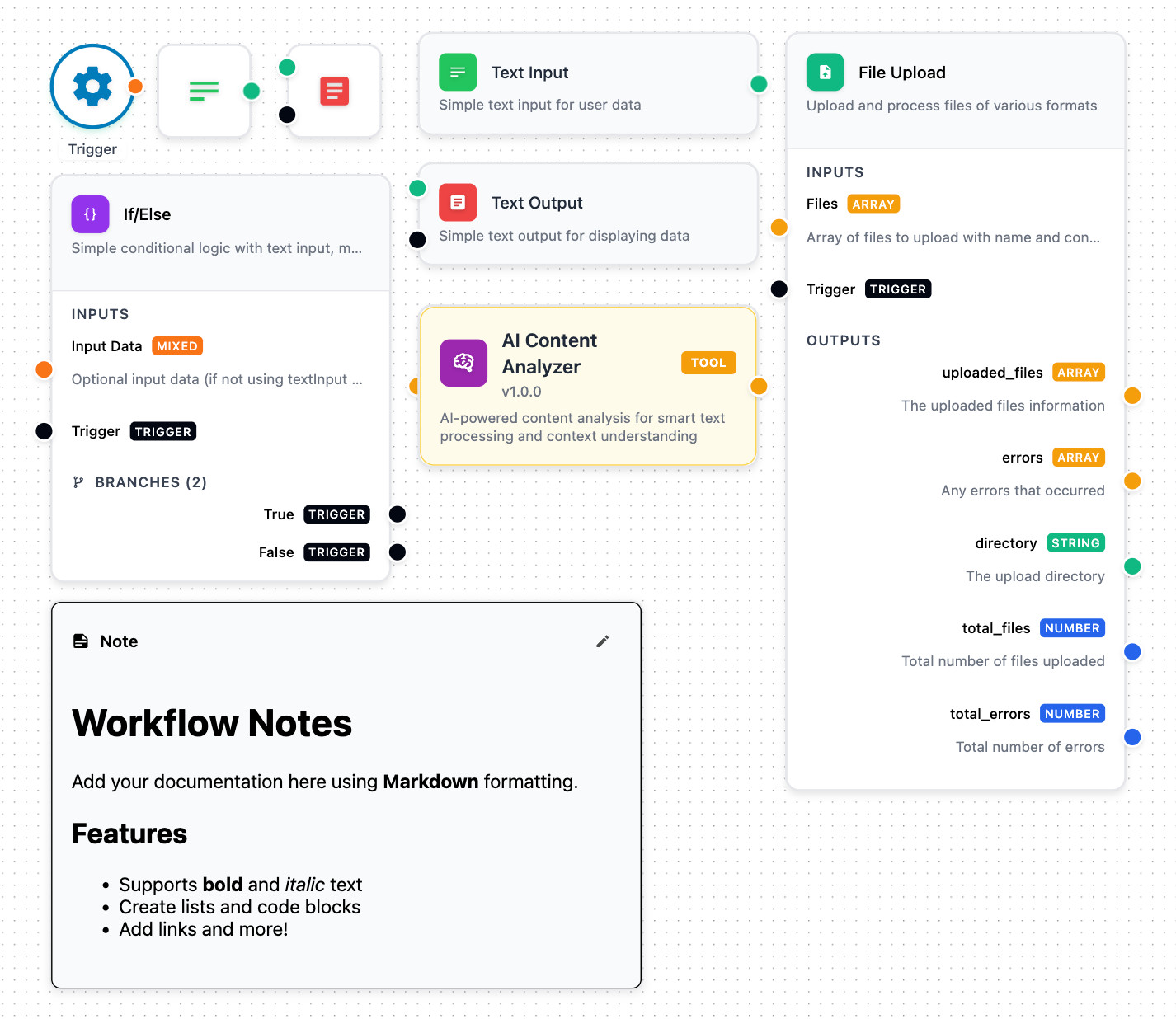
From simple triggers to complex branching logic, each node type is designed for specific workflow patterns.
Themes
FlowDrop includes a theme system with built-in light/dark support:
<script lang="ts">
  import { App } from '@flowdrop/flowdrop';
  import '@flowdrop/flowdrop/styles';
</script>

<!-- Built-in themes: 'default' or 'minimal' -->
<App theme="minimal" />
Themes bundle a visual skin (CSS token palette) with behavioral UI defaults. You can also pass a custom theme object with your own skin tokens for full control over the light and dark palettes.
// Via the mount API
const app = await mountFlowDropApp(container, {
  theme: 'minimal'
  // or a custom theme object:
  // theme: { name: 'minimal', skin: { tokens: { primary: '#e11d48' } } }
});
Customising messages
Every user-facing string flows through a typed Messages tree. Pass a callback to override any subset:
<App messages={() => ({ form: { schema: { save: 'Apply' } } })} />
Wire the callback to your i18n library (paraglide-js, sveltekit-i18n, etc.) — locale changes propagate automatically. See the i18n & Custom Messages guide for the full shape and a paraglide-js worked example.
Sub-Module Exports
FlowDrop provides tree-shakeable sub-module exports so you can import only what you need:
| Export Path | Contents |
|---|---|
@flowdrop/flowdrop | Slim front door: App, mount functions, createFlowDropInstance, getInstance, auth providers, core bootstrap types |
@flowdrop/flowdrop/core | Types and utilities only (no heavy dependencies) |
@flowdrop/flowdrop/editor | WorkflowEditor, stores, services |
@flowdrop/flowdrop/form | SchemaForm, form fields, registry |
@flowdrop/flowdrop/form/code | Code editor field (CodeMirror) |
@flowdrop/flowdrop/form/markdown | Markdown editor field |
@flowdrop/flowdrop/display | MarkdownDisplay component |
@flowdrop/flowdrop/ui | Design-system components: primitives, surfaces, Input, Textarea (experimental in 2.x) |
@flowdrop/flowdrop/playground | Playground components and services |
@flowdrop/flowdrop/settings | SettingsPanel, stores, services |
@flowdrop/flowdrop/styles | Base CSS stylesheet |
@flowdrop/flowdrop/schema | Workflow JSON schema |
@flowdrop/flowdrop/openapi | OpenAPI spec (YAML) for the FlowDrop backend API |
@flowdrop/flowdrop/webmcp | WebMCP editor tools for browser agents: attachWebMCP, createToolRuntime, approval gate (experimental in 2.x) |
Entries marked experimental may change in a minor release while their API settles; every change is listed in the CHANGELOG. Pin a minor version (~2.16.0) if you depend on one. All other entries follow semantic versioning.
OpenAPI spec
The full OpenAPI spec for the FlowDrop backend API ships with the package, version-matched to your installed release. It defines the node-config / form-element schema (ConfigProperty), playground messages, and every endpoint. Resolve it from @flowdrop/flowdrop/openapi, or read it directly at node_modules/@flowdrop/flowdrop/dist/openapi/v1/openapi.yaml. Point your AI assistant at that file when authoring node config schemas. The latest spec is also browsable at api.flowdrop.io.
Integration
Svelte (Native)
<script>
  import { WorkflowEditor, NodeSidebar } from '@flowdrop/flowdrop/editor';
</script>

<div class="flex h-screen">
  <NodeSidebar {nodes} />
  <WorkflowEditor />
</div>
Vanilla JS / React / Vue / Angular
import { mountFlowDropApp, createEndpointConfig } from '@flowdrop/flowdrop';

const app = await mountFlowDropApp(document.getElementById('editor'), {
  workflow: myWorkflow,
  endpointConfig: createEndpointConfig('/api/flowdrop'),
  eventHandlers: {
    onDirtyStateChange: (isDirty) => console.log('Unsaved changes:', isDirty),
    onAfterSave: (workflow) => console.log('Saved!', workflow)
  }
});

// Full control over the editor
app.save();
app.getWorkflow();
app.destroy();
Enterprise Integration
import { mountFlowDropApp, CallbackAuthProvider } from '@flowdrop/flowdrop';

const app = await mountFlowDropApp(container, {
  // Dynamic token refresh
  authProvider: new CallbackAuthProvider({
    getToken: () => authService.getAccessToken(),
    onUnauthorized: () => authService.refreshToken()
  }),

  // Lifecycle hooks
  eventHandlers: {
    onBeforeUnmount: (workflow, isDirty) => {
      if (isDirty) saveDraft(workflow);
    }
  },

  // Auto-save, toasts, and more
  features: {
    autoSaveDraft: true,
    autoSaveDraftInterval: 30000
  }
});
API Configuration
Connect to any backend in seconds:
import { createEndpointConfig } from '@flowdrop/flowdrop';

const config = createEndpointConfig('https://api.example.com', {
  endpoints: {
    nodes: { list: '/nodes', get: '/nodes/{id}' },
    workflows: {
      list: '/workflows',
      get: '/workflows/{id}',
      create: '/workflows',
      update: '/workflows/{id}',
      execute: '/workflows/{id}/execute'
    }
  }
});
Customization
The recommended way to customize FlowDrop's appearance is through the theme system. For fine-grained control, you can also override individual CSS custom properties:
:root {
  --fd-background: #0a0a0a;
  --fd-primary: #6366f1;
  --fd-border: #27272a;
  --fd-foreground: #fafafa;
}
Deploy
Docker (Recommended)
cd ../../apps/example-client-docker
cp env.example .env
docker-compose up -d
Node.js
npm run build
FLOWDROP_API_BASE_URL=http://your-backend/api node build
Runtime configuration means you build once and deploy to staging, production, or anywhere else with just environment variables.
Specification
The editor implements the FlowDrop Workflow Specification, version 1.0: the rules a FlowDrop workflow obeys, stated independently of any one implementation. The specification has 386 numbered rules (217 core, 167 extended, 2 optional) covering how a workflow is written, stored, validated and executed, with rulings for the hard cases and conformance fixtures you can run against your own backend. Rules are also published as machine-readable JSON, and the source is on GitHub.
Documentation
| Resource | Description |
|---|---|
| QUICK_START.md | Get running in 5 minutes |
| API Documentation | REST API specification |
| Workflow Specification | Rules for workflows |
| CHANGELOG.md | Version history |
Development
pnpm install         # Install dependencies
pnpm dev             # Start dev server
pnpm build           # Build library
pnpm test            # Run all tests
pnpm storybook       # Launch Storybook
Contributing
FlowDrop is stabilizing. Contributions will open soon. Star the repo to stay updated.
FlowDrop - The visual workflow editor you own completely
Built with ❤️ Svelte 5 and @xyflow/svelte