react-circular-slider


A highly customizable circular slider with zero dependencies. Check out the live demos!
TypeScript Support
This component includes TypeScript types for the component props, ref handle, knob positions, and gradient stops.
JavaScript users: no worries - the published output is plain JavaScript and works exactly as before.
Installation
npm install @fseehawer/react-circular-slider
Example
import React from 'react';
import CircularSlider from '@fseehawer/react-circular-slider';

const App = () => (
    <CircularSlider onChange={(value) => console.log(value)} />
);

export default App;
Configuration Examples
See the live demos for copy-ready examples covering labels, colors, custom data, knob content, multi-stop gradients, and arc gauges.
Configuration Notes
- Use
datafor custom labels or non-linear steps; useminandmaxfor inclusive numeric ranges. - Use
dataIndexto choose the selected item indata, andvalueonly when controlling the slider by degrees. - Use
ariaLabelwhen the visiblelabelis abbreviated, hidden, or not descriptive enough for assistive technology. - Use
arcStartandarcEndfor gauge-style sliders. AddtrackDraggablewhen users should be able to click or drag the track. - In arc mode, gradient stops run from
arcStarttoarcEnd, which keeps gauge colors in value order.
Props
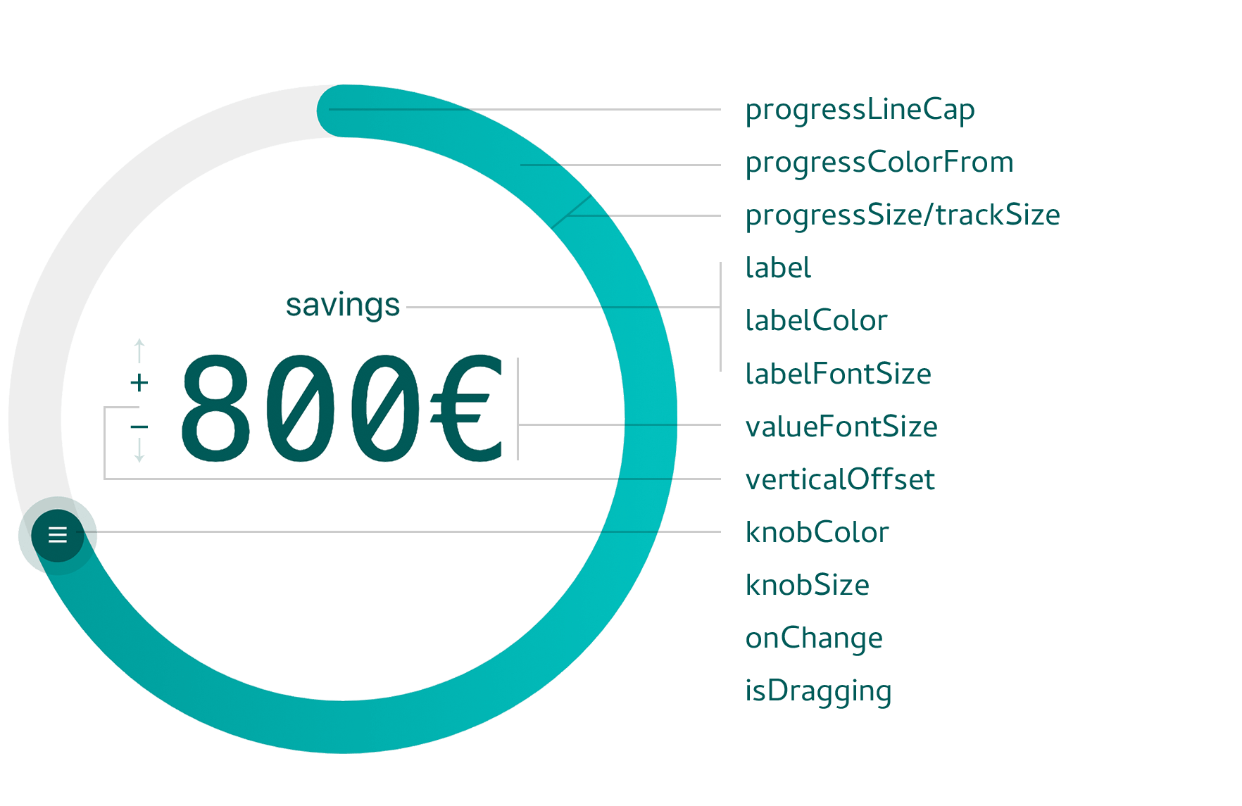
The table below lists all available props along with their TypeScript types, default values, and descriptions.
| Prop | Type | Default | Description |
|---|---|---|---|
width | number | 280 | Width of the slider in pixels. |
direction | 1 | -1 | 1 | Rotation direction: 1 for clockwise, -1 for anticlockwise. |
min | number | 0 | Minimum value. |
max | number | 360 | Maximum value. |
initialValue | number | 0 | Initial value for the label. |
value | number | undefined | Controlled value in degrees. |
data | (string | number)[] | [] | Array of values or labels, evenly spread over the slider. |
dataIndex | number | 0 | Initial or controlled index position in the data array. |
knobColor | string | "#4e63ea" | Color of the knob. |
knobSize | number | 36 | Diameter of the knob in pixels. |
hideKnob | boolean | false | If true, the knob is hidden. |
hideKnobRing | boolean | false | If true, the translucent ring around the knob is hidden. |
knobDraggable | boolean | true | If true, the knob is draggable. |
knobPosition | string | number | "top" | Starting position: accepts "top", "right", "bottom", "left" or an angle (in degrees). |
label | string | "ANGLE" | Text label displayed on the slider. |
ariaLabel | string | undefined | Accessible label for the slider control. Falls back to label. |
labelColor | string | "#272b77" | Color of the label and value text. |
labelBottom | boolean | false | If true, the label is positioned below the slider. |
labelFontSize | string | "1rem" | Font size of the label. |
valueFontSize | string | "3rem" | Font size of the displayed value. |
appendToValue | string | "" | Text appended to the value. |
prependToValue | string | "" | Text prepended to the value. |
renderLabelValue | React.ReactNode | null | Custom JSX for rendering the label and value. |
verticalOffset | string | "1.5rem" | Vertical offset for the label/value display. |
hideLabelValue | boolean | false | If true, both the label and value are hidden. |
progressColorFrom | string | "#80C3F3" | Start color for the progress gradient. |
progressColorTo | string | "#4990E2" | End color for the progress gradient. |
progressSize | number | 8 | Thickness of the progress track. |
progressLineCap | "round" | "butt" | "round" | Cap style for the progress track. |
useMouseAdditionalToTouch | boolean | false | If true, also listens for mouse input on touch-capable devices. |
trackColor | string | "#DDDEFB" | Color of the background track. |
trackSize | number | 8 | Thickness of the background track. |
trackDraggable | boolean | false | If true, clicking or dragging the background track updates the value. |
progressGradient | (string | GradientStop)[] | undefined | Array of color stops for a multi-stop progress gradient. Overrides progressColorFrom/To. Each stop can be a color string or { offset, stopColor, stopOpacity }. |
trackGradient | (string | GradientStop)[] | undefined | Array of color stops for a multi-stop track gradient. Overrides trackColor. |
arcStart | number | undefined | Start angle (in degrees) for arc mode. Use with arcEnd to create a partial-circle gauge (e.g. 225 for lower-left). |
arcEnd | number | undefined | End angle (in degrees) for arc mode. Use with arcStart (e.g. 135 for lower-right = 270° speedometer sweep). |
children | React.ReactNode | undefined | Custom knob content. |
limitDragRange | boolean | false | If true, clamps drag movement to the configured data range. |
onChange | (value: string | number) => void | () => {} | Callback fired when the value changes. |
isDragging | (dragging: boolean) => void | () => {} | Callback to signal whether the slider is being dragged. |