Mantine Rings Progress Component


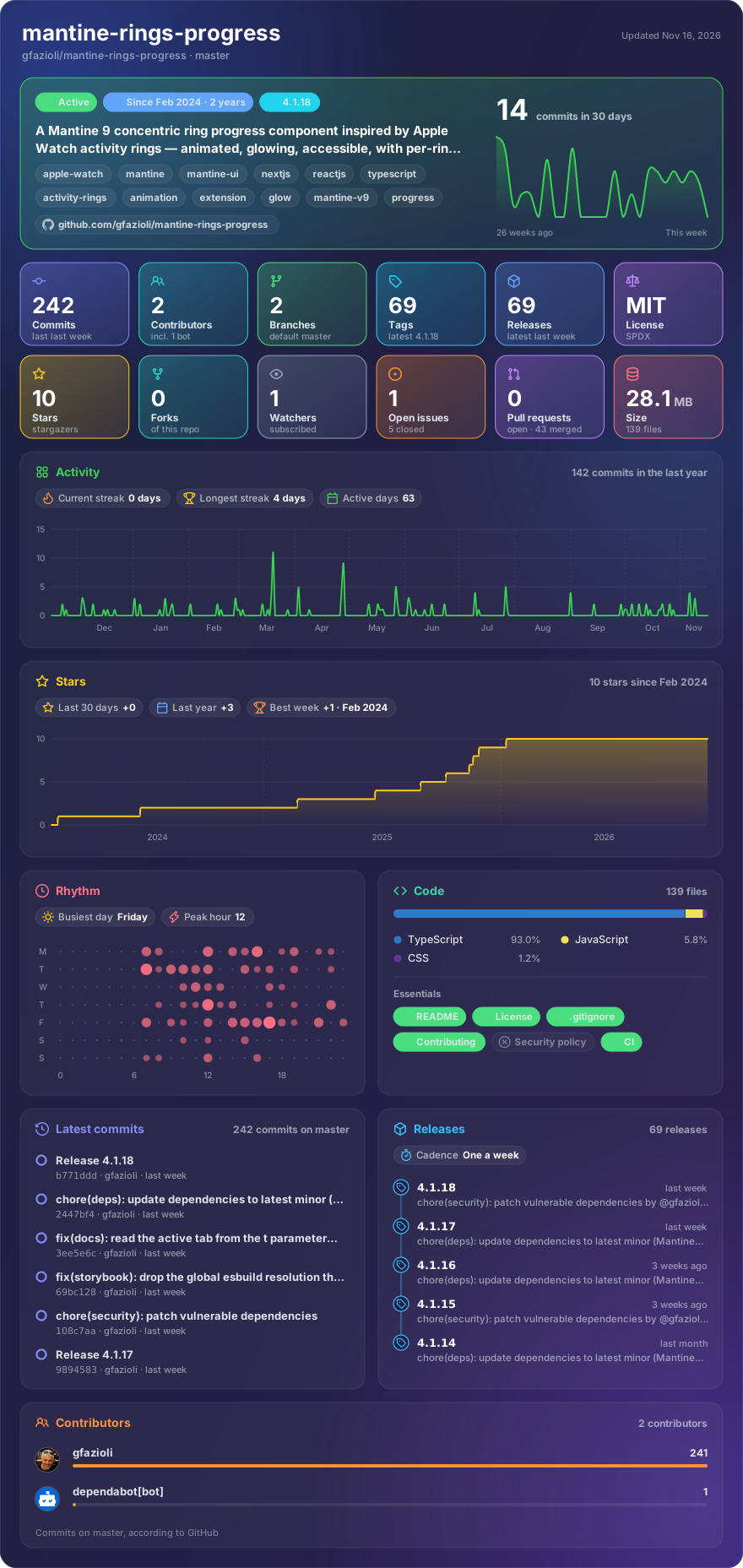
Made with glancecard · refreshed daily
Overview
This component is created on top of the Mantine library. It requires Mantine 9.x and React 19.
Mantine Rings Progress is a Mantine UI extension that renders multiple concentric ring progress indicators — inspired by the Apple Watch activity rings. Each ring is defined by a value and color, and the component wraps native Mantine RingProgress instances with rich customization options.
Features
- Per-ring customization — Override
thickness,roundCaps, androotColoron individual rings - Per-ring linear gradients — Paint a ring's stroke with a two-stop gradient via
gradient: { from, to, deg? } - Per-ring value labels —
showValues(or per-ringshowValue) drops a styled pill at the endpoint of each arc, with customformatValue - Per-ring interactions —
onClickandonHovercallbacks with geometric hit-testing, so the right ring fires even when their wrappers overlap - Entrance animation — Animate rings from 0 to their target values on mount
- Staggered animation — Animate rings one after another with configurable delay
- Animated value changes —
animateValueChangesinterpolates value updates after mount (great for live dashboards) - Glow / neon effect —
drop-shadowglow that follows the ring shape, with per-ring intensity and color - Pulse on completion — Subtle pulse animation when a ring reaches 100%, with
onRingCompletecallback - Start angle & direction — Customize where rings start filling and in which direction (clockwise/counterclockwise)
- Unified tooltip —
withTooltipshows a chart-like tooltip with color swatches for all rings - Accessibility —
role="progressbar"with ARIA attributes on each ring, keyboard activation for clickable rings,prefers-reduced-motionsupport - Central label — Display any React node (text, emoji, component) centered in the rings
[!note]
→ Demo and Documentation → Youtube Video → More Mantine Components
Installation
npm install @gfazioli/mantine-rings-progress
or
yarn add @gfazioli/mantine-rings-progress
After installation import package styles at the root of your application:
import '@gfazioli/mantine-rings-progress/styles.css';
Usage
import { RingsProgress } from '@gfazioli/mantine-rings-progress';

function Demo() {
  const rings = [
    { value: 75, color: 'green' },
    { value: 50, color: 'blue' },
    { value: 90, color: 'orange' },
  ];

  return (
    <RingsProgress
      size={180}
      rings={rings}
      animate
      staggerDelay={300}
      transitionDuration={1000}
      glow={6}
    />
  );
}
Sponsor
Your support helps me:
- Keep the project actively maintained with timely bug fixes and security updates
- Add new features, improve performance, and refine the developer experience
- Expand test coverage and documentation for smoother adoption
- Ensure long‑term sustainability without relying on ad hoc free time
- Prioritize community requests and roadmap items that matter most
Open source thrives when those who benefit can give back—even a small monthly contribution makes a real difference. Sponsorships help cover maintenance time, infrastructure, and the countless invisible tasks that keep a project healthy.
Your help truly matters.
💚 Become a sponsor today and help me keep this project reliable, up‑to‑date, and growing for everyone.
https://github.com/user-attachments/assets/de494ff9-5e3c-4026-bdc3-0402110917e7