Kazoku UI 家族
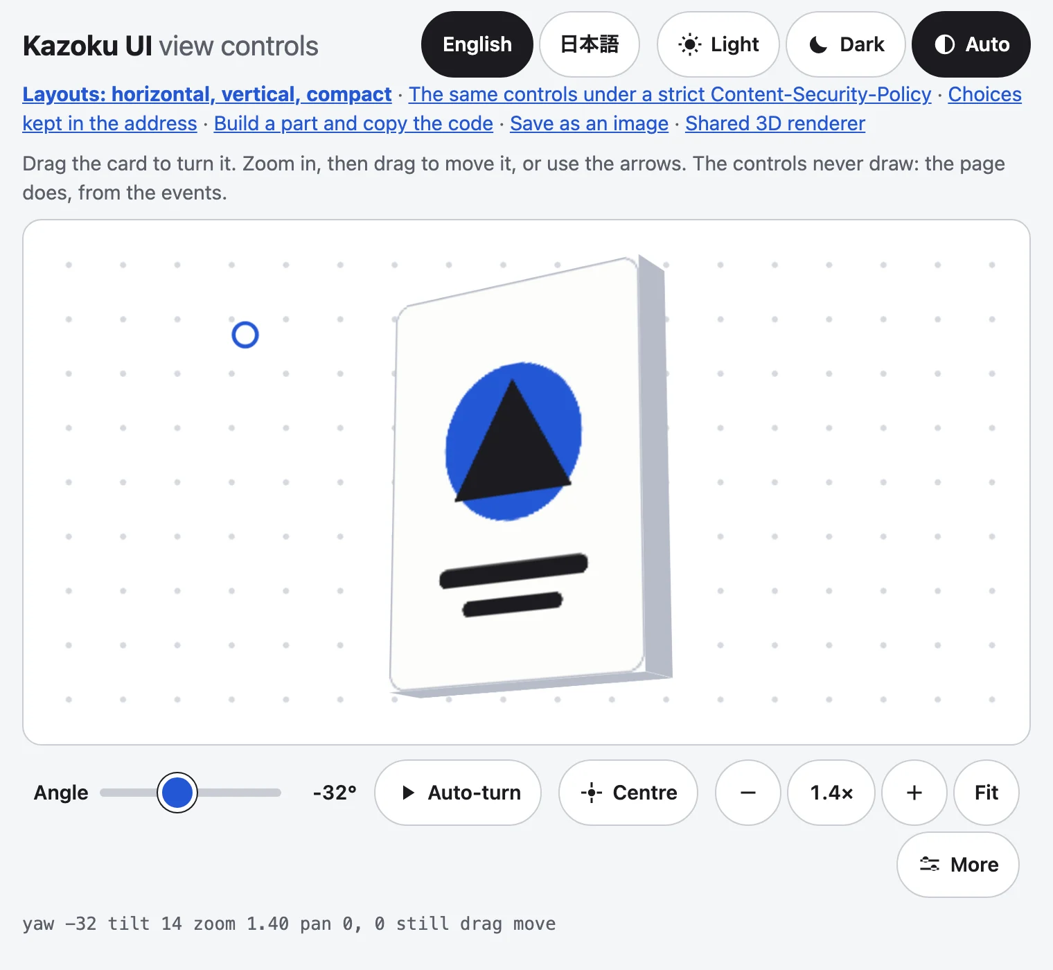
The family's shared interface parts, as their own versioned package: one part per subpath, so a page loads only what it uses. No runtime dependencies, MIT. The first part is the view controls for any 3D or zoomable view. They never draw the scene: they tell your page what the reader chose, and your canvas, WebGL, SVG or CSS 3D applies it.
Demo · Labels, English and 日本語 · Changelog
npm install @johnmorrisdotca/kazoku-ui
Parts (each its own subpath; later ones: picture-tile pickers, theme swatches with light and dark, the English and 日本語 switch, Help, GitHub and npm pills, Save SVG and PNG, the family's backgrounds):
| Subpath | What it is |
|---|---|
@johnmorrisdotca/kazoku-ui/view-controls | The controller, the arithmetic, the address and the labels. Imports on a server. |
@johnmorrisdotca/kazoku-ui/view-controls/element | The ViewControlsElement class (needs a browser). |
@johnmorrisdotca/kazoku-ui/view-controls/define | Registers <kazoku-view-controls> (once, and only if the tag is free). |
View controls
- Angle and tilt sliders, Auto-turn with play and pause, Front.
- Zoom out, 2 times, zoom in and Fit. Zoom is about the pointer (and Ctrl or Command with the wheel, or a trackpad's pinch).
- The four-arrow pan pad (shown once zoomed in) and the Move or Turn choice for what a drag does.
- Touch: one finger turns at 1x and moves the view when zoomed in; two fingers pinch.
- Keys on the view: arrows turn and tip it,
+and-zoom,0or Home is Front and Fit. - The choices are kept in the address, with keys you can rename.
- Labels in English and Japanese; light and dark; 48 px touch targets; a compact bar on a phone; no automatic turn for a reader who prefers reduced motion.
- A control never stops or resets the turn. Zoom, tilt, pan, the Move or Turn choice, Fit and Front all leave Auto-turn running (Front only sets the angle to 0 and the turn goes on from there). A hand on the angle slider, or turning the view by dragging it, holds the turn still while it is down and the turn carries on from where the hand left it. Only the Auto-turn button pauses it.
In plain HTML
<div id="scene" tabindex="0" style="height: 320px">...your scene...</div>
<kazoku-view-controls for="scene" address></kazoku-view-controls>

<script type="module">
  import "@johnmorrisdotca/kazoku-ui/view-controls/define";

  const scene = document.getElementById("scene");
  document.querySelector("kazoku-view-controls").addEventListener("kazoku-viewchange", (event) => {
    const { yaw, tilt, zoom, panX, panY } = event.detail;
    scene.style.transform = `translate(${panX}px, ${panY}px) scale(${zoom}) rotateX(${tilt}deg) rotateY(${yaw}deg)`;
  });
</script>
Put the element on the view or right beside it, so it is on screen with the view. for names the element the hands bind to (the pointer, pinch, wheel and keys); give it a tabindex if you want the keys on it, and size it to the view, because the pan is held to the room the zoom gives. With overlay the bar sits over the bottom of its positioned parent instead.
In a framework
The element is plain DOM, so any framework uses it with a ref and one listener. React:
import "@johnmorrisdotca/kazoku-ui/view-controls/define";
import { useEffect, useRef } from "react";

export function Viewer({ draw }) {
  const view = useRef(null);
  const controls = useRef(null);
  useEffect(() => {
    const bar = controls.current;
    bar.view = view.current;
    const on = (event) => draw(event.detail);
    bar.addEventListener("kazoku-viewchange", on);
    return () => bar.removeEventListener("kazoku-viewchange", on);
  }, [draw]);
  return (
    <>
      <div ref={view} tabIndex={0} style={{ height: 320 }} />
      <kazoku-view-controls ref={controls} lang="en" />
    </>
  );
}
Without the element
createViewController is the same hands and state with no markup of its own, for a page that draws its own buttons. It touches the DOM only in bind.
import { createViewController } from "@johnmorrisdotca/kazoku-ui/view-controls";

const view = createViewController({
  speed: 30, // degrees a second for Auto-turn
  onChange(state, { final, reason }) {
    draw(state); // { yaw, tilt, zoom, panX, panY, turning, drag }
  },
});
const unbind = view.bind(document.getElementById("scene")); // pointer, pinch, wheel, keys
myPlayButton.onclick = () => view.toggle();
myZoomIn.onclick = () => view.zoomBy(1.4);
Options of createViewController that match: zoom ("fit" or a number), fitScale, ignore. The controller also has ignore (changeable), fitScale, startZoom (the zoom the view opens at) and setFitScale(n), setStartZoom(zoom); DEFAULT_IGNORE is the default selector.
Buttons and links inside the view
The hands capture the pointer on the for element, so a press on a button or link placed inside it would be taken for a drag and its click lost. A press on anything that matches ignore is left alone (no capture, no drag, no double-tap), and the click goes through. Mark any other child with data-kazoku-ignore. Dragging from the empty part of the view turns it as before.
ignore also sees through shadow DOM: it tests every element on the event's path from the innermost one up to the view, so a button inside a web component's open shadow root (a card's own Animate button, say) is left alone even though the event's target is the component. A closed shadow root hides its inside from the page, so only the component itself can be matched: mark the host with data-kazoku-ignore, or add its tag name to ignore.
Opening at the scene's natural size
Zoom 1 is Fit, whatever size that is on the page. A page that draws its scene at fitScale (for example 0.4 of natural size when it fits the view) and wants to open at natural size sets zoom="1" and tells the controls the scale:
const controls = document.querySelector("kazoku-view-controls");
controls.setAttribute("zoom", "1"); // natural size
controls.setFitScale(measure()); // the scale the scene is drawn at when it fits, for example 0.4
// the event's zoom is now 2.5; draw at event.detail.zoom * controls.fitScale
setFitScale moves the view to the opening zoom for the new scale, unless the reader has already zoomed. Fit and the Fit key still go to zoom 1, and the address leaves a zoom out when it is the opening one. zoom="fit", or no zoom, changes nothing from before.
The event API
kazoku-viewchange is dispatched on the element (it bubbles and crosses shadow roots). event.detail, and the first argument of onChange, is:
| Field | Meaning |
|---|---|
yaw | Degrees, -180 up to 180: the turn about the vertical. Dragging right makes it larger. |
tilt | Degrees, held to plus or minus tilt-max (30): the top tips away as it gets larger (dragging up). |
zoom | 1 to 5 (zoom-min, zoom-max): 1 is Fit. The scene is drawn at zoom * fitScale (see below). |
panX, panY | CSS pixels the zoomed picture is moved from the middle of the view; 0 at 1x. |
turning | True while Auto-turn is running. |
drag | "move" or "turn": what a plain drag does while zoomed in. |
final | False for the steps of a drag, a pinch, a slider and the automatic turn; true when something settled. Do the costly drawing on final, the cheap transform on every event. |
reason | What changed it: init, auto, drag, pinch, wheel, key, slider, zoom, pan, front, fit, fit-scale, play, pause or set. |
An init event is sent once, a moment after the element connects, with the starting view (from the attributes and the address). element.state is the current view at any time.
Attributes
| Attribute | |
|---|---|
for | The id of the view the hands bind to. Or set element.view = someElement. |
lang | en or ja. Otherwise the nearest lang above it, else English. |
yaw, tilt | The starting angle and tilt. |
zoom | The starting zoom: fit (the default) or a number, a scale where 1 is the scene's natural size. It opens at that number divided by fit-scale; with fit-scale left at 1 it is the zoom of the event. |
fit-scale | The scale your page draws the scene at when it is at Fit (event zoom 1): what zoom 1 means. 1 by default. Or call element.setFitScale(n) once the scene is measured. |
ignore | A CSS selector for what inside the view a pointer press leaves alone, so its click goes through: button, a, input, select, textarea, label, [data-kazoku-ignore] by default. A bare ignore="" leaves nothing alone. |
autoplay | Turn by itself from the start, unless the reader prefers reduced motion. |
speed | Degrees a second (30). |
flat | The view cannot turn: no angle, tilt, Auto-turn or Front, and a drag moves it. |
tilt-max, zoom-min, zoom-max | The limits (30, 1, 5). |
address | Keep the choices in the page's address (?yaw=40&tilt=10&zoom=2&drag=turn). |
address-keys | Other keys: yaw:a,zoom:z. |
theme | light or dark; otherwise the page's colour scheme. |
overlay | Sit over the bottom of a positioned parent. |
Methods: play(), pause(), front(), fit(), set({ yaw, tilt, zoom, panX, panY, drag }), setFitScale(n), and controller (the createViewController object behind it). element.words = { front: "Home" } replaces labels.
Colours are custom properties: --kazoku-ink, --kazoku-surface, --kazoku-line, --kazoku-accent; the parts are bar, field, slider and button.
The address
Only what a reader chose is kept: angle, tilt, zoom and the drag choice. The pan is in pixels of one screen and the turning is of a moment, so neither is; while the view turns by itself the angle is left out. A value at its start (Fit, or the zoom the page opens at) leaves the address, and other parameters are kept. The address is written at most four times a second (Safari stops a page that changes its address more than 100 times in 30 seconds). Without the element: parseAddress(search, keys?) and formatAddress(search, choices, keys?, leaveYaw?, startZoom?).
Why the tag is only defined when it is free
customElements.define throws when a name is taken, and a page can meet that without any fault: two copies of this package (an app and a widget that each bundle one, or two versions), the script loaded twice, or a page that registered the tag to supply its own element. A throw would stop the importing module and the page's script with it. So define calls customElements.get first and the first definition wins; defineViewControls(registry?) returns whether it defined the tag.
Size
Gzipped, unbundled: the element and its definition about 5.0 KB, the controller 3.9 KB, the maths 1.4 KB, the address 1.2 KB, the labels 0.7 KB and the styles 1.6 KB (pnpm test:package prints them). Nothing is loaded from the network.
Checks
pnpm check (lint, types, 29 unit tests of the maths, the address, the controller and the package, the build and the packed package), and pnpm test:demo (the demo in Chromium and WebKit at a phone's width and a desk's: the controls in the first screen, a toggle during Auto-turn leaves the angle advancing, a button or link inside the view still clicks while a drag turns it, the opening zoom and fit scale, zoom about the pointer, pan when zoomed, touch, the address, the labels, reduced motion).
Not yet
Not published to npm yet. The Japanese labels have not yet been read by a native speaker. The demo's scene is a CSS 3D card; the package has no opinion about what draws.
Licence: MIT. No brand, league or sponsor mark is in this package.